| Image |
Comment |
| 03/23/2016 09:33:10 AM |
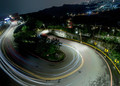
Down to Town by GeorgesBogaertComment: Haha!! I've been getting annoyed with all of the slanted horizons in recent shots. But as soon as I saw this, I thought: "Someone who knows how to tilt a horizon with a purpose, instead of by mistake." It adds a lot to it, and does give a sense of movement and dizziness. It wouldn't have been nearly as interesting without it!
Way to go out and get a shot! Congrats on the blue! |
 Photographer found comment helpful. Photographer found comment helpful. |
| 03/22/2016 10:32:23 PM |
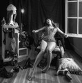
The Resting Placeby Lauren3145Comment: It was a really nice shot, but the filter on the sky, and then the problem with the selection around the trees (red on the horizon, grey/blue behind the trees) just ruins the shot for me. It could have been so good without the processing of the sky. |
| 03/20/2016 09:44:21 PM |
|
| Photographer found comment helpful. |
| 03/20/2016 09:43:56 PM |
|
| Photographer found comment helpful. |
| 03/20/2016 09:43:31 PM |
|
| Photographer found comment helpful. |
| 03/20/2016 09:43:14 PM |
covering his tracksby mefnjComment: Brilliant idea and POV. I'm still trying to figure out whether he would have been walking backwards and thus the tracks would be going the other way...
Don't particularly care, because it's a fun photo. But was curious. :)
(voted earlier) |
| 03/18/2016 08:46:24 PM |
Untitled #629by Samantha_TComment: Looking old? I think you failed that at! Too gorgeous to look old. :)
Huge congrats on the blue! And on #2! (I was wondering... :) |
| Photographer found comment helpful. |
| 03/18/2016 08:44:31 PM |
the aging gameby flahermaComment: +1 to Tangy's comment. I'd do self portraits all the time if I had that face! |
| Photographer found comment helpful. |
| 03/18/2016 08:43:48 PM |
U n t i t l e d by PaulComment: Loved this one. I figured it would be 1st or 2nd with Tanguera as the other. Great idea and great capture! |
| Photographer found comment helpful. |
| 03/18/2016 08:42:50 PM |
conformation by tangueraComment: Fully expect it to bomb?? I thought it was awesome. 9 from me. I thought it would get the blue. :)
Huge congrats!! |
| Photographer found comment helpful. |
Home -
Challenges -
Community -
League -
Photos -
Cameras -
Lenses -
Learn -
Help -
Terms of Use -
Privacy -
Top ^
DPChallenge, and website content and design, Copyright © 2001-2026 Challenging Technologies, LLC.
All digital photo copyrights belong to the photographers and may not be used without permission.
Current Server Time: 06/23/2026 01:35:35 AM EDT.