| Image |
Comment |
| 11/21/2017 08:05:21 PM |
|
 Photographer found comment helpful. Photographer found comment helpful. |
| 11/21/2017 08:05:01 PM |
|
| 11/21/2017 08:04:09 PM |
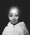
scoutby JustinMComment: Really quite intriguing. The headlamp being so bright is distracting, yet not overwhelming. The really dark shadow under the nose is also distracting. Yet, for some reasons, the distractions actually add to this shot. I really don't know why. There's something a little creepy about this, but then it seems sweet. I don't like noise, but that actually also adds.
I think if this were mine, I would have tried to fix things, and it would have ended up not nearly as strong. -8- |
| Photographer found comment helpful. |
| 11/20/2017 12:11:16 PM |
|
| 11/17/2017 01:38:24 PM |
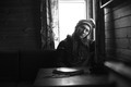
Gold Rushby skewsmeComment: So beautiful. This was my highest score (I thought the dead body added interest, actually) |
| Photographer found comment helpful. |
| 11/17/2017 01:37:14 PM |
|
| Photographer found comment helpful. |
| 11/17/2017 01:36:55 PM |
|
| 11/17/2017 01:36:30 PM |
|
| Photographer found comment helpful. |
| 11/17/2017 01:36:18 PM |
|
| Photographer found comment helpful. |
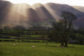
| 11/17/2017 01:35:32 PM |
Barrow Gill by salmiakkiComment: This is so incredibly beautiful. Huge congrats on the red. Is the horizon tilted a bit? I kept going back and forth on whether I thought it was... (just bringing it up because I'm curious. :) |
| Photographer found comment helpful. |
Home -
Challenges -
Community -
League -
Photos -
Cameras -
Lenses -
Learn -
Help -
Terms of Use -
Privacy -
Top ^
DPChallenge, and website content and design, Copyright © 2001-2026 Challenging Technologies, LLC.
All digital photo copyrights belong to the photographers and may not be used without permission.
Current Server Time: 06/21/2026 02:13:04 AM EDT.