| Image |
Comment |
| 01/09/2009 03:40:40 PM |
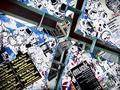
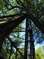
Ataxiaby ImagineerComment: Ataxia describes a loss of coordination, especially of the muscles -- fitting as averything in this image looks off-balance. :-)
Interesting that it is full of right angles, but there are no "right" angles ... |
 Photographer found comment helpful. Photographer found comment helpful. |
| 01/09/2009 03:36:55 PM |
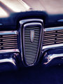
The Edsel Transmogrifiedby sherComment: Processing works well for this subject -- what I'd expect to see in an ad in a "high-end" or arty magazine. |
| Photographer found comment helpful. |
| 01/08/2009 10:00:06 PM |
|
| Photographer found comment helpful. |
| 01/08/2009 09:54:34 PM |
|
| Photographer found comment helpful. |
| 01/07/2009 04:45:31 PM |
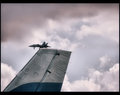
Number 1 - A wing and a prayer (edited)by KelliComment: Yes -- better contrast and detail help. I don't care so much for the thicker border on the top -- I make most of mine "poster style" with the border (approximately) equal on the top and sides, and fatter on the bottom (in my case, to accomodate a caption). |
| Photographer found comment helpful. |
| 01/06/2009 01:37:41 PM |
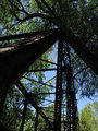
Week 01 by KenComment: Good job opening up the details in the shadows (e.g. on the tree trunk); it does shift the sky color a lot though ... |
| Photographer found comment helpful. |
| 01/06/2009 01:35:08 PM |
Week 01 Originalby KenComment: I like the splash of light on the ironwork on the left. Message edited by author 2009-01-06 13:35:54. |
| Photographer found comment helpful. |
| 01/05/2009 02:17:07 PM |
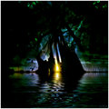
Fortune Cookieby smichenerComment: Good idea. The lighting seems just a bit harsh, but that does provide good clarity and focus. |
| Photographer found comment helpful. |
| 01/05/2009 02:15:21 PM |
|
| Photographer found comment helpful. |
| 01/04/2009 09:35:21 PM |
1-jan 09 archive foto. dreamscapeby rozComment: Stare hard at the area just above and to the right of the ascending birds near the right side and tell me what you see....
A well-constructed composite, with painterly qualities suitable for the subject/genre -- nice job!
Now you have to write the story which accompanies the illustration ... ;-) |
| Photographer found comment helpful. |
Home -
Challenges -
Community -
League -
Photos -
Cameras -
Lenses -
Learn -
Help -
Terms of Use -
Privacy -
Top ^
DPChallenge, and website content and design, Copyright © 2001-2026 Challenging Technologies, LLC.
All digital photo copyrights belong to the photographers and may not be used without permission.
Current Server Time: 06/19/2026 05:23:43 PM EDT.