| Image |
Comment |
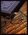
| 05/13/2003 11:44:54 AM |
The Professorby jmsetzlerComment: Mostly because of my work I'm more interested in the embossing die than the specs, although you did a fine job shooting those too, showing the glass by refraction instead of too many reflections. |
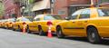
| 05/13/2003 02:20:46 AM |
code orangeby tomzinhoComment: What could be more representative (even cliche) of "Transportation" than a yellow cab? And standing still is emblematic of the number one complaint about transportation in the modern era... |
 Photographer found comment helpful. Photographer found comment helpful. |
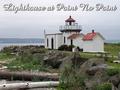
| 05/13/2003 12:36:29 AM |
Point No Point Lighthouseby robbiehComment: Originally posted by robbieh:
I live in northwest WA state. It rains here often for weeks at a time. It is very discouraging to have people tell you your photo is bland or has bad lighting. When the contests are under time constraints and you are working two jobs, you do the best you can with what you have. I set this shot up carefully. I got the rugged messy beach in, an interesting angle on the lighthouse, the water and the distant land in the photo. It is often stormy here hence the lighthouse. Though this photo did poorly here, I did have two people who wanted to purchase a print. I really liked this shot. I do intend to be more careful what I submit for contests-- if I submit again at all. |
Don't be discouraged -- that's very positive feedback, that the only problem is something beyond your control given the time constraints, but that re-shot under different lighting it would rate highly.
Or, now that the voting is over, you can go back and selectively edit it to be closer to the vision you have of the scene, not the light values present when you released the shutter.
A very big part of this site (to me) is to see what flaws others can find, so I know where to improve.
I'd have made that type a little smaller, and maybe a light blue (or maybe a light yellow) to try and fool people into thinking they see some blue in the sky. Message edited by author 2003-05-17 11:00:03. |
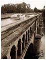
| 05/12/2003 05:40:15 PM |
The extravagance of yesterday's commercial waterwaysby jjbeguinComment: I appreciate the architecture even more with the background notes...it sure wouldn't last long out here in earthquake country however. I like the aged look you've given it; everything else too!
I agree having a large boat on the river below with one above would be even a little better -- I would probably title it something about "Freeway Interchange c. 1500" (or whenever)... |
| Photographer found comment helpful. |
| 05/11/2003 11:32:51 PM |
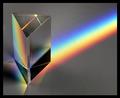
Prismby autoolComment: I wanted to do this for Primary Colors (or Secondary or whatever) -- nice job. |
| 05/11/2003 11:09:19 PM |
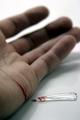
Nitricby dadas115Comment: I didn't even think of shooting a condenser! |
| 05/11/2003 07:01:41 PM |
Magnifying Picassoby kosmikkreeperComment: Great idea...I wonder if shooting from any farther back and cropping would put the right side in more equal focus (if you wanted that) without making the lens too obvious. |
| 05/11/2003 06:58:38 PM |
|
| 05/11/2003 03:12:56 PM |
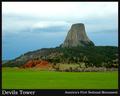
Devils Tower National Monumentby SonifoComment: A fine shot, needs a little cropped top and bottom to fit standard size. Good job bringing out the color from what looks like a flat lighting situation. |
| Photographer found comment helpful. |
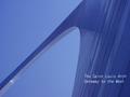
| 05/11/2003 03:01:46 PM |
Gateway to the Westby kaysrivComment: A different perspective on this landmark. I'd move the type down, crop the top a tiny bit to a standard aspect ratio. |
Home -
Challenges -
Community -
League -
Photos -
Cameras -
Lenses -
Learn -
Help -
Terms of Use -
Privacy -
Top ^
DPChallenge, and website content and design, Copyright © 2001-2026 Challenging Technologies, LLC.
All digital photo copyrights belong to the photographers and may not be used without permission.
Current Server Time: 06/21/2026 11:57:51 AM EDT.