| Image |
Comment |
| 05/25/2003 08:52:34 PM |
|
| 05/25/2003 08:50:59 PM |
|
 Photographer found comment helpful. Photographer found comment helpful. |
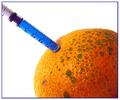
| 05/25/2003 08:49:11 PM |
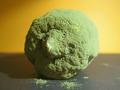
Light and Shadowby scrooslooseComment: The lime just seems out of place...maybe if it were on a black plate, and with one or two other pieces of fruit, it would feel more in context. As it is it feels to me more like a well-done study or test than finished piece. |
| Photographer found comment helpful. |
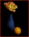
| 05/25/2003 08:45:17 PM |
Floating Flameby TerryGeeComment: Clever candle; excellent focus and exposure, although to be a completely cliched flower shot I think the flower has to leave the frame in the upper-left corner... |
| Photographer found comment helpful. |
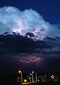
| 05/25/2003 08:39:21 PM |
Natures Purple, Man's Yellowby K-RobComment: Great job getting the lightning and the upper clouds -- you will probably lose points for not straightening the horizon (you could do that easily when cropping without losing anything significant). |
| Photographer found comment helpful. |
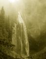
| 05/25/2003 01:32:41 AM |
Comet Falls (Duotoned)by paganiniComment: On my monitor the highlights and lighter midtones look a little too bright for my taste...I think a little darker would add to the atmosphere and maybe bring out a little more detail in the rocks on the far side. Like the setting and composition a lot... |
| Photographer found comment helpful. |
| 05/24/2003 05:40:30 PM |
|
| Photographer found comment helpful. |
| 05/23/2003 05:30:06 PM |
Intrigue_21702-pdm-whtype.jpgby GeneralEComment: Originally posted by FranziskaLang:
Plus, I really like this photo anyhow, the little girl is so beautifully entranced by the music and the colorful musicians balance the girl's bright clothes perfectly.
Wonderful capture! :) |
Thank you, but please note that this is not my capture, but rather my roughly-done suggested edits for this original image by Diversq. |
| 05/22/2003 07:10:05 PM |
|
| Photographer found comment helpful. |
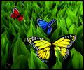
| 05/20/2003 11:37:07 AM |
Butterfly Fantasy by dsidwellComment: Originally posted by paganini:
I knew these were fake butterfly, hence the 2 vote, you can tell by looking at the perfect colors of the butterfly wings, which doesn't happen in nature, also the edges of the wings, looks like it's CUT from paper.
We already have what, a ton of photos with hue adjustments and shifted colors FOR NATURE shots (which i consider blasphemous), but this one is worse. It's just like spot editing an image by inserting elements that weren't there before. I don't care for other shots, but for nature shots I'd expect real photographs, not fake ones. |
This wasn't a "Nature" challenge, it was a COLOR challenge. I see it as a "real photograph" of a variety of objects in the colors specified... |
| Photographer found comment helpful. |
Home -
Challenges -
Community -
League -
Photos -
Cameras -
Lenses -
Learn -
Help -
Terms of Use -
Privacy -
Top ^
DPChallenge, and website content and design, Copyright © 2001-2026 Challenging Technologies, LLC.
All digital photo copyrights belong to the photographers and may not be used without permission.
Current Server Time: 06/21/2026 02:59:12 PM EDT.