| Image |
Comment |
| 01/15/2004 12:06:37 AM |
San Francisco's Golden Gateby GeneralEComment: Thanks for the comments and suggestions! Later I'll post another shot which has the GG Bridge actually visible, but didn't seem to have the same oomph! as the more panoramic view.
In the meantime, here's a link to the panoramic crop most people seemed to want ...
 |
| 01/08/2004 10:45:27 PM |
Lick Observatory in Whiteby edsphotosusComment: Hey, I've been up there ... about 35 years ago! That road is so winding that school buses need to negotiate some curves in two passes ... that can be kind of interesting if you're in one of those rear seats which overhangs the back wheels by a few feet (like I was) when they back up to finish the turn.
I believe there's actually another road which approaches from the East, but I've never been on it if it's there. |
| 01/05/2004 01:13:54 AM |
Imagine... by JasperComment: Excellent job all around. You may be our youngest ribbon-winner to date! |
 Photographer found comment helpful. Photographer found comment helpful. |
| 01/04/2004 10:37:07 PM |
|
| 01/03/2004 11:50:19 PM |
|
| Photographer found comment helpful. |
| 01/03/2004 11:48:03 PM |
Snowmanby channeledComment: Even though he's tacked together, that's actually pretty creative, I think. Looks like you used a flash, making a harsh shadow, but it makes it possible to see the detail that way. |
| 01/03/2004 11:44:47 PM |
|
| Photographer found comment helpful. |
| 01/01/2004 04:01:09 PM |
Exams are on the Horizonby KonadorComment: Every time I see you studying you seem to have quite a headache. Might I suggest some brighter reading lights and a dose of your favorite caffeinated beverage? |
| Photographer found comment helpful. |
| 12/29/2003 04:04:43 PM |
|
| Photographer found comment helpful. |
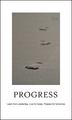
| 12/29/2003 03:53:15 PM |
Progressby ronnersComment: I like your different perspective on the footsteps motif. |
| Photographer found comment helpful. |
Home -
Challenges -
Community -
League -
Photos -
Cameras -
Lenses -
Learn -
Help -
Terms of Use -
Privacy -
Top ^
DPChallenge, and website content and design, Copyright © 2001-2026 Challenging Technologies, LLC.
All digital photo copyrights belong to the photographers and may not be used without permission.
Current Server Time: 06/23/2026 07:30:47 AM EDT.