| Image |
Comment |
| 11/15/2010 03:11:27 AM |
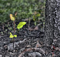
Saplingby bcenuComment: Lovely concept. Striking contrast with the bark of the old tree. Looks like it was burned. I wish the background was a bit more blurred. |
 Photographer found comment helpful. Photographer found comment helpful. |
| 11/15/2010 03:09:33 AM |
Inside Outby JudiComment: Very neat high-key image. Composition is dead on. The lines of the fence in contrast with the boy making a triangle with his legs. The only suggestion how to improve this photo would be to sweep the leaves off. Without the distractions, this would be one of my top images. |
| Photographer found comment helpful. |
| 11/15/2010 03:07:22 AM |
A Window Visitorby vawendyComment: Great idea and well executed. It reminds me of a chinese painting. The dots on the right look like chinese alphabet in columns. |
| Photographer found comment helpful. |
| 11/15/2010 02:58:18 AM |
Off into the blueby SaltehComment: Neat idea and lovely soft colors. I wish you had seamless background though. It would make this nice image into a perfect one. All you need is a bigger piece of soft blue paper and bend it without creasing it to make it into continuing piece. |
| Photographer found comment helpful. |
| 11/15/2010 02:55:30 AM |
Green Teaby hernan43Comment: Cool idea, but the background is really not complementing this subject. Try toning it down to a more pleasing tone of green, not so neon looking. |
| Photographer found comment helpful. |
| 11/15/2010 02:54:27 AM |
Oculusby BastaComment: Very interesting composition and toning. |
| Photographer found comment helpful. |
| 11/15/2010 02:54:09 AM |
Two souls with but a single thought...by kellmak10Comment: Lovely soft effect and the background is so nice. Love the way it glows. But my issue is with the white space on the left. It competes for attention with the couple. I wish it was not so bright. |
| Photographer found comment helpful. |
| 11/15/2010 02:52:14 AM |
One Autumn Dayby dahlinComment: There seems to be a lot of pink and purple in this image, which makes it look a bit unnatural. The shirt stands out and is a nice colour, but the leaves shouldn't be this blue. It is otherwise a very lovely image. |
| Photographer found comment helpful. |
| 11/15/2010 02:50:29 AM |
|
| Photographer found comment helpful. |
| 11/15/2010 02:49:50 AM |
Bottom Alignedby LandzEncaComment: I like the placement and the soft background. The flower is a bit overexposed, therefore you lost some of the texture of the bottom petals. It is also oversaturated a bit. If you tone it down, this would actually be a lovely flower shot. |
| Photographer found comment helpful. |
Home -
Challenges -
Community -
League -
Photos -
Cameras -
Lenses -
Learn -
Help -
Terms of Use -
Privacy -
Top ^
DPChallenge, and website content and design, Copyright © 2001-2026 Challenging Technologies, LLC.
All digital photo copyrights belong to the photographers and may not be used without permission.
Current Server Time: 06/21/2026 03:58:04 AM EDT.