| Image |
Comment |
| 12/09/2003 12:27:24 AM |
Frozenby timmiComment: Thank you all very much for all the incouraging comments. With every challenge I learn so much. My eyes are open to new posibilities all the time. I am glad to be part of DPC. |
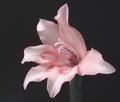
| 12/09/2003 12:09:27 AM |
soft romantic thoughtsby trainComment: Great effort Sally. The soft pink colours are just really beautiful. I think you could have make it even more powerful by differently coloured background. I find the grey kind of dreadful.
I do think you have a bit of soft focus going on. The flower itself and the colours are soft, but I guess in this challenge people were really expecting misty looks. As you said, you are happy with the result, and that's what counts the most. Keep on trying, you'll do just fine. |
| 12/08/2003 11:56:40 PM |
Joshuaby deemerComment: I quite don't know what to make of this shot. The magnifying glass doesn't really add much to the image, since it didn't actually magnify anything. It just looks like it's in the way of showing the silly glasses. The expression in the boy's face has no emotion, so it is not very fun to look at. Could use some overall sharpening as well. |
 Photographer found comment helpful. Photographer found comment helpful. |
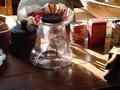
| 12/08/2003 11:53:12 PM |
THE SHAPE OF DAYS GONE BYby ANTHONYComment: You have too many things happening in your shot. The backlighting is interesting, but the image is so busy that the viewer doesn't know what to make of it. Perhaps simplifying or different arrangement of the objects could improve your image. Also you could use the cloning tool to clean up some of the specs on the glass (legal in this case). |
| Photographer found comment helpful. |
| 12/08/2003 11:50:25 PM |
My Favorite Shapeby Chilly0999Comment: This image has a lot of potential, but it has few bugs that could be improved upon. The grain here is on purpose I guess, but it kind of kills the shape. Also it apears too horizontal. Perhaps positioning the body on an angle with just the bikini and legs showing to make it more abstract flow of shapes. Also since we are alowed to spot edit this challenge, you could have cloned out the specs on the bottom of the right leg. Great effort. |
| Photographer found comment helpful. |
| 12/08/2003 11:46:50 PM |
Square Snowball?by fdpiechComment: Your photo is nicely colourful and main subject is sharp, but it looks a bit tacky to mee. I know you were going for a Christmas theme here, but the two lights on the left have nothing to do with your main object, so the shape doesn't really stand out here. As for post processing, I would have cloned out the harsh glow on the bottom below the lights. Maybe simpler background would have helped to bring attention to your happy face shape. |
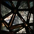
| 12/08/2003 11:43:13 PM |
Abstract Starby mariomelComment: This photo looks very busy to me. Maybe isolating one or two of the triangles could have helped to simplify it enough to stand out in terms of shape and composition. The way it is now, it's hard to find a spot to rest your eyes on. It's not abstract enough, but I cannot guess what it is at all. |
| Photographer found comment helpful. |
| 12/08/2003 11:37:26 PM |
Holiday Trimmingsby OneSweetSinComment: You got many shapes, but they don't really make the image any better. You could have picked one of the ornaments and explore that in more depth. Simplify. The colours are nice, but your photo is a bit pixelated. The snow looks greish blue (if that's a snow). Also the crop is a bit too tight. Give your object more breathing space. |
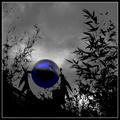
| 12/08/2003 11:33:40 PM |
Sphere and Fractalsby GeneralEComment: Very dramatic photo. But IMO you went a bit too far in the post processing with this. Sometimes less is more. The blue ball stands out nicely against the dramatic surroundings, but it is almost distorted by pixelation. The colour looks strange (the greenish part). I've seen fractals before, but in your image I cannot really make the connection - it looks more like chaos (fractals are highly organized). Overall, not bad image, it caught enough of my attention. |
| Photographer found comment helpful. |
| 12/08/2003 11:30:10 PM |
Ordinary Shelves in a New Lightby jaimeegrlComment: Interesting concept. Great colour contrasts. But my eyes are going around the blurry area in the centre a bit. Did you try to soften this on purpose? It could have worked all sharp as well. Also I am not too keen on centred composition. |
| Photographer found comment helpful. |
Home -
Challenges -
Community -
League -
Photos -
Cameras -
Lenses -
Learn -
Help -
Terms of Use -
Privacy -
Top ^
DPChallenge, and website content and design, Copyright © 2001-2026 Challenging Technologies, LLC.
All digital photo copyrights belong to the photographers and may not be used without permission.
Current Server Time: 06/23/2026 01:00:45 PM EDT.