| Image |
Comment |
| 12/29/2003 05:04:52 AM |
|
 Photographer found comment helpful. Photographer found comment helpful. |
| 12/29/2003 05:04:29 AM |
|
| Photographer found comment helpful. |
| 12/29/2003 04:59:13 AM |
The key to lifeby trainComment: Interesting idea about the balancing act. But the text is so very ugly. If this was a joke, then sorry. But if you are serious about this motivating someone, I think you've just succeeded to scare them away. |
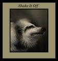
| 12/29/2003 04:57:06 AM |
Shake It Offby RefocusedComment: Amazing frozen action shot. But very ugly border. I am sorry to be so direct, but the border totally turned me away from otherwise interesting photo. |
| Photographer found comment helpful. |
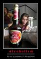
| 12/29/2003 04:55:56 AM |
Alcoholismby rooComment: OK, this is a joke I guess. I wouldn't want to be motivated into drinking :-)) Even a snapshot like this can be lulled into serious looking poster with some heavy border and red text I guess. The red text is pixelated and why is the image so small. Anyway, you met the challenge, but it's not your best. |
| 12/29/2003 04:52:58 AM |
Little Ninja's Uniteby BigMoComment: Composition is good, concept ok, but how is it supposed to motivate me? The word UNITE could have been a bit smaller (less tall). Too bad the front hand is not in focus as the rest of the image is. If this is a child's shot - well done. If it is an adult who created this - keep trying. |
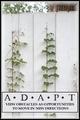
| 12/29/2003 04:50:42 AM |
ADAPTby RonBComment: Nice concept and shot. Fits perfectly with the challenge and with the text. But I would have put the text completely to the bottom of the poster. This way it kind of floats. Also the border is somehow not fitting with this image, either have a soft border or a hard one. Combining both creates unbalance to me. |
| Photographer found comment helpful. |
| 12/29/2003 04:01:06 AM |
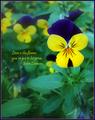
Love is the flower...by sherComment: Great flower shot. Lovely colours and composition of the image. But I would have placed the text lower towards the bottom. You will rarely see a text in the middle of a poster especially when it's competing for attention with the main subject. |
| Photographer found comment helpful. |
| 12/29/2003 03:58:44 AM |
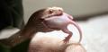
Mouse or Man?by johnnykillchristComment: I do not get this? What is it supposed to motivate me towards? Eating rats or having a snake? Could you please explain. Photo itself is great. |
| 12/29/2003 03:57:15 AM |
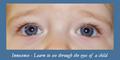
Innocenceby wkmenComment: Sweet picture. Beautiful colours and cute composition. But it is not as sharp as I would expect from this kind of close up shot. Also, you could have edited out the glare in the left eye and the redness in the baby's pupils. |
| Photographer found comment helpful. |
Home -
Challenges -
Community -
League -
Photos -
Cameras -
Lenses -
Learn -
Help -
Terms of Use -
Privacy -
Top ^
DPChallenge, and website content and design, Copyright © 2001-2026 Challenging Technologies, LLC.
All digital photo copyrights belong to the photographers and may not be used without permission.
Current Server Time: 06/23/2026 08:20:28 PM EDT.