| Image |
Comment |
| 12/29/2003 05:47:32 AM |
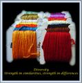
Diversity - Strength in similarities, strength in differencesby wetlandComment: Oh, very good idea. Colours are just great. The border doesn't really go very well with your image. You have lots of colours happening, so simple border would have not competed for attention. Also, the text in yellow is a bit clownish. The main title should be bigger and different type face. If you've made simpler text and border, it would have been looking like a pro poster. |
 Photographer found comment helpful. Photographer found comment helpful. |
| 12/29/2003 05:45:16 AM |
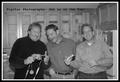
Go Digitalby rll07Comment: Looks like guys are having fun. Like the way the cupboards frame the people. I am missing colour in this image. It's lively shot, so some nice colour would have added a sparkle. Like the simple text. |
| 12/29/2003 05:44:11 AM |
|
| Photographer found comment helpful. |
| 12/29/2003 05:43:20 AM |
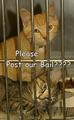
Please......Post Our Bail?by ddmckinney1954Comment: This would have been great in the propaganda challenge as well. Well framed, but I would never put text smack in the middle of a poster. The photo should portray the message, the text is just supporting it and would have been fine along the bottom. |
| 12/29/2003 05:41:59 AM |
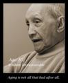
Wisdom Grows With Ageby HRoxasComment: Very inspirational. Although I would have chosen a bit livelier colour tone for this great man - something warmer looking. |
| Photographer found comment helpful. |
| 12/29/2003 05:40:58 AM |
Just Move It!by cimarron98Comment: Good idea and concept, horrendous text (sorry). Glowing neon green text is a bit too much for me, especially with script font in all caps (practically all No No's of a good design). |
| Photographer found comment helpful. |
| 12/29/2003 05:38:57 AM |
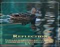
Reflectionby TerryGeeComment: Gorgeous photo and reflection. Love the colours and the composition is very good. I do not like the text in all caps, as it is very hard to read. Sometimes it is a good technique to darken the background behind the text a bit with a faded layer to make the text stand out from the busy background. This actually looks like a pro poster and I like it over all. |
| 12/29/2003 05:36:22 AM |
|
| Photographer found comment helpful. |
| 12/29/2003 05:34:55 AM |
|
| Photographer found comment helpful. |
| 12/29/2003 05:34:16 AM |
|
| Photographer found comment helpful. |
Home -
Challenges -
Community -
League -
Photos -
Cameras -
Lenses -
Learn -
Help -
Terms of Use -
Privacy -
Top ^
DPChallenge, and website content and design, Copyright © 2001-2026 Challenging Technologies, LLC.
All digital photo copyrights belong to the photographers and may not be used without permission.
Current Server Time: 06/24/2026 03:11:55 AM EDT.