| Image |
Comment |
| 11/16/2010 09:14:06 PM |
Jammin'by NayComment: Great moment shot and the colours are very cool. This is a bit over the top with the tilt. Just a bit less of an angle would have made this quite good. |
 Photographer found comment helpful. Photographer found comment helpful. |
| 11/16/2010 09:12:49 PM |
Straight Into The Sunsetby NayDizComment: To make this even stronger image, crop it about an inch below the person (just above the first connector of the pipe). Otherwise lovely image. |
| Photographer found comment helpful. |
| 11/16/2010 09:11:18 PM |
bouquet on blueby clictacameraComment: Neat idea and strong colours. Smart use of a car as a background. To make it into a better image, do not chop off the bottom part of the plant and on the left you are getting too close to the edge. Also, the top part being brighter than the rest, throws it out of balance. Perhaps, moving further away from the car, and letting the background go soft, you might have had enough dark space for the plant. If you try this on a cloudy day, it will eliminate the contrast problem between dark and light. |
| Photographer found comment helpful. |
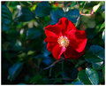
| 11/16/2010 09:05:34 PM |
Roses are red...by burtctComment: Nice shot of a rose. A bit overexposed highlights, but nice contrast between darks and lights. To make it even better and stronger image, I suggest cropping off the top and right parts of the image. The over-exposed rose bud at top right is a distraction, as is the cut of bud above the rose. |
| Photographer found comment helpful. |
| 11/16/2010 09:02:46 PM |
|
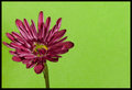
| 11/16/2010 09:02:24 PM |
Go Greenby BackpackRComment: Nicely handled lighting and colour. The green is pleasing, not overpowering. You need to work on your composition. Try the flower on an angle (diagonals make great line compositions). In this case, you needed a bit more space on the left, as the flower is almost touching the edge. Also, the border doesn't need to be that thick. It doesn't help the image. Nice thin one would have been quite enough. 7 |
| Photographer found comment helpful. |
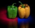
| 11/16/2010 08:59:46 PM |
Double Split Complementary Colorsby dtallaksonComment: Neat idea. I don't mind the grain of the image, but would suggest cropping off about three quartrs of an inch from the bottom to get rid of the yellow reflection. |
| Photographer found comment helpful. |
| 11/16/2010 08:57:41 PM |
Autumnby acg83Comment: Beautiful strong colours. The leaf is a bit overexposed (blown out highlights). Also, when you photograph on such a dark surface, watch out for dirt (give it a quick blow, before you put down the leaf). |
| Photographer found comment helpful. |
| 11/16/2010 08:56:22 PM |
Unlucky cloverby erikingComment: This is a unique idea and well composed image. I love the way the sharpness fades into the background. Too bad the clover is not sharp. Your lens might have been too close to it for good sharpness. Also try making the border dark green. The black doesn't fit with the rest of the soft colours. |
| Photographer found comment helpful. |
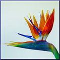
| 11/16/2010 08:52:45 PM |
Bird of Paradiseby trainComment: There is so much detail in this photo. The colours are great and it is so well lit. The background is perfect. The only thing I would just completely avoid is the border. It doesn't really improve the image, it takes away from it. |
| Photographer found comment helpful. |
Home -
Challenges -
Community -
League -
Photos -
Cameras -
Lenses -
Learn -
Help -
Terms of Use -
Privacy -
Top ^
DPChallenge, and website content and design, Copyright © 2001-2026 Challenging Technologies, LLC.
All digital photo copyrights belong to the photographers and may not be used without permission.
Current Server Time: 06/21/2026 12:43:23 AM EDT.