|
|
|
Showing 2641 - 2650 of ~3215 |
| Image |
Comment |
| 02/10/2003 03:59:53 PM | Concealedby RemieComment: Not only is this very well done, its amusing too. Great job! |
| 02/10/2003 03:52:37 PM | A Baby Boy and His Dog (who ate the flower!)by jimmspComment: Comment:
Critique Club Critique
(1) COMPOSITION (CONTENT) This is going to be a very difficuot photograph for me to critique. I am not one of those people who dislike kid and dog pics, on the contrary, when they are well done they are my favorite subjects. Unfortunately I do not find the composition of this photograph to be very compelling. My interst is not held for every long because the composition is weak.
(2) BACKGROUND The background is very plain, which is a good thing for this particular subject. Both of the subjects stand out well against the neutral color of the carpet.
(3) CAMERA WORK ,TECHNICAL The DOF is very deep, the eyes of the dog and the child are both in sharp focus. I feel a bit distracted by the dogs missing ear tips and the childs missing fingers and toes. I wish you had maybe gotten a bit closer to their level. Looking down on them is not as effective as if you had gotten down on yur knees and faced them on their level.
(4) DIGITAL PROCESSING ,TECHNICAL Your post processing is good. Saturation is good. The colors here are really quite wonderful.
(5)MEETING THE CHALLENGE This photo a very good job of meeting the challenge. Children and pets are particular favorites of mine.
(6) MY OPINION ON THE PHOTO The subject here is alright. The way you executed it is alright. I think this is a photograph that you may wish to re-shoot under different conditions and placing the baby and the dog into different positions. The potential here is great, but I feel that you have not quite gotten it yet. |  Photographer found comment helpful. Photographer found comment helpful. |
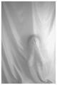
| 02/10/2003 03:26:16 PM | Decaying Beautyby stephanComment: Comment:
Critique Club Critique
(1) COMPOSITION (CONTENT) This is one of theose photographs that the viewer needs to look at for a long time to fully appreciate. I love how you have used the "other" rules of thirds so well (using three "things"). That is an especially effective tool. The three parts of the flower are strategically placed and that gives a very strong composition to this photograph.
(2) BACKGROUND The background is very dark, thus letting the brilliant colors of the flower be the only subject. The way that you have painted the yellows especially with light is wonderful. leaving darkness in the center of the flower adds to the decay. The missing part is just another example of the slow wilting of the flower.
(3) CAMERA WORK ,TECHNICAL The DOF is very deep, and there are no parts of the photograph that are out of focus. The subject stands out sharply against the pitch black of the background. This creates a striking subject.
(4) DIGITAL PROCESSING ,TECHNICAL Your post processing is good. Saturation is good, cropping is good. I see where several of your comments say that cropping a bit tighter would be nice. I do not tend to agree with that, I think the extra room around the subject is the perfect example of negative space. This is especially true because it is so dark. I would not feel this way if the background had been white or another color.
(5)MEETING THE CHALLENGE This photo does an excellent job of meeting the challenge. Not only is your subject cliche, but you have shot it in an imaginative and new way.
(6) MY OPINION ON THE PHOTO The subject here is wonderful. The way you executed it is fantastic. I think this is a photograph that you may wish to re-shoot a few times, it will probably be different with each shot. It would make for an interesting experiment. I may have to try this painting with light on my next photo shoot. Great job!! | | Photographer found comment helpful. |
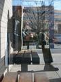
| 02/09/2003 10:12:17 AM | me squaredby johnny_justjohnnyComment: Comment:
Critique Club Critique
(1) COMPOSITION (CONTENT) This is going to be a very difficuot photograph for me to critique. I find the jumble of "things" to be a distraction rather than adding to the composition. It is very difficult to find a place for the eye to rest.
(2) BACKGROUND The background is very cluttered. Between the tree and the building in the reflection, its hard to know what to look at first
(3) CAMERA WORK ,TECHNICAL The DOF is very deep, and there are no parts of the photograph that are out of focus. The subject is rather ambiguous because of this. I am guessing that the face is the subject...you have placed the face into the proper location (according to the rule of thirds).
(4) DIGITAL PROCESSING ,TECHNICAL Your post processing is good. Saturation is good, cropping is good.
(5)MEETING THE CHALLENGE This photo does not do a very good job of meeting the challenge. I do not really get the square part (you personally look anything but "square" to me).
(6) MY OPINION ON THE PHOTO The subject here is alright. The way you executed it is alright. I think this is a photograph that you may wish to re-shoot under different lighting conditions. The potential here is great, but I feel that you have not quite gotten it yet. | | Photographer found comment helpful. |
| 02/09/2003 08:27:15 AM | Evolved Squareby Swami GComment: Critique Club Critique
(1) COMPOSITION (CONTENT) I find the layout of this photograph to be very strong. The goldball is off center in its placement just enough to add visual appeal rather than being static. The shadow of the golf ball is the perfect balance.
(2) BACKGROUND The background is very plain, which make the whites and textures of your golf ball really "pop". Background exposure is perhaps a bit uneven.
(3) CAMERA WORK ,TECHNICAL The focus is very crisp. Exposure leaves a little burn out in the top of the golfball which is rather distracting. The shadow behind and under the golf ball add a certain depth to the photograph which is very nice.
(4) DIGITAL PROCESSING ,TECHNICAL Your post processing is very good. Saturation is good, cropping is perfect.
(5)MEETING THE CHALLENGE This photo does not meet the challenge in my opinion. This same photograph entered into a more appropriate challenge would have done alot better.
(6) MY OPINION ON THE PHOTO The subject here is good. The way you executed it is very good. |
| 02/09/2003 08:15:57 AM | A castle for my princessby jenaromComment: Critique Club Critique
(1) COMPOSITION (CONTENT) I find the layout of this photograph to be very strong. The diagonal lines of the blocks leads the viewers eye directly to the face of the little girl. Even though her face is out of focus, it is very clearly the subject and very well done!
(2) CAMERA WORK ,TECHNICAL The focus is very appropriate for this shot. The colors of the blocks really "pop". Good exposure and DOF. There is really nothing I would change about this this shot.
(4) DIGITAL PROCESSING ,TECHNICAL Your post processing is very good. Saturation is good, cropping is perfect.
(5)MEETING THE CHALLENGE This photo does a very good job of meeting the challenge. I love the colors and the fact I feel that I can almost touch the blocks because their texture is so clear.
(6) MY OPINION ON THE PHOTO The subject here is good. The way you executed it is very good. I love the texture of all of the separate objects. This is the sort of photograph that would look very nice hanging in a childs room, or maybe a pediatricians waiting room. It is very cheerful and bright.
I just realized that I did not give you any advice on how to improve your photograph. I guess this means that I see no area for improvement. Very well done! | | Photographer found comment helpful. |
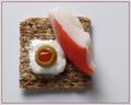
| 02/04/2003 02:59:19 PM | Krabby magnetic9999Comment: Critique Club Critique
(1) COMPOSITION (CONTENT) I find the layout of this photograph to be very strong. The square is off center in its placement just enough to add visual appeal rather than being static. I find the diagonal line of the krab and the roundness of the olive to be a very pleasing change from the straight lines of the square. This is dynamic to the eye.
(2) BACKGROUND The background is very plain, which make the colors and textures of your setup really "pop". Perfect background exposure.
(3) CAMERA WORK ,TECHNICAL The focus is very crisp. Good exposure and DOF. The slight shadow behind and under the cracker add a certain depth to the photograph as well. There is not much that I would change about this.
(4) DIGITAL PROCESSING ,TECHNICAL Your post processing is very good. Saturation is good, cropping is perfect. I feel that the border is overkill, not really necessary and perhaps a bit distracting.
(5)MEETING THE CHALLENGE This photo does a very good job of meeting the challenge. I love the colors and the fact I feel that I can almost touch the cracker.
(6) MY OPINION ON THE PHOTO The subject here is good. The way you executed it is very good. I love the texture of all of the separate objects. | | Photographer found comment helpful. |
| 02/04/2003 09:36:01 AM | May The Light Shine On Youby goodtempoComment: Comment:
Critique Club Critique
(1) COMPOSITION (CONTENT) I find the layout of this photograph to be very strong. The spiral of color and the off center placement of the center of it all add to the power of this composition. I am so glad you did not center this, that would have made it into a bullseye.
(2) BACKGROUND The background is very dark, which make the bright colors of the windows really "pop". Perfect background exposure.
(3) CAMERA WORK ,TECHNICAL The focus seems just a trifle soft on the windows. Did you hand hold the camera at 1/30? Did you try this with a tripod? I think just that little change might have moved this into ribbon contention. You also might try this shot with a smaller aperture. That would add to the DoF and more of the windows would be in sharp focus.
(4) DIGITAL PROCESSING ,TECHNICAL Your post processing is very good. Saturation is good, cropping is perfect.
(5)MEETING THE CHALLENGE This photo does a very good job of meeting the challenge. I love the colors and the feeling of movement from the spiral.
(6) MY OPINION ON THE PHOTO The subject here is fantastic. The way you executed it is excellent. There is much to see here and this is the sort of photograph that can hold my attention for a long time. This is a wonderful photograph! | | Photographer found comment helpful. |
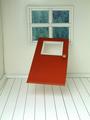
| 02/04/2003 09:20:12 AM | Aunti Em it's a Twisterby TurbotechComment: Comment:
Critique Club Critique
(1) COMPOSITION (CONTENT) Oh this is a most humorous photograph, and the more I look at it the more I smile. I have read your details about how it was set up and I have to hand it to you, you did a great job. The shadow under the floating door is the icing on the cake, what surrealism!
(2) BACKGROUND The background is very realistic here. Your lighting was especially effective in making this appear to be a "real" window looking out onto a forest scene.
(3) CAMERA WORK ,TECHNICAL Exposure is very well done. Your exposure keeps the whites very crisp without losing any of the detail in the rest of the scene. The deep DoF is perfect here.
I would have liked to see a little more light on the back wall, to make it as crisp and white as the floor. That would be my only suggestion for this entire photograph.
(4) DIGITAL PROCESSING ,TECHNICAL Your post processing is very good. Saturation is good, cropping is perfect.
(5)MEETING THE CHALLENGE This photo does a very good job of meeting the challenge. This photograph brings to mind some of the famous surreal painters such as Salvador Dali. The fact that you have achieved this through photography is wonderful.
(6) MY OPINION ON THE PHOTO The subject here is fantastic. The way you executed it is excellent. This is a photograph I can see hanging on the wall in my bar.
I am sorry that this critique does not give much advice to improving your photograph. I see this as near perfect and I do not know what you could do to make it any better. | | Photographer found comment helpful. |
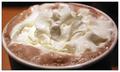
| 01/31/2003 10:59:18 AM | Crémeby ClubJuggleComment: Critique Club Critique
(1) COMPOSITION (CONTENT) I find the layout of this photograph to be very strong. You can almost never go wrong by getting as close as possible. This allows little details to be seen that normally would be invisible to the eye.
(2) BACKGROUND There is not much background in this photograph. I like how the left side is more brightly lit and the right side falls into shadows, give more depth to the photograph. There is such a small amount of background that it almosst fails to be a part of the picture.
(3) CAMERA WORK ,TECHNICAL Exposure is very well done. Your exposure keeps the whites very crisp without losing any of the detail in the whipped cream. The shallow DoF tends to focus the eye directly on the mound of whipped cream in the center of the cup. I am wondering if you tried this also with a deep DoF and chose this one for that reason. I would be curious to see it both ways.
(4) DIGITAL PROCESSING ,TECHNICAL Your post processing is very good. Saturation is good, cropping is perfect.
(5)MEETING THE CHALLENGE This photo does a very good job of meeting the challenge. This is the sort of photograph that would look very nice hung on the wall of a coffeeshop.
(6) MY OPINION ON THE PHOTO The subject here is nice. The way you executed it is very good. Unfortunately it has very little "wow" appeal. It does not hold my attention for long enough to see past the first impression. | | Photographer found comment helpful. |
|
Showing 2641 - 2650 of ~3215 |
Home -
Challenges -
Community -
League -
Photos -
Cameras -
Lenses -
Learn -
Help -
Terms of Use -
Privacy -
Top ^
DPChallenge, and website content and design, Copyright © 2001-2026 Challenging Technologies, LLC.
All digital photo copyrights belong to the photographers and may not be used without permission.
Current Server Time: 06/23/2026 12:57:16 PM EDT.
|