| Image |
Comment |
| 04/01/2007 06:36:26 PM |
|
 Photographer found comment helpful. Photographer found comment helpful. |
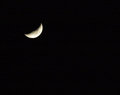
| 03/26/2007 12:53:32 PM |
Moonby emily212Comment: I would be interested in some additional info on the photo. You have captured some detail in the moon, but not alot. I love the use of negative space to really draw the eye to the subject of this photo. Sometimes large amounts of empty space can really "make" a photo, and that is true in this case. |
| Photographer found comment helpful. |
| 03/26/2007 11:46:03 AM |
The Circle of The Futureby luddeComment: To me, this looks less like a photograph and more like digital art. I love the colors and the creativity, but many voters can not see past the "fakeness". |
| Photographer found comment helpful. |
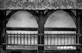
| 03/26/2007 11:03:00 AM |
Ladderby zeuszenComment: I really like the symatry of this photo. Nice choice to make it duotone. |
| Photographer found comment helpful. |
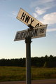
| 03/22/2007 08:28:04 PM |
Gjertson Roadby DadzbugComment: This is a very strong image and one that draws the eye. The incredibly strong diagonal line at the top of the sign is complimented by the strong vertical line of the post. Whete they meet is the logical subject placement.
The bottom half of the sign is a little bit in shadow, and could use a little brightening to bring it to the level of the top sign. Here I have adjusted the levels, the contrast and played with the color balance a little to bring out the blue in the sky so that the beutiful cloud is more pronounced.

You have a very very good eye for composition. Message edited by author 2007-03-22 20:28:27. |
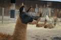
| 03/22/2007 08:12:14 PM |
Llama llamaby DadzbugComment: Everybody all together now.... awwwww. How completely precious.
I took this photo into photoshop and played with it a little bit. Iadjusted the levels, the contrast, brightened the face a bit to bring out some details, and then cropped to remove some of the clutter of the background. My results are here

It is important to remember the difference between film cameras and digital cameras, but also the ways that they are alike. The photo as it first some from the digital camera is like the negative from the film camera. The computer is the darkroom. Every digital image needs some tweeking and fine tuning. As a minimum, levels should be corrected so that the histogram fills the entire width of brightnesses, contrast usually needs to be adjusted, as digital cameras take very "flat" photos. The last step would be to do an Unsharp Mask to make things more sharp and focused.
If you need any further assistance, I would be happy to help. All in all your photos have wonderful potential, you have a good eye, you just need some further practice with youe post processing. This is where good photos become masterpieces. Message edited by author 2007-03-22 20:13:08. |
| Photographer found comment helpful. |
| 03/22/2007 07:58:49 PM |
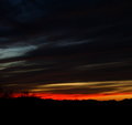
Tucson sunsetby DadzbugComment: You have to just love those Arizona sunsets! Such vibrant colors, such a feeling of peaceful tranquility. Your reds in this photo work very well against the black and the deep violets. Tones are generally very, very good.
Technicals are generally good, though not spectacular. There is a question in my mind as to whether it should be sharper or not. I can't figure it out myself. The trees in the distance tend to lack focus and clarity, but the second school of thought is that the sunset is the subject and the sharpness (or lack there of) in the trees pushes the mind in the proper direction. If (and this is strictly a personal preference) you wanted the trees to be in sharper focus, the use of a tripod would be helpful as low light situations demand a slow shutter speed.
This image has a lot of dark space and I'm sure this is by design, but is it good? Again, I don't really know for sure.
One thing I am sure of is that that this photo is very pleasing to the eye and fills me with peacefulness. Well done. |
| Photographer found comment helpful. |
| 03/22/2007 07:47:47 PM |
Candlesby DadzbugComment: The repetition of the flame is this photos strongest point. I love how perspective works in your favor here, each flame is just a little bit smaller than the one below it, giving the image an almost "Christmas tree" look.
I wish you had added some information such as f stop and shutter speed, because it looks like you used a wide open shutter and your DOF might be a little shallower than you intended. The flame at the top is obviously less in focus than the one at the bottom. There is also a little reflection or something at the top that I might clone out in Photoshop. All in all this is a very pleasing photograph, one that you should be proud of. |
| Photographer found comment helpful. |
| 03/19/2007 09:17:07 PM |
|
| Photographer found comment helpful. |
| 03/19/2007 08:22:33 PM |
|
| Photographer found comment helpful. |
Home -
Challenges -
Community -
League -
Photos -
Cameras -
Lenses -
Learn -
Help -
Terms of Use -
Privacy -
Top ^
DPChallenge, and website content and design, Copyright © 2001-2026 Challenging Technologies, LLC.
All digital photo copyrights belong to the photographers and may not be used without permission.
Current Server Time: 06/26/2026 08:40:51 PM EDT.