| Image |
Comment |
| 01/17/2012 10:25:17 PM |
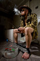
Born to hunt - forced to workby toto10Comment: This is one of 4 tens that I have given out. I fear that you will not score well with DPC voters but I enjoy your humorous take on the challenge and think that the techniques in lighting and composition alone should give you a top ten spot at least. Good luck. |
 Photographer found comment helpful. Photographer found comment helpful. |
| 01/17/2012 10:21:09 PM |
Splash by elsapoComment: I really like the editing here. If you have steps and are willing to share I am all ears. This is great. See you on the front page. Hopefully on top. |
| Photographer found comment helpful. |
| 01/02/2012 12:55:11 PM |
|
| Photographer found comment helpful. |
| 01/02/2012 12:53:27 PM |
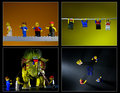
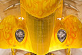
Triple Threatby gyabanComment: Looks like the dragon from this image: 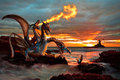
and the lighting is familar??? hmmmmm
I do quite like this image but think that the Spider-Man was not needed. I think it throws the balance of the image off. The middle dragons neck also seems to be too bright and my eye keeps getting drawn to that spot instead of looking at the image as a whole. |
| Photographer found comment helpful. |
| 01/02/2012 12:44:19 PM |
|
| Photographer found comment helpful. |
| 01/02/2012 12:43:35 PM |
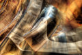
Soft + Hardby Dr.ConfuserComment: Great abstract. High marks from me. I like how it confuses the eye, but in a good way. |
| Photographer found comment helpful. |
| 01/01/2012 11:07:05 PM |
|
| Photographer found comment helpful. |
| 01/01/2012 10:23:48 PM |
|
| 01/01/2012 10:23:08 PM |
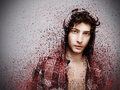
I Don't Think Soby apasciucComment: This image has great potential except for the blown out finger and the extreme shadows on the wall. Good focus on the hand with a slight OOF on the persons face and body. I would experiment with some lighting setups and try this one again. Try to accomplish a more even lighting across the entire image.
|
| Photographer found comment helpful. |
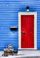
| 01/01/2012 10:20:43 PM |
The Red Doorby KarenNfldComment: I quite like this image but there is just something missing that I just can't put my finger on. It pops. The contrasting colors compliment each other well (from red to blue to white to black). All bright primary colors. I think it's the flower pot that seems out of place. Everything in the image pops and the pot is a drab brown and draws my eyes to it wondering why it is there. 6 from me. Probably 8 without the pot. Hope I'm not being to picky just trying to work through why I thought this was a 6 image. |
| Photographer found comment helpful. |
Home -
Challenges -
Community -
League -
Photos -
Cameras -
Lenses -
Learn -
Help -
Terms of Use -
Privacy -
Top ^
DPChallenge, and website content and design, Copyright © 2001-2026 Challenging Technologies, LLC.
All digital photo copyrights belong to the photographers and may not be used without permission.
Current Server Time: 07/18/2026 05:08:39 AM EDT.