| Image |
Comment |
| 10/03/2009 04:47:58 PM |
On a Pedestalby kwhj81979Comment: OK, I'm going through the Free Study submissions, purposefully finding those images I think are shot with a less conventional eye - this is one of those images! Thanks for offering something that isn't just DPC friendly eye-candy (though of course there's nothing wrong with eye-candy). I'll be picking one of these images for my Mu (most underrated) award:
Positives: Such an interesting image - great colour and lighting, the reflections are particularly good. I don't know how you have managed to achieve that mist effect at the bottom (top) of the image.
Critical stuff: the crop at the top of the image is a little tight I think but other than that - this brings a whole new look to water drops.
Overall: A really interesting and well executed image. |
 Photographer found comment helpful. Photographer found comment helpful. |
| 10/03/2009 03:55:20 PM |
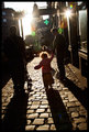
Country Nightsby colorcarnivalComment: OK, I'm going through the Free Study submissions, purposefully finding those images I think are shot with a less conventional eye - this is one of those images! Thanks for offering something that isn't just DPC friendly eye-candy (though of course there's nothing wrong with eye-candy). I'll be picking one of these images for my Mu (most underrated) award:
Positives: Wow - this looks very cinematic to me as if it is a frame from a David Lynch movie - I love it. The way you lead the eye with you use of light and shade is exceptional. Then there is the subject matter itself which carries a very high interest level.
Critical stuff: None really, all stylistic elements seem to be really well balanced.
Overall: A really interesting image that is very, very well executed. |
| Photographer found comment helpful. |
| 10/03/2009 03:49:51 PM |
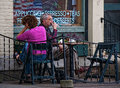
Cagedby CEJComment: OK, I'm going through the Free Study submissions, purposefully finding those images I think are shot with a less conventional eye - this is one of those images! Thanks for offering something that isn't just DPC friendly eye-candy (though of course there's nothing wrong with eye-candy). I'll be picking one of these images for my Mu (most underrated) award:
Positives: Probably the most significant title of any image I've commented on in this series. The degree to which you have communicated with the viewer is in stark contrast with the communication exhibited by the couple. This is an image which is more about story and journalism than it is about technique and art and in that context this is a great image.
Critical stuff: Not too much, given the context of the image
Overall: A fine photojournalistic image with a great metaphoric title. |
| Photographer found comment helpful. |
| 10/03/2009 03:28:39 PM |
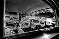
A Ghoulish Rideby franktheyankComment: OK, I'm going through the Free Study submissions, purposefully finding those images I think are shot with a less conventional eye - this is one of those images! Thanks for offering something that isn't just DPC friendly eye-candy (though of course there's nothing wrong with eye-candy). I'll be picking one of these images for my Mu (most underrated) award:
Positives: Interesting find! But the more interesting thing for me is what you've done with the image. I like your framing - you've got enough going on around the periphery to keep the eye nicely bounded; the rear 3/4 window bottom right, the sun flare at the bottom and the internal light top left. The slight amount of grain helps too.
Critical stuff: I like what you've done with this but I just not too sure that there is enough intrinsic interest in the scene to hold a viewers attention.
Overall: An very good edit of a scene which I think isn't over-endowed with interest. |
| Photographer found comment helpful. |
| 10/03/2009 03:00:08 PM |
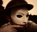
The Man in the Maskby aprudhommeComment: OK, I'm going through the Free Study submissions, purposefully finding those images I think are shot with a less conventional eye - this is one of those images! Thanks for offering something that isn't just DPC friendly eye-candy (though of course there's nothing wrong with eye-candy). I'll be picking one of these images for my Mu (most underrated) award:
Positives: I love the colour and the grain in this image and the close crop is pretty effective. I actually quite like the reflection on the forehead too.
Critical stuff: I'm not sure how well this all hangs together as a concept - the mask, hat and shirt don't really seem to gel and the elastic / string on the mask really needs cloning away.
Overall: Although I appreciated seeing such a conceptual image and I think the technicals are well matched - I think an image such as this lives or dies on the details and one or two of those let the image down. |
| Photographer found comment helpful. |
| 10/03/2009 02:45:54 PM |
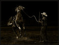
A Cowboy's Long Dayby LydiaComment: OK, I'm going through the Free Study submissions, purposefully finding those images I think are shot with a less conventional eye - this is one of those images! Thanks for offering something that isn't just DPC friendly eye-candy (though of course there's nothing wrong with eye-candy). I'll be picking one of these images for my Mu (most underrated) award:
Positives: Sometimes during this comment series I find myself commenting on images that have more than 'just' niche appeal - this is one of those images. What a brave edit to take this so dark but I really believe it is this boldness which is the key to the success of the image. The compositional elements are fantastic - such drama. The more I look at the image the better it gets.
Critical stuff: Nothing really, though I worry about the edit to your background.
Overall: This is a very good image, full of drama - I expect this to do very well. |
| Photographer found comment helpful. |
| 10/03/2009 02:39:00 PM |
Sunspotsby MelethiaComment: OK, I'm going through the Free Study submissions, purposefully finding those images I think are shot with a less conventional eye - this is one of those images! Thanks for offering something that isn't just DPC friendly eye-candy (though of course there's nothing wrong with eye-candy). I'll be picking one of these images for my Mu (most underrated) award:
Positives: You're so right to title your image after these compositional elements for the sun is so key to the success of the image. Both directly and indirectly through the evening colouration and the elongation of the shadows. There's plenty of story here too - I really like the most distant child in near silhouette with the hair catching the light; I also like how (I think) I can tell that his / her top is blue.
Critical stuff: The tilt is driving me nuts a little, I think it would've been easy to straighten it and I can't see what would have been compromised.
Overall: A charming, simple scene which captures a straightforward slice of life very well. |
| Photographer found comment helpful. |
| 10/03/2009 01:59:33 PM |
Our Lady of the Watersby posthumousComment: OK, I'm going through the Free Study submissions, purposefully finding those images I think are shot with a less conventional eye - this is one of those images! Thanks for offering something that isn't just DPC friendly eye-candy (though of course there's nothing wrong with eye-candy). I'll be picking one of these images for my Mu (most underrated) award:
Positives: I'm a little mystified by this image and I'm sure, to an extent, that is your intent. It isn't a pretty image but it does have a degree of fascination which holds our interest as we ponder 'what is that??' Not only is the subject ambiguous but so is the scale and the wider context.
Critical stuff: All of the above! Clearly confusing voters may not be too good for business.
Overall: This isn't an image I'm going to pretend to like but I think I can appreciate some of your intent (I think...) |
| Photographer found comment helpful. |
| 10/03/2009 12:11:29 PM |
Cool Portrait On A Hot Dayby 1m1AComment: OK, I'm going through the Free Study submissions, purposefully finding those images I think are shot with a less conventional eye - this is one of those images! Thanks for offering something that isn't just DPC friendly eye-candy (though of course there's nothing wrong with eye-candy). I'll be picking one of these images for my Mu (most underrated) award:
Positives: I really like this image, it puts a smile on my face - I can almost feel the sun on my back! I don't mind admitting that I looked at this as a remote observer wondering what the figure was holding before I realised it was the camera! Doh! However, it works even better as a self-portrait.
Critical stuff: The border - I fear for you - this might be a rule-breaker for the addition of a new image area; I hope it doesn't get flagged up or if it does that it is judged to be OK.
Overall: A simple but happy-making image! |
| Photographer found comment helpful. |
| 10/03/2009 12:06:51 PM |
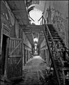
Solitaryby beneeComment: OK, I'm going through the Free Study submissions, purposefully finding those images I think are shot with a less conventional eye - this is one of those images! Thanks for offering something that isn't just DPC friendly eye-candy (though of course there's nothing wrong with eye-candy). I'll be picking one of these images for my Mu (most underrated) award:
Positives: First reaction - look at the depth! I've then noticed your title and I begin to realise this is an old prison and a big one too; that realisation make the image even more interesting. I'm not normally a fan of portrait orientations, you'll find very few in my portfolio, but what a good choice it was for this image. The monochrome conversion is very well done and I really pleased you have chosen to not give us deep shadows - being able to see detail in all of the scene is key to its success.
Critical stuff: Nothing really
Overall: A fine image, which has been well served by your editing choices. |
| Photographer found comment helpful. |
Home -
Challenges -
Community -
League -
Photos -
Cameras -
Lenses -
Learn -
Help -
Terms of Use -
Privacy -
Top ^
DPChallenge, and website content and design, Copyright © 2001-2026 Challenging Technologies, LLC.
All digital photo copyrights belong to the photographers and may not be used without permission.
Current Server Time: 06/23/2026 02:59:23 AM EDT.