| Image |
Comment |
| 01/03/2011 08:31:47 AM |
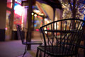
Table for twoby DennisheckmanComment: I'm going through the entries, stopping at those images I feel have had the benefit of an unconventional eye and dwelling a little longer to try to see and appreciate what you saw. This is one of those images.
Positives: I really like the POV and the background colours in this shot - for some reason it looks too chilly to take a seat though! The focus on the chair with the wide open aperture works really well - the bokeh of the tree lights is a stand out feature.
Critical stuff: The verticals.... I really want to straighten this up.
Overall: A nice image but one that (for me) falls short of having wow factor. |
 Photographer found comment helpful. Photographer found comment helpful. |
| 01/03/2011 08:24:46 AM |
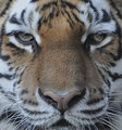
Kiss My Noseby MeMex2Comment: I don't really understand the circle in the Tiger's left eye. Looking at the right (our left) I think you may have cloned across. |
| 01/03/2011 08:03:11 AM |
recklessby saintaugustComment: I'm going through the entries, stopping at those images I feel have had the benefit of an unconventional eye and dwelling a little longer to try to see and appreciate what you saw. This is one of those images.
Positives: The juxtaposition of the sign and the legs makes for a great visual gag - it makes me wonder whether the sign is there for safety reasons. The overall composition is very sound and I like the way the red writing contrasts with the blue sea - reason enough not to take this monochrome.
Critical stuff: The dark blue haloing around the legs - I think you could have cleaned up that part of the image by tweaking that a little.
Overall: An interesting shot with enough story to make me smile. |
| Photographer found comment helpful. |
| 01/03/2011 07:58:42 AM |
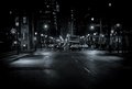
Wellingtonby mBastinComment: I'm going through the entries, stopping at those images I feel have had the benefit of an unconventional eye and dwelling a little longer to try to see and appreciate what you saw. This is one of those images.
Positives: I like the idea behind this shot - the glowing lights, the bustling scene. I like how you have deviated from straight monochrome too.
Critical stuff: This is the sort of shot I would normally like but there are a few elements that conspire to detract from it's overall feel:
1. We are distant from the scene, although I'm a fan of negative space the emptiness of the lower frame here is not quite empty enough to merely act as a guide for the eye and as a consequence frustrates rather than delights. We remain remote and uninvolved.
2. The overall sharpness - it just doesn't have enough clarity to communicate the scene well; I remember the street signs picture that ribboned a few weeks back, the clarity in that shot was astounding and contributed much. You could do with some of that magic here.
3. Coloration- I appreciate the slight bluish hue but I think you could push it further. Checkout JimiRose's 8+ scoring image of Rome just to see how well blue coloration can work on a might time city street scene.
Overall, this image demonstrates a good eye but (for me) needs a bit more finesse to do well. |
| Photographer found comment helpful. |
| 01/03/2011 07:20:11 AM |
The Holiday Photographerby abuscemiComment: I'm going through the entries, stopping at those images I feel have had the benefit of an unconventional eye and dwelling a little longer to try to see and appreciate what you saw. This is one of those images.
Positives: This is rather beautifully done. It may look snap-shottish at first glance but get past that and we have something that is well composed, has great coloration and is fun to boot.
Critical stuff: Not much, perhaps a tad more highlight recovery might have been welcomed.
Overall: I think you have captured a moment here... and a 'feel-good' one at that. Giving this a significant bump from my first viewing. |
| Photographer found comment helpful. |
| 01/03/2011 07:12:57 AM |
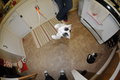
Catlandby hopelessoptimistComment: I'm going through the entries, stopping at those images I feel have had the benefit of an unconventional eye and dwelling a little longer to try to see and appreciate what you saw. This is one of those images.
Positives: I really like the quirkiness of this shot - the POV and the scene. I particularly like the feet at the bottom of the frame. I also like the general, everyday domestic feel of the image.
Critical stuff: I feel the edit is a bit vanilla and you could have gone a lot bolder - particularly in a way that would pull out the fantastic shadow on the oven door.
Overall: A very engaging image but one that (for me) feels a little sub-optimal in terms of its edit. |
| Photographer found comment helpful. |
| 01/03/2011 06:57:44 AM |
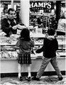
Little Window Shoppersby crikComment: I'm going through the entries, stopping at those images I feel have had the benefit of an unconventional eye and dwelling a little longer to try to see and appreciate what you saw. This is one of those images.
Positives: Very nice story here and I am a fan of the high contrast - personally I think the blown highlights work really well.
Critical stuff: There seems to be some 'Topaz'-like smoothing going on - most prominent on her top and his trousers; I must admit to finding the effect distracting.
Overall: An engaging image, but one that (for me) has a couple of niggles. |
| Photographer found comment helpful. |
| 01/03/2011 06:45:55 AM |
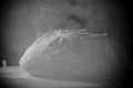
Artisanby aliquiComment: I'm going through the entries, stopping at those images I feel have had the benefit of an unconventional eye and dwelling a little longer to try to see and appreciate what you saw. This is one of those images.
Positives: This is a grower! Bumped it a couple of times now. The 'through mesh' appearance is effective and gives a slightly furtive look that I am always fond of. Despite the low contrast, I like how the crusty texture of the bread is still well communicated. I also like the restraint in relation to the light here. I'm a fan of the vignette too.
Critical stuff: I think there is only so far you can go with an image like this - in the end, you can only wring out some much interest.
Overall: A shot that I have come to like after a few viewings - perhaps a problem when there are as many images as there are in a FS to get through. |
| Photographer found comment helpful. |
| 01/03/2011 06:38:22 AM |
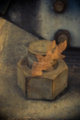
anamnesisby 4trtoneComment: I'm going through the entries, stopping at those images I feel have had the benefit of an unconventional eye and dwelling a little longer to try to see and appreciate what you saw. This is one of those images.
Positives: This image does manage to intrigue - both from a technical and content perspective. Technically, the double-exposed appearance and the soft colours work really well.
Critical stuff: Compositionally, this doesn't quite work for me, the image seems a little out of kilter - I don't know why, I've tried different crops (with my hands) and your composition looks better than anything I can simulate.
Overall: A lot going for it but in the final analysis there is something that just doesn't click for me. |
| Photographer found comment helpful. |
| 01/01/2011 09:22:30 AM |
|
Home -
Challenges -
Community -
League -
Photos -
Cameras -
Lenses -
Learn -
Help -
Terms of Use -
Privacy -
Top ^
DPChallenge, and website content and design, Copyright © 2001-2026 Challenging Technologies, LLC.
All digital photo copyrights belong to the photographers and may not be used without permission.
Current Server Time: 07/23/2026 02:05:25 PM EDT.