| Image |
Comment |
| 05/05/2011 07:53:05 PM |
|
 Photographer found comment helpful. Photographer found comment helpful. |
| 05/05/2011 07:51:27 PM |
|
| Photographer found comment helpful. |
| 05/05/2011 06:57:05 PM |
|
| 05/05/2011 04:10:33 AM |
|
| Photographer found comment helpful. |
| 05/05/2011 04:08:54 AM |
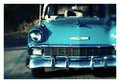
Chevyby MelethiaComment: Just brilliant. The coloration of this processing is just perfect! What did you do? |
| Photographer found comment helpful. |
| 05/04/2011 08:38:15 AM |
blissful kinshipby RetroesqueComment: I love this coloration - do you have a particular filter or preset you use? Perhaps it's Color Efex 'Ink' - but it's less purple than that. Message edited by author 2011-05-04 08:38:49. |
| Photographer found comment helpful. |
| 05/04/2011 08:37:14 AM |
|
| Photographer found comment helpful. |
| 05/03/2011 02:31:26 AM |
11by RetroesqueComment: Very nicely done. Fantastic tones.
I think I may have been tempted by a squarer crop but I quite like your choice of including that negative space. It would never have occurred to me. |
| Photographer found comment helpful. |
| 05/02/2011 05:59:53 AM |
|
| Photographer found comment helpful. |
| 05/02/2011 05:57:36 AM |
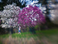
Girl in Arboretumby wheeleddComment: I like this but I wonder if a crop to the trees might have worked even better - leaving us guessing as to whether this was a Lensbaby image or not...
Probably not the point for this side challenge though!! |
| Photographer found comment helpful. |
Home -
Challenges -
Community -
League -
Photos -
Cameras -
Lenses -
Learn -
Help -
Terms of Use -
Privacy -
Top ^
DPChallenge, and website content and design, Copyright © 2001-2026 Challenging Technologies, LLC.
All digital photo copyrights belong to the photographers and may not be used without permission.
Current Server Time: 07/21/2026 06:28:57 PM EDT.