| Image |
Comment |
| 12/20/2003 02:34:53 PM |
Pastelby nbortonComment: This IMHO is too post edited. I don't really go for the psychedelic look. Cut back on the saturation a touch then maybe...
TC |
 Photographer found comment helpful. Photographer found comment helpful. |
| 12/20/2003 02:33:27 PM |
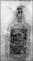
In the Rocksby jdw91479Comment: This I like a lot, but It needs something. I wanted to say color at first, but I don't think that's quite it. Maybe a golden based duo tone? Maybe a golden overtone (filter)? Maybe just the golden color of the whiskey left in the shot? Nice almost shot!
TC |
| Photographer found comment helpful. |
| 12/20/2003 02:30:23 PM |
Mediterranean Sea at Sunsetby AlexysComment: Something seems not really right about this shot but I don't know what exactly. I think it's the lighting on the wave. Don't live by this much water, so I don't have any potential solutions, just the gut feeling that there is something improvable...
TC |
| Photographer found comment helpful. |
| 12/20/2003 02:26:34 PM |
|
| Photographer found comment helpful. |
| 12/20/2003 02:19:36 PM |
Life by the waterby NukktaComment: The colors here are way dull. I like the composition but you need way more light. The water fall seems very regular. Is that a fountain?
TC |
| Photographer found comment helpful. |
| 12/20/2003 02:18:16 PM |
|
| Photographer found comment helpful. |
| 12/20/2003 02:04:28 PM |
Winter Creekby Firstrich1Comment: This is a very pretty scene, but is a bit too contrasty. It looks like a very relaxing place, but the feeling of the shot is unrestful. You go from too dark to too light. Maybe play with levels a little more? I like the red tones against the blue.
TC |
| Photographer found comment helpful. |
| 12/20/2003 02:00:43 PM |
Geese Lakeby pitsamanComment: Beatiful tones and I love the capture here. IMHO this shot has to much of something though. Cropping with my hands on the screen, if you get rid of some of the bottom (water) and go down from the gap in the center of the geese to the left OR right you end up with a much cleaner composition. This shot is both a little empty (too much negative space that doesn\'t seem to add IMHO) and busy at the same time.
TC |
| Photographer found comment helpful. |
| 12/20/2003 01:48:26 PM |
Used Beautyby lizbeth010Comment: Nice simple lines, but the lighting is a little harsh for you to get good B/W contrasts here.
TC |
| Photographer found comment helpful. |
| 12/20/2003 01:46:50 PM |
2004 SUV (Strange Unusual Vehicle) x 3by DiamondPeteComment: In my humble opinion, you would have more power with this shot in color OR with more lighing to help bring out the dark detail. You lose to much in the dark parts of this shot. Was it night when you took this? Did you rely solely on camera flash? More other lighting would definatly help!
TC |
| Photographer found comment helpful. |
Home -
Challenges -
Community -
League -
Photos -
Cameras -
Lenses -
Learn -
Help -
Terms of Use -
Privacy -
Top ^
DPChallenge, and website content and design, Copyright © 2001-2025 Challenging Technologies, LLC.
All digital photo copyrights belong to the photographers and may not be used without permission.
Current Server Time: 08/09/2025 05:04:56 PM EDT.