| Image |
Comment |
| 06/30/2004 02:05:57 AM |
Innocenceby mariomelComment: You either spent a lot of time setting up the lighting, or have a nice studio cause it's spot on. You got it all, hair light, catch lights in the eyes, beautiful highlites and shadows. Kudos
TC |
 Photographer found comment helpful. Photographer found comment helpful. |
| 06/30/2004 02:03:41 AM |
Safari Samby JackoComment: One of the better kid pics. You have great lighting here giving a sense of depth. Pulls out the wonderful grin on his face also. I like the high key effect. Wanna know how ya didi it.
TC |
| Photographer found comment helpful. |
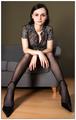
| 06/30/2004 01:59:06 AM |
Veroniqueby sahkoComment: Though your lighting may be a little harsh for my taste, your use of leading liines, simple set and almost monotone color scheme make this a pleasure to look at! Love the use of perspective.
TC |
| Photographer found comment helpful. |
| 06/30/2004 01:54:45 AM |
KIDS!by ChefbozComment: Looks like a fun bunch of kids! Wish they weren't so harshly lit though. It kind of makes them look flat. If ya move the lights to the side it will help a lot! It also looks like you tried to blur out all but their faces. It looks a little contrived and is distracting. With a little better lighting, and a little less editing this would be the bomb!
TC |
| Photographer found comment helpful. |
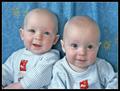
| 06/30/2004 01:49:44 AM |
got twins?by soniecatComment: Beautiful boys! Too bad they look so flat. It doesn't do them justice... Try moving your lights around to the sides. Also, it looks like ya might have used a flash here, try it without. You'll definately need a tripod and a little luck cause kids are a little squrimy, but it should pay off!
TC |
| Photographer found comment helpful. |
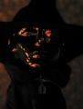
| 06/30/2004 01:45:27 AM |
The Invisible Manby GeneralEComment: I'm sorry, but I just don't get it. I don't see portrait here, just a shot of what looks like a mask...
TC |
| Photographer found comment helpful. |
| 06/30/2004 01:43:54 AM |
|
| Photographer found comment helpful. |
| 06/30/2004 01:38:18 AM |
My Little Angelby briphotoComment: Very cute! Love the look in her eyes! Nicely composed. The lighting here doesn't do her justice though. Your colors are a little dull which to me means ya need more light. She also looks a little flat. Try movin' the lights around to the side a little more. You did get the catch light in the eyes spot on. Keep tryin' and post 'em so I can see!
TC |
| Photographer found comment helpful. |
| 06/30/2004 12:09:17 AM |
|
| Photographer found comment helpful. |
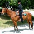
| 06/29/2004 02:59:24 PM |
Samantha's Challengeby NeuferlandComment: Beautiful horse and lovely girl! However, this shot has a few issues that are easy to overcome as a photographer. The first one is the harsh lighting. If this wast taken during a different time of day that would help to do away with the too strang highlights and rather dark shadows. Or you could move horse rider and photographer to a more shaded area and shoot there. The girls face is hidden a little in a shadow. If you use the flash (yes, I know it was daylight out) it would help to fill in her face with light. The shot is slightly tilted which is easy to fix in photoshop.
This is probably getting slaughtered for not being in a studio. I'm having the same problem there even though mine is kind of ambiguous in setting I thought.
Hope some of this is helpfull
TC |
| Photographer found comment helpful. |
Home -
Challenges -
Community -
League -
Photos -
Cameras -
Lenses -
Learn -
Help -
Terms of Use -
Privacy -
Top ^
DPChallenge, and website content and design, Copyright © 2001-2025 Challenging Technologies, LLC.
All digital photo copyrights belong to the photographers and may not be used without permission.
Current Server Time: 08/18/2025 03:41:05 PM EDT.