| Image |
Comment |
| 08/09/2005 02:02:32 AM |
Little dreamerby rameviComment: Incredible lighting though a touch of reflected fill under her hand would have been a bonus. Great expression in your model! The catch light in her eyes looks a little off though with the lighting of the rest of the shot. Just a little too bright. My only REAL complaint though is the ball doesn't look round. It is a ball right? I don't know if you got jpeg jaggies goin' on or if it's in the way you suspended the ball. However overall I find my eye going to the girl and not the ball so it's not really much of an issue! Kudos
TC |
 Photographer found comment helpful. Photographer found comment helpful. |
| 08/09/2005 01:58:58 AM |
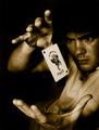
The Magician's Illusionby MontereykiddoComment: This shot is simply incredible. You have some of the best lighitng I've seen in a challenge entry for a portrait type shot in AGES! Your focus is maybe a touch off, but it works just fine IMHO! Love the tone that you gave it. Hope this does well in the standings! (oops I just jinxed you.)
TC
Hey, did ya try adding just a touch of grain? Might give it even more of a mystical feeling or then again might just ruin it... |
| Photographer found comment helpful. |
| 08/09/2005 01:56:22 AM |
The Illusion Of Gamblingby MarkBComment: Can't wait to see how this was set up. I'm assuming a poster in the background and a wire holding everything together... Maybe wrong though. You appear to be overexposed slightly though which tends to wash out what would otherwise be very vivid colors.
TC |
| Photographer found comment helpful. |
| 08/09/2005 01:54:37 AM |
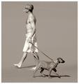
delusionby whiteroomComment: Great shot. Even like the square crop which often doesn't work that well. Ya got decent lighting on the dog. Love the way the muscles in his shoulders are accentuated. However, I'm not sure how it fit's the challenge as I saw it...
TC |
| Photographer found comment helpful. |
| 08/09/2005 01:45:57 AM |
Two For Oneby lynnesiteComment: Great angle! Looks like a horse ya might find around three mile island! :-P
TC |
| Photographer found comment helpful. |
| 08/09/2005 01:40:00 AM |
cementedby dragonladyComment: Great concept! I love it. My only complaint is that the lighting makes the shot kinda flat. Ya need a little more detale in the shadows. Was this one light or two? A little fill light placed to the left of frame may have made this pop more...
TC |
| Photographer found comment helpful. |
| 08/09/2005 01:37:40 AM |
Dice in Spaceby justin_hewlettComment: When you have a studio type set up shot such as this, it's the little details that make or break the shot. In this instance you have what appears to be a dirty die at the two o'clock position. It may not be dirty, it could simply be imperfections in the die itself. However that is enough to be a tad bit put offish. Just out of curiousity, why did you choose a b/w treatment for this?
TC |
| Photographer found comment helpful. |
| 08/08/2005 12:46:28 AM |
Maximum Warp...Engageby taterbugComment: Dude ya got your first top 50 and your first 6+! Feels good don't it!
TC
Where's my shout out? Doin' payroll tomorrow! :-P Message edited by author 2005-08-08 00:47:09. |
| Photographer found comment helpful. |
| 08/03/2005 02:24:24 AM |
Maximum Warp...Engageby taterbugComment: Dude, a bit oversaturated for my taste, but good show anyways. Wonderful what a decent camera can do for ya, eh? Oh, by the way. Ya better gimme a shout out for the help on this one or I'm gonna short ya on your next paycheck! Just kiddin'! Great capture.
Yours (like ya don't know it)
TC |
| Photographer found comment helpful. |
| 08/01/2005 12:57:03 AM |
Sunset on Lake Elginby LouiseBComment: Your exposure looks spot on which kinda defeats the purpose of the challenge according to it's description. Also looks a little too red but that may just be me. What's the original look like?
TC |
| Photographer found comment helpful. |
Home -
Challenges -
Community -
League -
Photos -
Cameras -
Lenses -
Learn -
Help -
Terms of Use -
Privacy -
Top ^
DPChallenge, and website content and design, Copyright © 2001-2025 Challenging Technologies, LLC.
All digital photo copyrights belong to the photographers and may not be used without permission.
Current Server Time: 08/25/2025 05:19:23 AM EDT.