| Image |
Comment |
| 08/14/2005 09:45:14 PM |
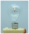
1st Birthdayby ArtanComment: Wow, I really thought this was kinda cool of an idea that needed some work till I scrolled down and saw the cake. It made the title make sense though... Lose the cake, play around with the lighting and maybe try a polarizing filter to take away some of the reflections on the bulb and this could be a winner!
TC |
 Photographer found comment helpful. Photographer found comment helpful. |
| 08/14/2005 09:42:51 PM |
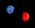
The Masksby idnicComment: Very nicely executed! However I think I woulda picked another color than red for the right hand face. It's very hard to get good detail in certain shades of red to pop out. You got great depth in the blue face, but the red face looks flat...
TC |
| Photographer found comment helpful. |
| 08/14/2005 09:41:05 PM |
|
| Photographer found comment helpful. |
| 08/14/2005 09:40:33 PM |
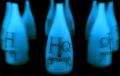
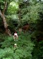
Water Go Up!?!?!??!?!?!by jellyooooComment: I like the concept, but you have too much negative space that detracts from the illusion. It's also cropped quite tight which doesn't help any either...
TC |
| Photographer found comment helpful. |
| 08/14/2005 09:38:59 PM |
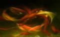
Lighting Up The Sunby JunieMoonComment: Nice abstract. However, I'm put off by the appearance of the match. You hand held the match I'm assuming. If you would have found a way to hold the match in place with some kind of mechanism that would hold it very still it may have improved the overall quality of the image. I'm also put off by the writing at the bottom of the what ever it is in the background. Rotating that object so the writing was under the match might help. Remember in a set up shot such as this, attention to detail is KEY!
TC |
| Photographer found comment helpful. |
| 08/14/2005 09:37:02 PM |
Hypnotized and Mesmerizedby troyloxComment: Love the overall tonality of this shot! The cropping though tight works well here. The thing I find distracting though is that the focus is to shallow. The neck of the bottle is not sharp and I keep finding my eye landing there and asking why...
TC |
| Photographer found comment helpful. |
| 08/14/2005 09:35:39 PM |
Bottoms Upby Mr_PantsComment: Cute. Simple. But IMHO you have too much negative space that doesn't add to the shot.
TC |
| Photographer found comment helpful. |
| 08/14/2005 09:34:58 PM |
Aloofby ZoomdakComment: To really make this pop, you would have to be a lot closer to the subject in effect filling more of the frame with it. You also would have to have a picture to cut out with a white balance to match the white balance of the surroundings. It's very apparent to me how you did it if ony from the very red skin tones of the subject.
TC |
| Photographer found comment helpful. |
| 08/14/2005 09:33:11 PM |
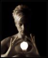
Positive Energyby LouiseBComment: Wow. This shot has one thing going for it that I always look for in a portrait/set up/studio type shot. You got awesome lighting going on. You got a great soft focus effect too! I hope you're not getting bad comments about it being out of focus. Soft focus for some reason doesn't seem to do good here. I keep hoping that shots like this will change that. The only minor complaints that I have are that the base of the light bulb is hard to see which doesn't help the illusion. Nor in this instance does the lighting help the illusion. It would have been the first ten in my voting history if the overall lighting would have appeared to have come from the bulb itself and not from outside frame left...
Kudos
TC |
| Photographer found comment helpful. |
| 08/14/2005 09:28:23 PM |
grass killerby mandyturnerComment: You just made me spew beer all over my keyboard and monitor! You owe me a new keyboard.
TC |
| Photographer found comment helpful. |
Home -
Challenges -
Community -
League -
Photos -
Cameras -
Lenses -
Learn -
Help -
Terms of Use -
Privacy -
Top ^
DPChallenge, and website content and design, Copyright © 2001-2025 Challenging Technologies, LLC.
All digital photo copyrights belong to the photographers and may not be used without permission.
Current Server Time: 08/26/2025 08:49:33 AM EDT.