| Image |
Comment |
| 08/19/2005 11:11:16 AM |
the piano manby yomanComment: Your skin tones look a little off. Otherwise a nice shot.
TC |
 Photographer found comment helpful. Photographer found comment helpful. |
| 08/19/2005 11:07:00 AM |
Sax Manby theflyComment: Just a touch of bounce light to fill under the hat and this would be the bomb!
TC |
| Photographer found comment helpful. |
| 08/19/2005 11:05:47 AM |
|
| Photographer found comment helpful. |
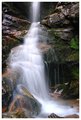
| 08/18/2005 05:39:11 PM |
Eternal Fallsby justin_hewlettComment: Of the three, this one is IMHO the best by far, but still is lacking a little. It needs what Bearmusic would call luminosity! The rocks are quite dark and could use a little more detail/texture. I would try using your favorite method of selecting to grab the water, invert the selection and use that as a mask to selectively play with the levels of the rocks.
TC |
| Photographer found comment helpful. |
| 08/15/2005 12:36:43 AM |
plays itselfby graphicfunkComment: Aaah the cursed 4th place. A pox on one of the ribbon winners! (just kidding no poxes please!) Kidding aside, I knew this one would do good! Congrats and I'm hopin many more to come!
TC |
| Photographer found comment helpful. |
| 08/15/2005 12:33:13 AM |
Apollo Rising by Keith ManiacComment: I knew tis would do well and it did! I do get some of them right. The only problem is there can only be one blue... Congrats on the second ribbon. Hope the next one ain't Yella!
TC Message edited by author 2005-08-15 00:33:54. |
| Photographer found comment helpful. |
| 08/15/2005 12:29:53 AM |
Illuminate by deapeeComment: Well I got a couple of winners right including this one! Congrats on the second of hopefully many ribbons! Shoulda been a blue... Did I say that out loud?
TC |
| Photographer found comment helpful. |
| 08/15/2005 12:25:03 AM |
|
| Photographer found comment helpful. |
| 08/15/2005 12:00:57 AM |
X-Ray Vision : Framedby mesmerajComment: With only three minutes to spare I make it back to the only shot that I voted on during the challenge and didn't comment on right away. I wanted to see the rest of the pack and peruse this image a couple more times before commenting. This shot has soooooo much potentional and shos soo much creativity. However there are a couple of things that are lacking. Your lighitng is a little harsh and throws shadows that don't add to the shot. The lighting on the wall to the right isn't very even. Moving your lights around till it's more appealing is all I can say to try and improve it. I really like the overall concept. Just tweak it a little...
TC |
| Photographer found comment helpful. |
| 08/14/2005 11:54:17 PM |
If Only I Could Be.....by TDCollinsComment: I see a huge amount of potential in this shot and in your photographic talent here. This took a lot of work to put together I can tell. You just need to tweek the lighting. Experiment try one or two lights on either side and move them around. Make sure the lighting and tonality of the 'reflection' match the rest of the shot. Play with it. It'll be worth it!
TC |
| Photographer found comment helpful. |
Home -
Challenges -
Community -
League -
Photos -
Cameras -
Lenses -
Learn -
Help -
Terms of Use -
Privacy -
Top ^
DPChallenge, and website content and design, Copyright © 2001-2025 Challenging Technologies, LLC.
All digital photo copyrights belong to the photographers and may not be used without permission.
Current Server Time: 08/26/2025 03:58:24 PM EDT.