| Image |
Comment |
| 03/12/2006 08:27:30 AM |
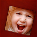
Double squareby srugoloComment: Very nicely done! Very nice idea! Very cute model (hope she got an ice cream cone at least!) Best that I've seen in challenge so far!
Kudos
TC |
 Photographer found comment helpful. Photographer found comment helpful. |
| 03/12/2006 08:24:19 AM |
Art Decoby DrAchooComment: You shoulda made the people in the room to the left of the sign turn off their damn lights so ya coulda got a good shot... :-P
TC |
| Photographer found comment helpful. |
| 03/11/2006 06:39:29 PM |
COMFORT FOOD FOR TWOby hotpastaComment: From the Critique Club:
It looks like you will be subjected to the second of my critiques in a very short time! Unfortunately this time I do not have any photographers comments to help me see what you were trying to achieve with this shot. Well I'm sure we can come up with some good comments anyways...
This shot begs for me to use the like/don't like format so here goes.
What I like: The overall composition of this shot is very nice. I especially like how the handles of the spoons and the cut of the cake have the same angles. This gives the shot an interesting appearance. I like how you kept the compostion simple also. Everything in the shot appears like it has a place in the shot. There are no elements that look like they don't belong. Nice focus and nice simple color scheme.
What I don't like: The overall appearance of the shot is kinda flat. I think this is because of your lighting. It appears that you used natural light which is good. It appears that the light came from an angle slightly behind the subject which doesn't work so good here. It also looks like the subject was some distance away from the light which means the light wasn't quite strong enough to help pull out the textures of the shot. It's these textures that are important to giving the shot depth. I'm also kind of put off by the angle from which you shot this. You shot from mostly above looking down. This makes for a nice round plate, but looks kind of awkward. If you look at most food shots in magazines or advertisements, they tend to be shot from a lower angle. This tends to be more appealing. Your shot also appears to be a touch soft. With a food item like this, I don't think soft focus really works. It also doesn't go over well with the voters.
Give the shot more light. Shoot from a lower angle. Nice sharp focus. Work on these elements and I think you will see a marked improvements in these types of shot. The cool thing is that this is a shot that you can really practice with (untill you can't stand it and eat the desert anyways!)
Yours
TC |
| Photographer found comment helpful. |
| 03/11/2006 06:23:36 PM |
my dog, Jack, my man's red hat and the remoteby SignaturecardsComment: From the Critique Club:
I see that this is your very first entry into a challenge here at DPC. Please don't let your low score discourage you from future participation!
At first glance it appears to be just a snapshot. There is nothing wrong with a snapshot but they only really have value to the person who took them or those that know the subject well. To everyone else there is not really anything to hold their attention.
This shot could be improved in many ways. The first thing is the angle that you shot from. This looks like you shot it from a standing or seated position and from above the subject of the shot. In other words you shot it from YOUR point of view. When shooting kids and pets this doesn't work so well. You need to get down to THEIR level and shoot them more directly! This may mean getting down on your hands and knees or even lying right on the floor. Try this sometime with your dog. Shoot him from a standing position then again from down at his level. You will see a significant improvement assuming you can keep the dog from licking the lens. :-P
The next thing that would help to improve this would be to take out any element of the shot that doesn't really ADD to the shot. In this case it would be the red hat and the remote control. The hat is especially distracting as it is such a bright red color and the rest of the shot is more muted. It just screams for you to look at it and takes all the attention away from your pet.
Your lighting here is not very creative. It looks like you used the flash on the camera. You can see this in the bright spot on the couch cusion and in the harsh shadow behind the hat. It also takes all the depth out of the shot and makes it appear very flat. One of the first things that I learned when I arrived here at DPC was to NEVER use the flash on the camera as is. Sometimes you need to use it but most times you can get away without it with some care. Use a tripod to keep the camera still with the slower shutter speed. Use other lights to light up the scene preferably from one side or the other. Use more than one light. One for the main lighting and another to fill in the darker side a touch (this could even be a simple reflecter like a piece of white poster board). If you think that you MUST use your flash you can difuse it a tad by taping a couple layers of tissue paper over the flash. This will help to soften it up.
The last thing that I can think of off the top of my head to help improve a shot like this is to get closer! This will first off help with the extraneous elements of the shot. It will also allow your camera to record more of the detail (texture in the dogs fur for example). It will also force you to think more about the overall composition.
I know that this is a lot to think about when trying to take a picture but if you practice and take lots of pictures, soon it will be second nature! Once again, please don't be discouraged by your score or your placing in the challenge. We all started somewhere and even the best photographers take bad shots once in a while! I'll be looking forward to your future shots.
Hope this helps
Yours
TC |
| Photographer found comment helpful. |
| 03/11/2006 06:04:33 PM |
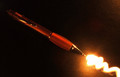
Lightning Penby clypComment: From the Critique Club:
Your lack of photographers comments does not help to tell me what you were trying to achieve with this shot. This makes it a bit tougher to do an in depth critique but let's see what we can come up with anyways...
The overall concept of this shot is very sound! I like how you have a nice diaginal line running through the shot. You did a nice job of lining up the 'writing' with the pen. It actuall does appear to be coming out of the pen tip. You also have nice colors and a good overall color scheme!
The lighting on the pen itself however is a little confusing. It appears on the top half of the pen to be coming from one place. On the part of the pen you actually hold on to it's coming from all around. On the tip of the pen it appears to be coming from a different angle. The total effect of this is confusing to the eye. Another thing that is a bit confusing to the eye is that even though you have light seeming to come from different angles, the overall look of the shot is very flat. Was the light that you used to create the 'writing' the only light in the shot?
The pen itself also does not seem to be truly in focus. It doesn't look like soft focus, it actually looks OOF. This doesn't go over very well with the voters here.
What could improve the shot? Having never tried this type of shot I'm not sure. I know that I would really like to see it brightened up a bit and I would like to see the pen sharper. I think that these two improvements alone would have taken this from a nice shot to one that stood out of the crowd.
Yours
TC |
| Photographer found comment helpful. |
| 03/08/2006 12:29:57 AM |
|
| Photographer found comment helpful. |
| 03/08/2006 12:28:52 AM |
|
| Photographer found comment helpful. |
| 03/07/2006 11:30:08 PM |
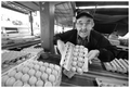
Harry The Egg Manby hotpastaComment: From the Critique Club:
I wanna start off by saying that this is my favorite type of shot to critique and I'm glad I pulled it from the queue. What do I mean by this? It may not be the most excellent shot, but there is so much potential there that I have to stop and look again!
This critique begs for my what I like and what I don't like format...
What I like! You captured an incredible moment in time. The look on the gentlemans face is priceless! He has an incredible pride in what he does and it shows in his expression and your capture. He also has incredible character. I love the taped together glasses and his wonderful grin. There are layers of great texture and leading lines in this shot. The texture is in the eggs and egg crating. The lines are there both in the eggs and the space that they are displayed. You obviously used a wide angle lens. This is apparent in the overall feel of the shot. Not having seen the original, I would say that your choice to go b/w is a good one but I can't be 100 percent on that point.
What I don't like. This is a bit harder. Everything in the crop left of the post on the left third line is unneeded. It distracts and detracts from the shot. A lot of that portion of the shot is blown out which doesn't help anything... You shot is a touch skewed. It's not level. A little more skewed and it would look artsy. The way it is now looks like you didn't take time to straighten the shot in camera. Looks a little sloppy. You are a touch soft here. Most times I like soft focus, but this looks more like it is OOF or your focal point is in the wrong place. I may be wrong on this issue but without seeing a full sized original I can't tell. You lose your subjects left (right in image) elbow in the shadows of the background. The subjects dark clothing against the dark background is a bit of a distraction.
I truly like this shot. I like the overall compostion minus the left side of the frame. I love the character of the subject. I love the textures. If I was you, I would see if he would let me shoot him again. It may take a couple of tries, but I see an potential award winning shot here. Please, keep shooting! If you go back and shoot this subject again, PLEASE post your results here! I will be watching for it.
Yours
TC |
| Photographer found comment helpful. |
| 03/07/2006 09:32:53 PM |
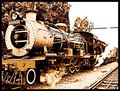
Maureenby zetosComment: From the Critique Club:
First thing I would like to say is that this is very nicely composed. I love how your lines lead you out of frame. This is something that is very powerful when done right and you did it pretty good here. I my only compositional complaint is the cutting off of the front of the train. I would have liked to see the whole train and a little breathing room in the front of it.
Now the hard part. The first thing I thought when I saw this is 'Damn that's harsh!' It appears that you took this shot during mid day in bright sunlight. This is a very hard time of day to make shots including sky come out nice without filters. Later in the evening or early morning are of course the best times to shoot but that may have been impossible with this subject...
The shot is extremely contrasty. This is a side effect of shooting this time of day. A side effect of being to high in contrast is that it looks oversharpened. Looking closely, I don't believe that this shot really is oversharpened but it has that appearance...
I believe that the time of day that you shot this is probably why it only scored a very low 5.xxxx. Unfortunately because of the subject matter, you may not have had a choice!
Keep on shooting!
TC |
| Photographer found comment helpful. |
| 03/05/2006 02:02:26 PM |
Playing the Bluesby kteachComment: Love the idea. Needs a boost in levels though to bring out the light painted...
TC |
| Photographer found comment helpful. |
Home -
Challenges -
Community -
League -
Photos -
Cameras -
Lenses -
Learn -
Help -
Terms of Use -
Privacy -
Top ^
DPChallenge, and website content and design, Copyright © 2001-2025 Challenging Technologies, LLC.
All digital photo copyrights belong to the photographers and may not be used without permission.
Current Server Time: 08/26/2025 11:01:15 AM EDT.