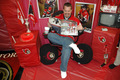
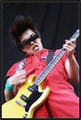
DPChallenge: A Digital Photography Contest You are not logged in. (log in or register
 
Browse Settings
Currently viewing:
Registered UserTooCool

Show comments:

Per page:

Order:

Comments:


Comments Made by TooCool
Pages:   ... [111] [112] [113] [114] [115] [116] [117] ... [305]
Showing 1131 - 1140 of ~3048
Image Comment
My Key Reflections
05/19/2006 12:18:29 AM
My Key Reflections
by cheegirl

Comment:
Very Bowie!
TC
Photographer found comment helpful.
no Sens crying over spilt ice milk
05/19/2006 12:18:07 AM
Photographer found comment helpful.
En vert et rose
05/19/2006 12:17:45 AM
En vert et rose
by Mambe

Comment:
I'm confused by your choice of desat'ing the skin tones. It doesn't make sense to this viewer...
TC
Photographer found comment helpful.
Lateral Displacement
05/19/2006 12:15:37 AM
Lateral Displacement
by Bear_Music

Comment:
Robert, I don't know if a shot has ever touched me like this. I'm speachless...
TC
Photographer found comment helpful.
Semper Paratus
05/17/2006 05:30:37 PM
Semper Paratus
by island_girl1

Comment:
Needs more DOF to make the glove in focus. Is this your gear? If so, please accept my gratitude for your service!
Yours
TC
Photographer found comment helpful.
Morning Raaga...
05/17/2006 05:29:01 PM
Morning Raaga...
by ankursomani

Comment:
Landscape is not still life...
TC
Photographer found comment helpful.
Crescendo
05/16/2006 11:39:17 PM
Crescendo
by greslizzz

Comment:
From the Critique Club:

To me this looks like a very nice study type of shot. By that I mean you can shoot it over and over again and study how it comes out. That said:

What I like: You have some interesting contrasting lines here. The most obvious would be the vertical lines caused by the stems of the plants. More subtly, you have a neat diagonal line caused by the various heights of the plants. Put the two together and you have potential for a very interesting shot.

What I don't like: The pots at the bottom of the shot have no definition. They blend together. You can not tell where one pot ends and the next begins. The raindrops at the bottom of the window look like an oversight. Or in other words they look like you didn't notice them when taking the shot. If they were all over the window this would rock. As is it's a distraction. The reflections in the glass, see what I said about the raindrops. More reflections good! Less reflections good! As is: it looks like you didn't know they were there.

This has great potential. Figure out what you want it to finally look like and keep experimenting. You could end up with a shot that rocks!
Yours
TC
Photographer found comment helpful.
Rhythmic Curves
05/16/2006 09:24:01 PM
Rhythmic Curves
by DigiFotoBuddy

Comment:
From the Critique Club:

Wow... This is a very interesting shot. And definately right on challenge.

What I like: First of all, the rythm and repetition jump right out at you a slap you in the face! Very cool! Love the colors of the thing... What is it exactly? :-P Love the reflection: Is it on a mirror or a glass table? I think it's a table because of the line just above the object that has reflections and you can see through it also. Your DOF is awesome. You're a little soft at the top of the object where it goes out of frame but this is just a sniglet. Incredibly well done!

What I don't like: Well people have already said it over and over again, but your background definately detracts from and competes with the subject of the shot. Black background would have worked VERY well and possibly have moved this up into ribbon contention! Top right corner, your subject moves out of frame right in the corner. Bottom left it moves out of frame just above the corner. I keep wondering how it would have looked either moving the top right down in frame out of the corner. This would have given a touch cleaner line. Either that or move the bottom left down into the corner making a true diagonal.

Why didn't this score higher? I think your background was your downfall in this though 6.3 is still a damn good score!
Kudos
TC
Photographer found comment helpful.
Music Has Charms to Soothe the Savage Beast
05/14/2006 08:37:22 PM
Music Has Charms to Soothe the Savage Beast
by BobsterLobster

Comment:
From the Critique Club:

Bob, let me preface my comments by saying it's kinda wierd pulling your shot for a critique. I have great respect for you as a gig photographer. We share a love for music and photography and usually have the same point of view on these subjects. However, on my Live Music entry, you had the opposite viewpoint from every other commenter on the pic and I think that is kinda funny. That said...

This shot is too easy to critique. It's damn near perfect. Incredible POV. Incredible use of shutter speed to get a perfect DOF and just enough motion to capture the energy of the moment. Incredible colors for the most part. The yellow guitar has some funky tones in it but that's a sniglet. I know how hard yellow is to get perfect for the web.

The only things I think coulda used a little improvement are the skin tones. They look a touch too light or maybe pink. The yellow like I said above is very hard to get right for the internet. And the one thing that catches my eye every time I look at this is how the hair almost dissappears into the background. These things are very minor though. Great capture of a moment and energy.

Why didn't this score higher? Who knows but the voters.

Yours
TC
Photographer found comment helpful.
Elvis Sighted At Parade!
05/14/2006 04:17:36 PM
Elvis Sighted At Parade!
by ClubJuggle

Comment:
From the Critique Club:

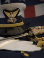
I'm not sure how to go about critiqueing this one, if I should go from a photographic point of view or strictly from a challenge point of view. Either way, there isn't a lot that I can point out for improving the shot as is...

The lighting on this is harsh. I know in this type of photography we do not have a whole lot of control over the lighting. The lighting on his face and hands at this viewing size are not terribly appealing. Not sure your exposure is spot on either as the whites of the platform/float are not truly white but more of a muddied grey.

Compositionally, the platform that he is standing behind, quite bluntly, looks like crap. The boards going across it take away from the neatness (for lack of a better term) of the shot. In effect, they make it look cluttered. The house in the background is quite distracting too.

Technically, besides the exposure that I mentioned above, the shot seems quite soft. I don't know if it is motion blur (was he in the parade or mc'ing it?) or camera shake (what lens did you use for the shot?) or just not focused in the right place... I'm leaning toward the latter as his hand and the boards on the platform seem to be in focus but his face seems soft.

How can you improve this? I don't see anything that you could really do in PP except perhaps playing with levels to make your whites whiter and maybe mask out or darken the background house. The only real improvements I could suggest would have occured during the shooting. If he was actually in the parade, you could have followed the parade route till you had a better background and perhaps more even lighting. I have seen huge differences in parade lighting between two blocks. One with houses and trees like this and another with business that have nicely reflective fronts to help even out the light or fill the shadows... The only other suggestion I could make would be to zoom in more on the model and in effect crop out that funky platform. However, this may have removed the connection with the event which is important for this type of shot.

Hope you find something useful here. Photojournalism and candids are not exactly my forte...
Yours
TC
Photographer found comment helpful.
Pages:   ... [111] [112] [113] [114] [115] [116] [117] ... [305]
Showing 1131 - 1140 of ~3048


Home - Challenges - Community - League - Photos - Cameras - Lenses - Learn - Help - Terms of Use - Privacy - Top ^
DPChallenge, and website content and design, Copyright © 2001-2025 Challenging Technologies, LLC.
All digital photo copyrights belong to the photographers and may not be used without permission.
Current Server Time: 08/26/2025 02:38:20 AM EDT.