| Image |
Comment |
| 07/06/2006 12:35:02 AM |
|
 Photographer found comment helpful. Photographer found comment helpful. |
| 07/06/2006 12:33:36 AM |
|
| Photographer found comment helpful. |
| 07/06/2006 12:13:22 AM |
|
| Photographer found comment helpful. |
| 07/06/2006 12:03:48 AM |
|
| Photographer found comment helpful. |
| 07/05/2006 05:55:09 PM |
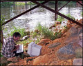
Troll !!!by taterbugComment: I would like to thank the 40 people who voted this below a 4. You guys got it and I think I saw one or two of ya down under the bridge...
TC |
| Photographer found comment helpful. |
| 07/02/2006 11:26:21 PM |
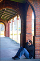
Wretchedness - Feeling Blueby TajhadComment: From the Critique Club:
This shot has so much potential that it is a joy to critique! I love your location. You have a good eye to spot such a location and associate it to this challenge. I love the repetition of the arches and brickwork. You have a good model and decent posing for the challenge. It would work fine but...
You picked the wrong time of day for this shot. There is just too much contrast. Your highlights are way to highlighted and to bring out the detail of the shadows makes it worse. Your background is a bit busy for this shot also. I have not seen this location but shooting from the other end of the prominade might have helped.
If you have the opportunity, I would definately recomend going back and reshooting this scene. I recomend going either late morning or early evening. This will help to even out the exposure. You may even get some very cool night shots depending on the lighting in the area.
Good eye, can't wait to see more shots with this potential fluffed out a little.
Yours
TC |
| Photographer found comment helpful. |
| 07/02/2006 11:18:23 PM |
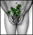
Abandoned Hopeby jeroweComment: From the Critique Club:
First of all I would like to say that you have a very beautiful model and I would love to have the opportunity to shoot her. This shot begs for my what I like what I don't like treatment so here goes...
What I like: Compositionally, this shot is right on. You have your model in one third of the frame. This doesn't exactly follow the rule of thirds but is very close and works well. I love how you have your model posed and her expression. I love how it appears that your lighting surrounds or floods the area that the model is in, however...
What I don't like: This to me looks a tad bit overprocessed. Please remember that this is only my opinion and I'm a bit old school when it comes to post processing. The circle of light around your model almost looks to perfect as if it was created in the p/p. The fade off from lit to shadow is too dramatic. It doesn't look real. Your model also looks a little plastic. This is probably a result of the neat image. I don't know exactly why, it may be a combination of the lighting and the use of neat image, but her clothes don't look 'real'. There is a bit of fuzziness to them that makes it look surreal. For this critiquer, this doesn't work all that well. The last thing I would have to say I was drawn to in a negative way is her eyes. They look dull or dead. Even the slightest bit of catch light in her eyes would have added a lot of feeling to the shot.
Overall, it's a nice shot. With a little less in the post processing and a touch of catch light this could be a great shot.
Yours
TC |
| Photographer found comment helpful. |
| 06/28/2006 09:55:32 PM |
|
| Photographer found comment helpful. |
| 06/28/2006 09:54:50 PM |
|
| Photographer found comment helpful. |
| 06/28/2006 09:53:16 PM |
|
| Photographer found comment helpful. |
Home -
Challenges -
Community -
League -
Photos -
Cameras -
Lenses -
Learn -
Help -
Terms of Use -
Privacy -
Top ^
DPChallenge, and website content and design, Copyright © 2001-2025 Challenging Technologies, LLC.
All digital photo copyrights belong to the photographers and may not be used without permission.
Current Server Time: 08/25/2025 02:24:52 PM EDT.