| Image |
Comment |
| 10/01/2003 04:11:02 PM |
A dedicationby RobroComment: base 1: 1
challenge: 3
technical: 1
aesthetics: 1
total: 6 |
 Photographer found comment helpful. Photographer found comment helpful. |
| 10/01/2003 04:09:10 PM |
|
| Photographer found comment helpful. |
| 10/01/2003 03:57:29 PM |
Diet Soda Fixes Everythingby LucidLotusComment: Lovely concept -- I see the irony here -- could use a great epth of field which would make the plate of food be in focus as well as the DC. |
| Photographer found comment helpful. |
| 09/19/2003 12:17:34 PM |
Homeless Friendsby ImagineerComment: Generally I like the shot and have thought about doing something like this myself -- kind of an intro into just talking to the person to learn their story. Anyway, as I said, I like the shot except the dog is looking off somewhere -- it makes me wonder where. If they were both looking in the same direction, or perhaps at each other, the shot would work much better. I don't get the sense of 'homeless partners' here.
Good luck on your endeavor. I hope you shoot more like this. I'd love to see them. |
| Photographer found comment helpful. |
| 09/17/2003 01:29:25 AM |
|
| Photographer found comment helpful. |
| 09/17/2003 12:27:53 AM |
The Cross, road to eternal lifeby GinxComment: I like the concept & the message, but the cross -- the whole picture is flat and lifeless. Kind of the antithesis of "Life." The choice to crop it at the edge of the cross left and right, but leave distance top and bottom -- and different distances to boot, doesn't help the image either. Perhaps a unique angle shot from below with the sun rising in the background -- maybe just peaking over the edge of the board background. Yeah, that would have been cool. |
| Photographer found comment helpful. |
| 09/17/2003 12:22:19 AM |
|
| Photographer found comment helpful. |
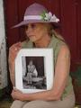
| 09/15/2003 06:15:25 AM |
Memoriesby jmritzComment: Is this the same woman? I think so! It looks like the same doorway too. I wish you had pulled back a bit to see more of the frame like in the original, but the message is still clear the way it is. If I could see more of the door frame and step I'd give it a 10, but as is, it's a 9. |
| Photographer found comment helpful. |
| 09/15/2003 06:13:37 AM |
Once upon a time, there were Quality Clothesby GrziComment: The harsh lighting from the window on the left has blown out the book or whatever on the table and the lower left total darkness makes me wonder what I\'m missing there -- the only problems I see with this photo. Perfect shutter speed to show the wheel in motion but yet let us see there are definite spokes there. I give it a 9! |
| Photographer found comment helpful. |
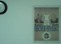
| 09/14/2003 10:24:25 PM |
Match of the Twentieth Centuryby zirkovicComment: What is the purpose of the negative space ending with the cut in half clock? I don't get that. I guess it makes it a photo of something besides a flat poster. It just doesn't work for me. Sorry. |
| Photographer found comment helpful. |
Home -
Challenges -
Community -
League -
Photos -
Cameras -
Lenses -
Learn -
Help -
Terms of Use -
Privacy -
Top ^
DPChallenge, and website content and design, Copyright © 2001-2025 Challenging Technologies, LLC.
All digital photo copyrights belong to the photographers and may not be used without permission.
Current Server Time: 08/19/2025 11:19:29 AM EDT.