| Image |
Comment |
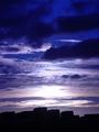
| 10/09/2003 04:39:35 AM |
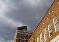
a view from downtownby perkygothComment: base 1: 1/1; challenge: 3/3; technical: 1/3; aesthetics: 0/3; total: 5
Qualifies for challenge, but no real visual appeal to me. Visible JPG artifacts in the clouds and the lamps seem out of focus. Timing is everything here and the picture would have worked much better with a more interesting sky.
|
 Photographer found comment helpful. Photographer found comment helpful. |
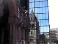
| 10/09/2003 04:35:51 AM |
Old and newby carinaComment: base 1: 1/1; challenge: 3/3; technical: 1/3; aesthetics: 2/3; total: 7
Sky seems blown out, building slants to the left and parking structure? to the right is also tilted. I LOVE the reflection. I find it interesting that the arches to the left look purple but the reflection of the building shows it to be gray. |
| Photographer found comment helpful. |
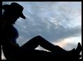
| 10/08/2003 08:56:48 PM |
Cowgirl at Sunset by Firstrich1Comment: Excuse me, but how could ANYONE give this a 1? This is an incredible shot. Congratulations on your well deserved ribbon. |
| Photographer found comment helpful. |
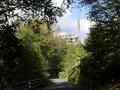
| 10/08/2003 02:20:47 AM |
Urban Sprawlby mullany1957Comment: base 1: 1/1; challenge: 1/3; technical: 2/3; aesthetics: 1/3; total: 5
Shadow areas too dark. I get more of a sense of a country drive than of urban sprawl though. |
| Photographer found comment helpful. |
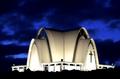
| 10/08/2003 02:19:18 AM |
Twins At Anglesby space amoebaComment: base 1: 1/1; challenge: 3/3; technical: 1/3; aesthetics: 1/3; total: 6
Gray tone nice, but not harsh enough and too dark in spots. Could use some perspective adjustment. Certainly meets the challenge, but no real 'wow' factor. |
| Photographer found comment helpful. |
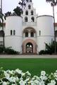
| 10/08/2003 02:15:23 AM |
Hepner Hallby CDSComment: base 1: 1/1; challenge: 2/3; technical: 2/3; aesthetics: 1/3; total: 6
Urban landscapes -- description called for "buildings" -- a bit picky, but I see only one. I don't get the sense of 'urban' here. The photo seems off center or asymmetric without meaning to. You should have been a couple more steps to the right to look squarely through the door and then make sure you are equidistant between the edge of the photo and the towers on both left and right. Sky upper right is blown out too -- not bad enough to knock off another tech point though. I like the flowers in the foreground. Nice touch. |
| Photographer found comment helpful. |
| 10/08/2003 02:02:37 AM |
Have a Cokeby rbrownloComment: base 1: 1/1; challenge: 3/3; technical: 2/3; aesthetics: 1/3; total: 7
A little fuzzy under the coca-cola sign -- hard to really find anything wrong. Seeing the top of one tower, but not the other -- maybe including just a bit more of the top would have helped the aesthetics for me. |
| Photographer found comment helpful. |
| 10/08/2003 01:57:01 AM |
Urban Blueby DufusComment: base 1: 1/1; challenge: 2/3; technical: 2/3; aesthetics: 1/3; total: 6
Nice sky shot, but low silhouette of buildings doesn't shout urban to me. |
| Photographer found comment helpful. |
| 10/08/2003 01:55:06 AM |
Itasca Downtownby pitsamanComment: base 1: 1/1; challenge: 3/3; technical: 2/3; aesthetics: 2/3; total: 8
The colors were pushed a bit too much for me. Specifically shown in the red blob foreground bush. |
| Photographer found comment helpful. |
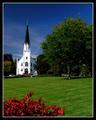
| 10/08/2003 01:53:06 AM |
The house of Godby oskarComment: base 1: 1/1; challenge: 3/3; technical: 2/3; aesthetics: 3/3; total: 9
Walls slightly blown out, but otherwise great. |
| Photographer found comment helpful. |
Home -
Challenges -
Community -
League -
Photos -
Cameras -
Lenses -
Learn -
Help -
Terms of Use -
Privacy -
Top ^
DPChallenge, and website content and design, Copyright © 2001-2025 Challenging Technologies, LLC.
All digital photo copyrights belong to the photographers and may not be used without permission.
Current Server Time: 08/19/2025 05:29:51 PM EDT.