| Image |
Comment |
| 12/10/2003 01:26:42 PM |
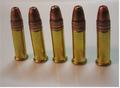
Bullettsby lmatrangaComment: color and lighting could use some work. nice reflection & shadow. |
 Photographer found comment helpful. Photographer found comment helpful. |
| 12/10/2003 01:26:09 PM |
|
| Photographer found comment helpful. |
| 12/10/2003 01:25:33 PM |
Simply a Vaseby ShelleyComment: I personally think the reflection is TOO clear and bright. I'd like to see the reflection dulled a little, putting more focus on the vase itself. Nice color though |
| Photographer found comment helpful. |
| 12/10/2003 01:24:40 PM |
|
| Photographer found comment helpful. |
| 12/10/2003 01:21:38 PM |
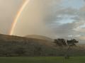
Simple Promiseby kernalklikComment: Wow, nice rainbow. Too bad it's so grey on the left. I really like this composition too! |
| Photographer found comment helpful. |
| 12/10/2003 01:20:47 PM |
|
| Photographer found comment helpful. |
| 12/10/2003 01:20:12 PM |
Cupby thelselComment: simple, nice lighting, a tad blurry though. |
| Photographer found comment helpful. |
| 12/10/2003 01:19:33 PM |
|
| Photographer found comment helpful. |
| 12/10/2003 01:15:33 PM |
Sundae - Lightiniby superkevComment: The background bothers me a bit, but the photo is excellent. I love how the focus is on the drops, not the glass. I think the glass is leaning to the right a little, maybe it's just me though |
| Photographer found comment helpful. |
| 12/10/2003 01:14:26 PM |
Simple But Usefulby melkingComment: I like the clarity, shadows and the composition. The blue tone is a bit too much though. I think more white or silver tone would be nice. Black and white would have been really nice on this i think. |
| Photographer found comment helpful. |
Home -
Challenges -
Community -
League -
Photos -
Cameras -
Lenses -
Learn -
Help -
Terms of Use -
Privacy -
Top ^
DPChallenge, and website content and design, Copyright © 2001-2025 Challenging Technologies, LLC.
All digital photo copyrights belong to the photographers and may not be used without permission.
Current Server Time: 08/01/2025 01:49:11 PM EDT.