| Image |
Comment |
| 09/24/2008 02:34:55 AM |
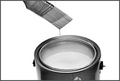
A Drop In The Bucketby XMountaineerComment: Trying to think what colour this is. Either a light blue, or pink maybe, but a pale colour i think. The light onto the paint in the tin makes it a little light, that it might be pale. It being a little more grey may have helped protray the colour. However, good idea and well done. |
 Photographer found comment helpful. Photographer found comment helpful. |
| 09/24/2008 02:31:45 AM |
Sealed with a Kissby PikkelComment: Nice Idea, I presume that lipstick is Ruby Red. The lighting is a little too much in the top right, and could have had a little more on the book on the left. Slight change of light angle (or set-up angle) just to balance that slightly. |
| Photographer found comment helpful. |
| 09/24/2008 02:29:20 AM |
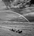
Watching the rainbow by gisliComment: Great Capture. Things obviously went right for you to get this. Hard to stage these and get the horses there when the rainbow is there. Exceptional shot and stands alone (outside of the challenge topic) as a great photo, as well as meets the challenge. Would love to see the original for this. |
| Photographer found comment helpful. |
| 09/24/2008 02:28:03 AM |
Obeyby LouisaComment: i like the idea, but you have overprocessed/overexposed it. The red to me should be a clear grey (instead of just off white) and the black righting/border ont he sign should be black. |
| Photographer found comment helpful. |
| 09/24/2008 02:26:26 AM |
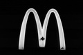
The Golden Archby evanescenteComment: Yep, Says yellow to me. Cannot understand the Maple leaf there though. Don't know why you would add it there, or wouldn 't find some arches without it on |
| Photographer found comment helpful. |
| 09/24/2008 02:25:32 AM |
Rainbowby phloverComment: This works. Had seen similar on this site before. Well taken and meets the challenge really well. The mark on the pencil (right side) is a shame as i noticed it straight away (would have been hard to notice during set up though, and rules don't allow its removal afterwards).
Still a Great Shot, Well done |
| Photographer found comment helpful. |
| 09/24/2008 02:23:56 AM |
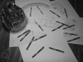
A Child's Dreamby marcbentonComment: I would have adjusted the levels on this photo, as it all seems a little dark to me, and it doesn't have to be. This could have brought out more differeing shades in the crayons, and therefore showed the better depth of colours. |
| Photographer found comment helpful. |
| 09/24/2008 02:22:46 AM |
|
| Photographer found comment helpful. |
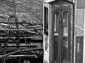
| 09/24/2008 02:18:03 AM |
Telephone Boothby AshleyLynn23Comment: Like the idea, but the clutter to the left detracts from the booth. As a result, the booth does not jump out as much from the rest of the photo |
| Photographer found comment helpful. |
| 09/24/2008 02:16:48 AM |
Red, White, and Blueby incubusComment: Flag would have been better if it took more of the frame. It waving towards us by that wuch doesn't work for me. |
| Photographer found comment helpful. |
Home -
Challenges -
Community -
League -
Photos -
Cameras -
Lenses -
Learn -
Help -
Terms of Use -
Privacy -
Top ^
DPChallenge, and website content and design, Copyright © 2001-2025 Challenging Technologies, LLC.
All digital photo copyrights belong to the photographers and may not be used without permission.
Current Server Time: 08/01/2025 06:41:28 PM EDT.