| Image |
Comment |
| 09/25/2008 11:14:58 PM |
National Colorsby antares1966Comment: I don't like the crop, the blue should be grey and not black, and the starts should be white and not grey |
 Photographer found comment helpful. Photographer found comment helpful. |
| 09/25/2008 11:13:52 PM |
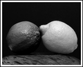
Lemon and Limeby cryanComment: Like the idea. The lemon is lit reasonably well, but the lime is not. Needed more light on its lower side as it disappears. The contrasting greys though give the impression of colour |
| Photographer found comment helpful. |
| 09/25/2008 08:38:19 PM |
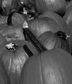
Pumpkinsby snafflesComment: You have managed to make Pumpkins interesting, n ot an easy task. The layout works really well, execution is great, depth of field is spot on and lighting is pretty good. Well Done |
| Photographer found comment helpful. |
| 09/25/2008 08:36:23 PM |
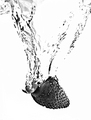
Strawberry Splash!by socalsteveComment: I don't like to blown out look of the background. i think it then looses the definition of the trail through the liquid.. |
| Photographer found comment helpful. |
| 09/25/2008 08:35:23 PM |
The Bearer of Thornsby VitaminBComment: A nice sharp photo of a (red?) rose. Colour and shaddows of the rose are great. Not really my thing but meets the challenge really well and does scream Red to me. |
| Photographer found comment helpful. |
| 09/25/2008 08:34:13 PM |
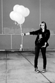
Six Pink Balloonsby zackdezonComment: They may be pink, but they are overexposed int he photo, making them white and loosing definition. Would have been much better if they were still a shade of grey, and the shaddows and shapes of the balloons obvious, as that wouldhave portrayed the colour better |
| Photographer found comment helpful. |
| 09/25/2008 08:31:33 PM |
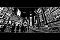
City Lights : Times Square by APComment: Well, the square is colourful. Photo is good and very busy, which also portrays colour and movement.
Not sure that the wide black border top and bottom quite works. |
| Photographer found comment helpful. |
| 09/25/2008 08:30:11 PM |
Hot Stuffby BrownEyesComment: Great idea, but I am not sure about the Lighting on this one. A mo4re even light, instead of the harsh reflections, may have been better |
| Photographer found comment helpful. |
| 09/25/2008 08:29:23 PM |
Seafood Anyone?by witt34Comment: I had a similar idea (but went with something else) The greys with the White and black does portray the different colours making up the Neon sign. Would have attempted to have a little more room to the right as I don't think there is quite enough space between the crab and the edge at that point (but I don't know what else might have been in the way) |
| Photographer found comment helpful. |
| 09/25/2008 08:27:11 PM |
Orchidby wei1108Comment: Its a nice photo, but this challenge said that the photo MUST be black and white, with no colour allowed. I would have attempted to have a slightly greater depth of field, as even parts of the main flower are soft because of the depth, while the center is very sharp. |
| Photographer found comment helpful. |
Home -
Challenges -
Community -
League -
Photos -
Cameras -
Lenses -
Learn -
Help -
Terms of Use -
Privacy -
Top ^
DPChallenge, and website content and design, Copyright © 2001-2025 Challenging Technologies, LLC.
All digital photo copyrights belong to the photographers and may not be used without permission.
Current Server Time: 08/02/2025 04:14:38 AM EDT.