| Image |
Comment |
| 02/18/2009 12:58:45 AM |
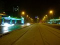
Hoary rivalsby cicarulezComment: I don't know whether you used a tripod, as is seems that the photo, especially in rhe lights etc, is not as sharp as it could have been. I feel there is too much dead space in the middle with the footprints in the snow. Teh rain does not help the photo either (but not much you can do about that). I can't see the signs for the servos, the prices etc, which could then have added to this....... |
 Photographer found comment helpful. Photographer found comment helpful. |
| 02/18/2009 12:55:33 AM |
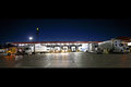
Big Boysby tjmuellerComment: I like this. The best I have seen so far. Well exposed with tricky conditions, great composition in the photo. Colours are pretty good (a little more punch int he red might have helped) Border is good and works for this. Very little to suggest. Well done. |
| Photographer found comment helpful. |
| 02/18/2009 12:53:03 AM |
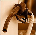
"Fill 'er up" circa 1920by bobnospumComment: I would have attempted to keep the end of the nozzel in focus. I like the background blurred, as it draws attention to the pump handle. The details in the rusted metal are great. A slightly wider DOF would have made all the difference as this could then have been one of the standouts of the challenge. Still reat composition, and PP. Like the colours and Duotone used. |
| Photographer found comment helpful. |
| 02/18/2009 12:50:50 AM |
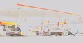
Overexposedby GemGemComment: Yes it is!!!
I am not a fan of overexposed photography, especially when it is THIS overexposed. It does not appeal to me, either achieved through the camera, or through PP.
You have managed to retain the Shell Shop label, and a couple of the numbers. I wish I could make out the pumps etc. I think you have taken this from an angle, that with correct exposure, it could have been an interesting shot, but as it is, it doesn't work for me. |
| Photographer found comment helpful. |
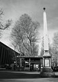
| 02/18/2009 12:32:11 AM |
Neoclassicby Lorenza FComment: The large Oblisk (I can't spell) is what draws my attention, instead of the Gas station, which is dark and hidden in behind. i can barely make out the details of it, when it is meant to be the focus of the Challenge.
The processing is good, I like the B&W used here. |
| Photographer found comment helpful. |
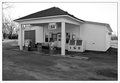
| 02/18/2009 12:28:15 AM |
Over 60 years of serviceby griz210Comment: I feel the crop restricts this photo. A little more sky would have helped, and some extra space on both sides of the image, especially the right. The image feels top heavy, as there is a large, plain area in the front caused by the driveway. This needed to be balanced with the extra room.
I like the B&W processing. It suits this image and helps in the stroy...... |
| Photographer found comment helpful. |
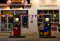
| 02/18/2009 12:26:06 AM |
Midnight at the Oasisby CEJComment: I am not sure that cropping out part of the car is a good idea, as it gives an unfinished look to the image. The front on shot means the Pumps merge in with the Shop windows. This means the photo looks like a bunch of colour, with no place for the eyes to focus on. A different angle may have helped this |
| Photographer found comment helpful. |
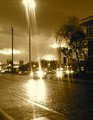
| 02/18/2009 12:24:05 AM |
Gaslightby cthulhuComment: The Noise in this photo is going to hurt you with Voters. The Flare from all of the lights also have caused large, overexposed areas that detract. This may have been the intent, but it doesn't work for me.. The colour of the Duotone also doesn't appeal for me. A straight Black and White may have worked better. |
| Photographer found comment helpful. |
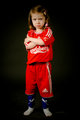
| 02/04/2009 12:51:26 AM |
That´s sucksby mr_simmiComment: As a Blackburn Rovers Supporter, I must mark you down for the Liverpool Shirt............
Nice Expression. Would have been great with some lighting from abpve to just stop her hair from merging with the black backdrop. I like to contrast of Red on Black, which makes the rest of her stand out well from the background.
The light appears to be from directly in front (correct me if I am wrong). This causes the areas closest to the camera and directly in front (her Arms, the Carlsberg logo) to grab a little too much attention, rather than her face, which appears slightly darker. I would love my eyes to get drawn to the face more than the arms in this shot. |
| Photographer found comment helpful. |
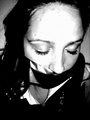
| 01/28/2009 09:17:56 PM |
duck tape makes silenceby ocheComment: There are a number of the same type of image submitted. The harsh lighting in this really hurts the image. |
| Photographer found comment helpful. |
Home -
Challenges -
Community -
League -
Photos -
Cameras -
Lenses -
Learn -
Help -
Terms of Use -
Privacy -
Top ^
DPChallenge, and website content and design, Copyright © 2001-2025 Challenging Technologies, LLC.
All digital photo copyrights belong to the photographers and may not be used without permission.
Current Server Time: 08/06/2025 05:40:02 AM EDT.