| Image |
Comment |
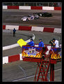
| 03/25/2009 09:12:39 PM |
Caution Aheadby BlackboxComment: Nice take on a different way to communicate. Prehaps some extra room at the top of the image, thus moving the flag onto the third line, and the cars onto the upper third line could have made this even better |
 Photographer found comment helpful. Photographer found comment helpful. |
| 03/25/2009 09:09:32 PM |
Despair - Language of Current Economyby jomernerComment: Different take ont eh challenge topic. Not sure that the image is strong enough at showing it though. This photo could have been composed in a significantly more dramitic way to really sell the story. |
| Photographer found comment helpful. |
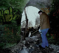
| 03/25/2009 09:08:11 PM |
Language without Limits by landcameraComment: Inspiring person..............
Not really sure on your cropping of this photo. It feels really constrained at the top. I feel it needed more room above his headm and to the left as well....... |
| Photographer found comment helpful. |
| 03/25/2009 05:31:44 PM |
Real Language Disappearingby kevwaggsComment: The box is on an angle. I would have rotated this so that the vertical lines are straight. Other than that, it is not a really interesting subject. The idea was good, but a more interesting, or colourful piece of grafitti would have worked better |
| Photographer found comment helpful. |
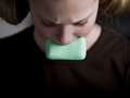
| 03/25/2009 05:30:09 PM |
Dirty Little Wordsby njsabsComment: Thought people might do something like this. I think the lack of colour hurts this. Too much brown in the photo for me. Maybe cropping out much of the brown jumper, and seeing more of her head may have worked better |
| Photographer found comment helpful. |
| 03/25/2009 05:28:31 PM |
Sign Language - DPCby Moose408Comment: Great take on the challenge. Was wondering how many people would attempt this. I have to take your word for what it reads, as Australian Sign Language (AUSLAN) is different to American.
Lighting is great, composition is great. I like the blue backdrop. Nothing really for me to add on this.......Great Shot |
| Photographer found comment helpful. |
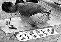
| 03/25/2009 12:53:31 AM |
proposalby yiannis723Comment: When submitting, use the maximum number of pixels. This photo appears very small on the screen, so it is hard to see the detail. Do not reduce the pixel numbers to get the photo under the size, instead reduce the quality slider. |
| Photographer found comment helpful. |
| 03/25/2009 12:51:51 AM |
School Girl Gone BADby okkyComment: Not sure on the pink border. Would have been greta to either stand in front of something less reflective, or be more careful with the light as the reflections off te door are a major problem. |
| Photographer found comment helpful. |
| 03/25/2009 12:50:20 AM |
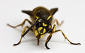
A, Bee, C, .........by benficaComment: OK, your title tries to make this meet the challenge, but ignoring that, we have a photo of a bee. The photo of it is good, the depth of field is good, but I still don't really see this as meeting the challenge, but showhorning a photo in |
| Photographer found comment helpful. |
| 03/25/2009 12:48:05 AM |
The Basic'sby tfarrell23Comment: They are. I like the colours, and the idea. I think it would have been better having the negative space ont eh shaddow side. Also, the border does nothing for me. Don't know why you chose grey. One of the bright colours would have siuted much better |
| Photographer found comment helpful. |
Home -
Challenges -
Community -
League -
Photos -
Cameras -
Lenses -
Learn -
Help -
Terms of Use -
Privacy -
Top ^
DPChallenge, and website content and design, Copyright © 2001-2025 Challenging Technologies, LLC.
All digital photo copyrights belong to the photographers and may not be used without permission.
Current Server Time: 08/07/2025 03:31:08 AM EDT.