| Image |
Comment |
| 05/13/2009 02:29:52 AM |
Innovationby dtremainComment: That it does.....
Like the picture. Shutter speed was spot on to get the blur but still seperate blades on the mian rotor, the full circle on the tail rotor, and keeping the chopper still sharp. I like the use of the blue in the border in traditional poster form. A great poster |
 Photographer found comment helpful. Photographer found comment helpful. |
| 05/13/2009 01:10:22 AM |
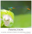
- In Nature , Nothing is Perfect yet Everything is Perfect -by andrewtComment: I will be fussy.......your writing should have been capitalised correctly. I noticed straight away that Perfect is the only word in Title case. In Nature, Nothing is Perfect yet Everything is Perfect........yes, being fussy on this challenge......
Ok, Photo.........Stunning. Love the colours in the bug. The blues are just brilliant. The composition is good, the depth of field is perfect.......The Photo fits with the phase exactly.....Its a great shot.
I note you didn't go with the normal Black background which is good, nor did you go with the standard poster crop.
A really good submission for this.......Hey, i had to be picky to find something to comment on.....a good score from me for that stunning photo |
| Photographer found comment helpful. |
| 05/06/2009 11:19:22 PM |
Darkness Falls by TezComment: Even though the challeneg topic is darkness, i feel this image is too dark overall. The loss of the detail in the rocks, i think through your processing, means that it has lost much of the impact for me. The Vignette doesn't work for me. I think without it and a little more detail in the foreground, the image could have been improved. |
| Photographer found comment helpful. |
| 05/06/2009 10:41:14 PM |
the last concert of his tenureby klkitchensComment: My constant complaint with photos of bands etc is that they insist on having music stands that get in the way. Musicians should learn the music so we can remove the stands and see their faces. Nothing you can do about that though.
I like the tonal range used int his image. We have the complete range from Black through white, as well and the greys. it ma have been better if he was instructing the players on this side of the photo when taken, to get a partial view of his face |
| Photographer found comment helpful. |
| 05/06/2009 10:38:36 PM |
Where's Waldo?by sgauriaComment: Was wondering if someone was going to do this, and also quite interested to see how it goes, and what the comments on the photo are.
The image fits the challenge topic very well. You have chosen a very nice tone of black here, spot on really. The PP to achieve this has been carried out exceptionally well. I also like the aspect ratio used, although you could have been tempted to go for the square crop. Concern of course with that is getting the detail in the photo retained when you have to reduce down for the image size limitations...............:p
I like it......we will see if the others do |
| Photographer found comment helpful. |
| 05/06/2009 08:49:03 PM |
One way out of the dark!by tmmac_9Comment: Great idea and really good composition. However, i feel the subject is overexposed. Always hard to expose correctly with all this black areas, but I think the square is too light, and could easily have been darker and still given the overall effect you were after, and presented better colours and scene |
| Photographer found comment helpful. |
| 05/06/2009 08:47:35 PM |
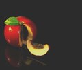
"The Darkness Within"by jomernerComment: Unlucky........glad you cut that and didn't bite into it arn't you.
I like the idea, but a few things ont eh execution. The flash lights on the apple are a major distraction. They emphasise that the lighting is uneven and quite harsh. The leaf there looks fake, like it has been placed there, and wasn't there originally. I would have cropped off the top area of the apple. At the moment, the dead space above does little for the image, and causes the apple to be centred. I feel the upper dead space detracts from the effect you were after with the negative sapce to the right. Cropping the topmakes this other negative space more effective.
Unfortunately, your refelctions are not distinct enough to really become a strong feature either. |
| Photographer found comment helpful. |
| 05/06/2009 03:01:22 AM |
Hiding in the darkby GemGemComment: The noise through this photo is a detraction from it. I like the idea you had for the image, and the composition is good. It is prehaps a touch too dark int he face as well, but that noise is the biggest problem here |
| Photographer found comment helpful. |
| 05/06/2009 02:45:17 AM |
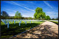
In Memoriumby SaraRComment: Interesting subject. I am heading to Cambridge to live soon so will be sure to visit here, and DPC might see a few submissions from this place.
The colours are great, which contrasts significantly with the place that you have photographed, a somber place......A lot of people will photograph this and convert to Black and White, which means it tells a completly different story. i like how you, by using colouor, have emphasised the trees, and the peaceful nature of the place, rather that the sense of loss that a B&W image would have portrayed. In this, you processed for the Challenge.
The path nicely leads you to the main tree, while the large shaddow in the front also ties in well to the challenge topic. i didn't vote, but this image probably deserved to score closer to a 6 average overall........ |
| Photographer found comment helpful. |
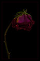
| 05/06/2009 02:36:22 AM |
Forgottenby LouisaComment: Long forgotten Rose........I like the idea, the composition here is very good. I feel the rose is a touch dark. I understand that you want the overall image dark, but at least on my monitor, having it a little (just a little) lighter would have made it and its details stand out just a bit more, and would have made it better........
I like the border you have applied, simple and elegant, as a rose should be, and provides a contrast to the subject that works well |
| Photographer found comment helpful. |
Home -
Challenges -
Community -
League -
Photos -
Cameras -
Lenses -
Learn -
Help -
Terms of Use -
Privacy -
Top ^
DPChallenge, and website content and design, Copyright © 2001-2025 Challenging Technologies, LLC.
All digital photo copyrights belong to the photographers and may not be used without permission.
Current Server Time: 08/14/2025 10:01:46 AM EDT.