|
|
|
Showing 451 - 460 of ~1024 |
| Image |
Comment |
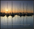
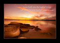
| 05/15/2009 03:02:29 AM | Believe in your Dreamsby eye-spyComment: Stunning. Not presented int eh normla motivational poster way, but doesn't need to be. The phrase is perfect, the image is very good, the exposure is spot on, just getting the glint off the boats, being able to see details, but them still being dark. A really good submission that has little to fault. |  Photographer found comment helpful. Photographer found comment helpful. |
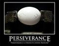
| 05/15/2009 03:00:33 AM | Perseveranceby jrmyrnsmComment: Brilliant Title, Saying and photo combination. They all compliment each other, and all work together to make a very good submission
The lighting is probably the largest concern here. The top of the egg is starting to be blown out, and yet i feel the need for a little more light on the two clamps, just to make them stand out a little more from the background. The only other thing is the areas int he very lower part of the photo, which add nothing, so removing them would have also been a plus. Still, a reall good submission. | | Photographer found comment helpful. |
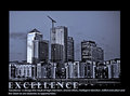
| 05/15/2009 02:56:31 AM | Excellenceby MarikaComment: The image works well with the saying. however you needed to have a larger area at the bottom so that the text does not sit over the image. For me, the writing and the lower lights are fighting, and it doesn't work. Also, I would prefer the words to be centre aligned, and not to the left.
The colour in the city is good, the crane is perfect for this, adds to the image and makes the statement. I like the image and the processing you have done, the exposure is good. With changes to the presentation, this could have been a very high scoring submission | | Photographer found comment helpful. |
| 05/15/2009 02:54:02 AM | Togetherness!by richabhatiaComment: Ducky's, and very effective. A good image to match the title and saying, which ties the who poster together. The spots on the ground on the right however are a problem, and a shame you couldn't clean it up under this editing ruleset. The light is a little harsh maybe. I understand having it come from that direction, and like the shadows that will create, but the chest/top of head areas are a little too bright in my opinion...... | | Photographer found comment helpful. |
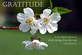
| 05/15/2009 02:51:57 AM | GRATITUDEby ZellerStudioComment: I like the image, except that I would love to remove the lower flower from it. The two flowers facing out are great, cutting the other off would have added to this in my opinion. It would then have allowed the image to move further down, away from the top of the photo and away from feeling that the leaf is almost cut off. Apart from that, it is a great capture, and the title/saaying do match exceptionally well | | Photographer found comment helpful. |
| 05/15/2009 02:49:51 AM | Diversityby banmornComment: yes, Diversity what........where is the motivational saying that makes this a motivational poster, rather than a statement. The image you have chosen does connect in well with the title. The colours are very bright and different. I don't know what this is that you photographed. Its just a shame it is not more closely linked to the challenge, as that will hurt your overall score | | Photographer found comment helpful. |
| 05/15/2009 02:47:36 AM | | | Photographer found comment helpful. |
| 05/15/2009 02:46:23 AM | Lifeby GlanniComment: I like the saying, very fitting of a motivational poster. I find the lighting to be very effective, it illustrates the day we are talking about, and as a result, works well. I know that an elephant like that is meant to be good luck, but I am not sure it is adding terrifically to the image in this case. it is pointing to the day (a positive) but the lighting and shadows makes me think then he is a bit of an afterthought. but having said that, without him, maybe the image wouold be a little too plain. So maybe some better lighting, or a different position could have been better. White border in this case was right, not sure of the yellow colour of the phrase though, as that colour doesn't appear in the rest of the photo...... | | Photographer found comment helpful. |
| 05/15/2009 12:48:07 AM | Window in Autumnby AmmieComment: An interesting image. You are always going to have people that like, and others that don't like the border. I personally would not have put a border on this, but that comes to choice. I don't use many borders on my photos.
For this, i would have used a more narrow (ie higher) appature. Instead of f5, I would have been shooting this more towards the F10+ area. I think the photo suffers from a depth of field issue, with some areas a little soft. This also might have been due to the slow (1/45) shutter speed used. I don't know what the light was, but that tells me it was a bit dark. The photo for me just could have been sharper. On that, did you sharper after you resized, as resizing the photo often can make it look a little soft anyway, so sharpening slightly can restore that back.
Someone mentioned Contrast, not sure as that would then blow out the window and that would be a problem. :) | | Photographer found comment helpful. |
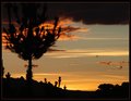
| 05/15/2009 12:41:13 AM | Between Light and Darknessby AmmieComment: I like the effect you have achieved here. however, with some extra Post Processing, you could have made this sunrise really stand out. The colours are quite light and subtle in this image. By adding some additional contrast, both globally, and then to selected colours (yellow/red) you can make the sky glow much more, with richer tones. Added to this, adjusting the midtone levels slightly darker then will darken that area of the image, which is the sky area in this photo, helping richen the colours. These small changes then add significantly to the photo. These clouds are then closer to red, and lighter ones orange, ad the blue is darker..........
It is a shame the large bank of clouds is in the upper part of the shot, but nothing you can do about that. in terms of composition, the tree could have been better sitting on a line of third, therefore with more space included on the left hand side of the picture, making it stand more clearly as the subject
Hope this helps :) | | Photographer found comment helpful. |
|
Showing 451 - 460 of ~1024 |
Home -
Challenges -
Community -
League -
Photos -
Cameras -
Lenses -
Learn -
Help -
Terms of Use -
Privacy -
Top ^
DPChallenge, and website content and design, Copyright © 2001-2025 Challenging Technologies, LLC.
All digital photo copyrights belong to the photographers and may not be used without permission.
Current Server Time: 08/14/2025 11:57:19 AM EDT.
|