| Image |
Comment |
| 05/19/2009 10:59:14 PM |
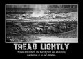
Tread lightlyby carofoComment: A good subject, but maybe colour would have added to the image. there is a lot going on in the image, and it is dificuklt to isolate each of the elements in the construction/demolition site. Maybe the different colours could have helped with this. |
 Photographer found comment helpful. Photographer found comment helpful. |
| 05/19/2009 10:58:14 PM |
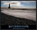
Determinationby BrinComment: A nice image, having a little more sky would have put the horizon on the third line and really balanced this photo. i currently feel the subject, the pillar, is a little too high in the image. other than that, a really well composed and presented poster |
| Photographer found comment helpful. |
| 05/19/2009 10:57:03 PM |
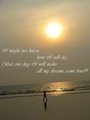
iDream iWalk iSucceedby fahadkalsekarComment: The uneven horizon, either intentional or not, is a major distraction for me in this photo. Maybe you did it to centre the sun more, which I don't think is right. Having the horizon straight, the sun in the top right corner, and the guy on the beach would ahve worked better.
Great phrase for the photo, which really works for this challenge |
| Photographer found comment helpful. |
| 05/19/2009 10:55:15 PM |
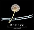
Believeby IreneMComment: A very interesting photo, and a very professional looking presentation. The combination of the photo, title and phrase is exactly what I thought this challenge was about, and you have done that exceptionally well.
Maybe it is a little overexposed/light. Especially the chain and the stem could have been darker, giving just that hint of green in the stem, and dulling down the chain. this would have helped really emphasise the plant as the subject, rather than the chain, which by being that light, does jump off the page a little too much. However, that is a small thing, a really very good submission for the challenge |
| Photographer found comment helpful. |
| 05/19/2009 10:51:48 PM |
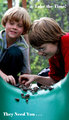
Be A Dad!by vtruanComment: More of a campain poster appealing to dads, rather than a motivational poster. In the campain poster, it has merits, int erms of meeting the challenge, it does struggle
Good depth of field, but not really what I would want on the office wall |
| Photographer found comment helpful. |
| 05/19/2009 10:50:21 PM |
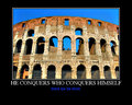
Conquerby npaselComment: Unfortunately, there are a number of artifacts int he sky that are clearly visible. I also think that this image needed some extra sky to really balance it. I find that I am seeing a part of a scene, and that it does not have any clear ending point that makes me think I am seeing the whole picture. A wider shot of this would have worked better.
It does tie in well with the title/phrase. Would have likes the presentation to have the title in the more traditional motivational poster style as welll. |
| Photographer found comment helpful. |
| 05/19/2009 10:46:13 PM |
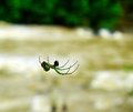
Focus on your Goals and not on your Challengesby yjoshiComment: I feel this needed a tighter crop, or needed something else in the image that connects to the statement made. As it is, most of theimage is a blurred mess, and the change in background colour by this is a distraction that hurts the overall image. The tighter crop of the spider would have illiminated this, allowed us to see more detail int he spider, and removed most of the distracting elements, making a much stronger picture. |
| Photographer found comment helpful. |
| 05/19/2009 10:41:33 PM |
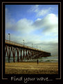
Find your wave...by tonodzComment: An inteeresting subject, but I don't think the overall capture does it justice. The image appears to be soft. The pier leads to the edge of the photo, neither negative space or a subject. The lines lead me to this space in the border.........
Even the wave in the image is a minor element, and yet this is what you highlighted in your title. A stronger connection between the photo and the motivational message you are trying to put forward was really needed. |
| Photographer found comment helpful. |
| 05/19/2009 10:36:20 PM |
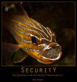
SecuritYby MotekComment: An interesting image, and one that fits in exceptionally well with the title and phrase you have applied to it. The overall presaentation fo the poster, with colour choices, test fonts ect are very good, and helps to give it a professional and finished look to it.
Always difficult to photograph fish, dealing with glass refelections and the like. I think you have done a very good job of the photo. Exposure is good and I like the depth of field you have applied to this. A great submission. |
| Photographer found comment helpful. |
| 05/18/2009 11:28:30 PM |
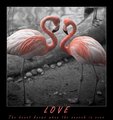
L O V Eby Anthony_D_ArcherComment: An interesting image, yet a wonder why you cropped off the tail of both birds. There is no reason why this cannot have a landscape appearance to it, and i think it would have looked more finished that way.....
Not sure whether you used channel desat (legal) or selective desat (which would be against the rules) so i will presume you have complied with the Basic Editing Rules and vote as if this is legal.
The attention to the presentation of this is very good and makes the entire poster look very professional......... |
| Photographer found comment helpful. |
Home -
Challenges -
Community -
League -
Photos -
Cameras -
Lenses -
Learn -
Help -
Terms of Use -
Privacy -
Top ^
DPChallenge, and website content and design, Copyright © 2001-2025 Challenging Technologies, LLC.
All digital photo copyrights belong to the photographers and may not be used without permission.
Current Server Time: 08/13/2025 03:09:31 PM EDT.