|
|
|
Showing 361 - 370 of ~1024 |
| Image |
Comment |
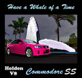
| 05/27/2009 10:45:18 PM | Holden V8 Commodore ssby BrianRComment: Ahhh, the Commodore SS.......
Not really sure about this. The bright car looks good, reasonable lighting on it, and the paint really does stand out. The whale looks completely fake, especially the way it is lit compared to the rest of the scene, and then the background is univiting, with the wind going, like there is a storm on he way. It seems like 3 scenes stitched together, with none of them really connecting, or shot in front of a blue screen.......... |  Photographer found comment helpful. Photographer found comment helpful. |
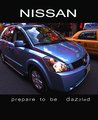
| 05/27/2009 10:40:33 PM | VERSA-tilityby PennyStreetComment: There are a lot of distracting elements in this photo. The taxi behind, the lights behind, and especially the reflection of the lights in the bodywork all interfer with the photo. Cropping off the rear bumper is also an issue, and overall the crop is too tight around the car. | | Photographer found comment helpful. |
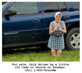
| 05/27/2009 10:39:09 PM | Trust Meby rrdjservComment: A different idea, but one that I am not sure has been executed as well as it could have been. I think by a different angle and more mud, you could have emphasised the contrast between the words and the car. At the moment, the crop on the car is awkward, cutting through elements of it and making it look incomplete. | | Photographer found comment helpful. |
| 05/27/2009 10:37:20 PM | Stand Out!by witt34Comment: The roadside elements, the large white and blue box etc are distracting elements that draw attention. I am not a fan of the writing, as it is hard to read, and goes against the standard left to right. Reflections of the tree on the car is also an element that would have been best avoided. | | Photographer found comment helpful. |
| 05/27/2009 10:35:48 PM | time for a new oneby goodnewsComment: The composition of this photo doesn't really work for me. I am struggling to see what the main subject is. The car with its hood up makes a large, black area. The people are all looking away, and in most cases, have their back to the camera. The crop includes plenty of road, but is tight at the top. The overall composition seems a little rushed, and more opportunistic than planned. | | Photographer found comment helpful. |
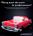
| 05/27/2009 12:22:39 AM | 1957 Chevy Bel Airby choltmeierComment: The car in this looks fake, and not like a photo. Maybe it is the softness of the image, or the way the light is, but to me it looks like a poster and not a photograph.
I am not a fan of the light reflecting strongly off the windshield. It draws attention and gives the photo an overexposed feel.
Overall ad composition is good, however the image in this case lets it down. | | Photographer found comment helpful. |
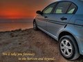
| 05/27/2009 12:20:47 AM | No Barriersby androgeusComment: I find the crop of this image to be awkward. The back of the car, adn its rook have been cropped out. We don't get to see many of the features of the car. In many ways, the car is a secondary element in this photo, while the sunset is the primary element. However, in a Car Ad, we are tyring to sell the car, and while sunsets are great, the car should always be the primary element of the photo that draws attention. Everything else should just be supporting the aim of selling that car. | | Photographer found comment helpful. |
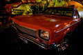
| 05/27/2009 12:18:51 AM | Classic, Not Plastic.by Kel73Comment: The lighting of the car is the biggest concern with this photo. Much of the car is too dark, and then there are bright highlights from surrounding lights reflecting off the paintwork. Also, the angle of the photo is awkward, as doesn't show off the best elements of the car. The background is interesting, but doesn't cover the whole back, as it runs out in the top right. More overall light was needed for this to more evenly light the car, and add more light to the overall image. | | Photographer found comment helpful. |
| 05/27/2009 12:16:16 AM | Girls in Trucks (soft in all the right places, tough in all the right ways)by pixelpigComment: Very different to what I expected out of this challenge. The letters are a bit of a problem, I find myself trying to work out what the word says, especailly as a letter is cut off on the left. Apart from that, something different. Howeer, having the text on the image, as was allowed for this challenge, would have allowed the image to stand by itself, and help with the connection to the challenge | | Photographer found comment helpful. |
| 05/27/2009 12:14:10 AM | Time For An Upgrade?by GeneralEComment: An interesting concept, a different image. There have been a couple fo these where people have gone the different direction, and a number have worked. I feel the crop on this just doesn't work, I feel seeing more of the car would have helped, or at a different angle. The striahgt on angle doesn't povide a lot of interest for this image. The text though is good and draws attention. | | Photographer found comment helpful. |
|
Showing 361 - 370 of ~1024 |
Home -
Challenges -
Community -
League -
Photos -
Cameras -
Lenses -
Learn -
Help -
Terms of Use -
Privacy -
Top ^
DPChallenge, and website content and design, Copyright © 2001-2025 Challenging Technologies, LLC.
All digital photo copyrights belong to the photographers and may not be used without permission.
Current Server Time: 08/12/2025 01:37:48 PM EDT.
|