| Image |
Comment |
| 05/31/2009 10:58:00 PM |
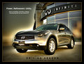
Infiniti FX by peterComment: The overdone processing of this works for some reason. It is something that you often see with car ads, and you have pulled it off effectively with this shot. A really professional looking submission that could easily be mistaken for something already in a magazine. Great job |
 Photographer found comment helpful. Photographer found comment helpful. |
| 05/31/2009 10:56:35 PM |
BMW in Sky Blueby mileskeaComment: Really like the idea you had with this one, the reflected clouds and all. great presentation of this as well...... |
| Photographer found comment helpful. |
| 05/28/2009 10:51:37 PM |
Volvoby banmornComment: A nice, simple image. Clean and well executed, well cropped as well.
The overall presentation of the add is boxy, but then again, so is a volvo. I probably would have not had Volvo in text in the bottom, as the image is clearly volvo, and just had the three words. I feel this would have helped remove the large, obvious blue and resulted in a better overall presentation |
| Photographer found comment helpful. |
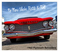
| 05/28/2009 10:49:07 PM |
Special Times call for Chevyby KelliComment: An interesting angle of this photo, which I am not sure it works. It helps add interest, but is seems awkward as well. Cropping out the edges of things (the left headlight surround, the right bumper) doesn't work for me and gives an incomplete feel. |
| Photographer found comment helpful. |
| 05/28/2009 10:47:23 PM |
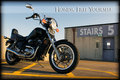
Babes Magnet Wunderbike by AmeedEl-GhoulComment: A great idea, however the lighting on the car is not even enough. Too much of the car is too dark, while the wheels are well lit and bright. The setting of the photo is really good, and with a well lit car, this would have been very good. |
| Photographer found comment helpful. |
| 05/28/2009 10:45:44 PM |
Hackney Carriageby lucienwestComment: A good idea on this. However I feel the crop is awkward, and doesn't seem to fit the image. You have cropped through bars on the grill, and the edge of the bumper..........
A major distraction though is the reflections we can see int eh paintwork. The house, the streetlamp, the trees etc. Eliminating those would have mave a large difference to this image. |
| Photographer found comment helpful. |
| 05/28/2009 10:44:00 PM |
The Monster You Want To Wake You Up.by power47Comment: A different view from most of the other images, and a nice effect created with the headlights. An interesting spot to take the photo, and one that gives interest to the photo. not really sure about the light shinning through the two bridges, not sure you could have done much about it either. However, a little extra dispersed light to light the car a little bot more would have been great, just so we could see the hint of deatil in it, while it still being dark. |
| Photographer found comment helpful. |
| 05/28/2009 10:41:37 PM |
1985 HONDA SHADOW VT500Cby tryals15Comment: ice composition of this image. The picture is well balanced, clean and interesting. I think the crop on this is pretty good as well, and the presentation of it is also very good from an advertising sense.
Prehaps the bike could have been a little bit lighter, just so that we can see a little more detail in it. Being Black, it is hard to get the right level of exposure to show detail, while still being the orrect colour.
A good submission for the challenge |
| Photographer found comment helpful. |
| 05/27/2009 10:53:44 PM |
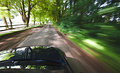
Let BMW move youby bob_bobskiComment: There have been a few of these. I feel this one has the movement right that makes my eyes go weird when looking at the image, and making it feel like I am moving through the photo. However the camera angle on this seems wrong, kind of like I am hanging out the window here (which maybe I am) Just that angle, and the unbalanced amount of car I get as a result is a negative. Exposure time was really good, camera placement in a more central position would have really made this (especially if I then got to see the BMW badge, which all advertises would insist on being in the shot) |
| Photographer found comment helpful. |
| 05/27/2009 10:49:39 PM |
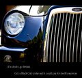
Smoothby HipychikComment: With a car with this much character, it amazes me why you would photograph the grill like this. The big silver grill jumps out and draws all the attention, rather than the great lines of the car. Elements to both sides are also distracting and don't add to the image in a positive way. |
| Photographer found comment helpful. |
Home -
Challenges -
Community -
League -
Photos -
Cameras -
Lenses -
Learn -
Help -
Terms of Use -
Privacy -
Top ^
DPChallenge, and website content and design, Copyright © 2001-2025 Challenging Technologies, LLC.
All digital photo copyrights belong to the photographers and may not be used without permission.
Current Server Time: 08/10/2025 10:51:22 PM EDT.