| Image |
Comment |
| 08/15/2009 07:43:40 AM |
Lord of the Fliesby EmerkazaComment: Without the title, i could have guessed this as Lord of the Flies, which means you have met the challenge exceptionally well. I also love how you set out to create this, while so many others have used it as a free study and shoehorned in.............Composition is really good, I think the cropping of the head adds to the photo. Depth of field works really well also............By far one of the best in the challenge..Good Luck |
 Photographer found comment helpful. Photographer found comment helpful. |
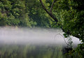
| 08/15/2009 07:41:43 AM |
Ghost Ship by scottiehamComment: Greatbeffect on this......for me this photo really works for the challenge, and is quite topical also...........Nice balance acheived to give the ghost look while preserving enough details......the border also seems to balance it as well....... |
| Photographer found comment helpful. |
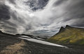
| 08/08/2009 09:42:48 AM |
On the mountainby BrinComment: Juliet asked someone to have a look at this, so I will go through it FWIW - I hope a few others do as well.
I think maybe the crop is a little awkward, and that is what is throwing the sshot out a little. The ccrop given is very square, whereas I think maybe it needed a more landscape crop to it. The two peaks on the right are a little too far to the right, adn there looks litle something is happening on the far left as well. A wider crop would still preserve the great sky here too.
The exposure is great. The range of shades through the sky is a highlight of the shot. from the brights through to the darks, with the black in the foreground of the shot. The green contrasts so well agaist the rest of the naturally almost black and white image. Maybe it is even that the green is a little too far to the right that throws it off a little...........
I love wide visas, and panoramic crops (which are often not liked on this site) so maybe my views won't reflect the widere group, but a more landscape crop would have worked better for me............ |
| Photographer found comment helpful. |
| 07/21/2009 11:48:23 PM |
Iceberg Melting on a Smooth Wave by JohannesFrankComment: The iceberg seems to be just slightly off centre.......Cropping a little off the left to bring it onto the third line would have been a stronger composition..........A slightly closer crop also I think would have helped, so we could see some more of the detail in the ice........... |
| Photographer found comment helpful. |
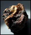
| 07/21/2009 11:46:12 PM |
Elementalby colorcarnivalComment: With such a simple composition, I think the entire rock needed to be in focus. Also, the light needed to be more even, rather than having a large area in shaddow...... |
| Photographer found comment helpful. |
| 07/21/2009 11:44:24 PM |
Tectonics: Mountains & Wavesby tSkyeComment: I really like the composition of the photo here, however the colours don't really seem to work. The overall image also appears to be a little soft |
| Photographer found comment helpful. |
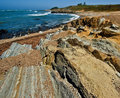
| 07/21/2009 11:43:28 PM |
Reef with Tafoni Sandstone Outcroppingby sfaliceComment: I think a greater depth of field would have worked better here. Keeping the point in focus would have added to the photo, rather than the slightly OOF area it currently is. |
| Photographer found comment helpful. |
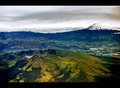
| 07/21/2009 11:40:01 PM |
Andean Geologyby elsapoComment: A shame that the clouds means the mountains do not contrast well against the sky, as that would have then made this scene really work well. I like the different colours through the green land, maybe this colour could have been pushed a little further to make it more of a feature fo the photo. |
| Photographer found comment helpful. |
| 07/21/2009 11:38:51 PM |
Vesicular Basaltby QuadrajetComment: An interesting subject. The crop on the sides though is a little tight, as is the crop above. A little mmore space would hve balanced the photo |
| Photographer found comment helpful. |
| 07/21/2009 11:38:09 PM |
In the Time Before Manby ElaineComment: the mist effect through this photo works well..........not exactly what i had in mind for this challenge. teh lighting here is really good, as you have kept the detail well in the dark areas. |
| Photographer found comment helpful. |
Home -
Challenges -
Community -
League -
Photos -
Cameras -
Lenses -
Learn -
Help -
Terms of Use -
Privacy -
Top ^
DPChallenge, and website content and design, Copyright © 2001-2025 Challenging Technologies, LLC.
All digital photo copyrights belong to the photographers and may not be used without permission.
Current Server Time: 08/05/2025 11:22:47 AM EDT.