| Image |
Comment |
| 10/14/2009 01:47:01 PM |
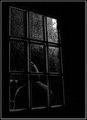
Somebody's Watching Meby colorcarnivalComment: Perfect for this challenge. A really good image where the window makes the photograph, rather than being a distraction. The pporcessing for this is spot on, the overall dark feel perfect. Really like the crop as well. The light from the top right of the window is really good, adding to the effect as well and the overall lighting.......Nothing to suggest cause I think you got this pretty much spot on..........well done |
 Photographer found comment helpful. Photographer found comment helpful. |
| 10/13/2009 04:56:03 PM |
Classic case of the smush face. by abrantonComment: The centred composition for me doesn't work. She is looking to the right, to nothing. The bands from the door, framming etc causes seperation in the photo which also effects the overall photo |
| Photographer found comment helpful. |
| 10/13/2009 04:53:15 PM |
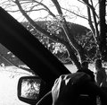
drive-byby tnunComment: I don't feel that the car window, or mirrow, add to the photo. The subjects are small, hidden and merge into the background. |
| Photographer found comment helpful. |
| 10/13/2009 04:51:28 PM |
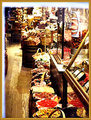
Country Storeby dtremainComment: Ok.......Firstly, the gold border I find is a distraction. The white band on the left and top is even more so. Both jump out, rather than just compliment the photo, so neither work for me. The clutter of a country store is always there, but is not something that really works for this photo. There are so many things competing for my interest, so much so that the window areas are not primary subjects here. The centred line of baskets dows not work. It is too central, and leads to nowhere, just more clutter......There are also overexposed areas, and the colours really dont work well..... |
| Photographer found comment helpful. |
| 10/13/2009 04:31:10 PM |
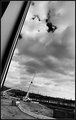
Drowning in Progressby bspurgeonComment: Not really sure that the window frame really adds to the overall photo. The black and white processing does work well here. You have both true white and black, without large overexposed areas, which is always the challenge in these photos. The large sky area does not quite have the interest to really take up this much of the photo, as the subjects, the cranes, are pretty small here........ |
| Photographer found comment helpful. |
| 10/12/2009 06:02:27 PM |
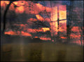
eye in the skyby skewsmeComment: The connection to the topic is clear. The overlaid image effect is interesting, but creates a messy image, where the eye does not know where to look on the page, but also what depth it should be focussed at. Should I be concentrating on the window, the fence, the trees, the sky.........but it also is appealling on a different level, while other images are following the rules, this breaks most of them, and creates a much more complex image........... |
| Photographer found comment helpful. |
| 10/12/2009 03:48:37 PM |
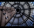
Windows 2000by hotpastaComment: Ahhh. Makes me think of home........A shame that you didn't have blue sky to really show up against the Melbourne Central Cone........The Shot Tower in from the side helps lead the eyes into the great Geometric shapes that the cone produces.......Really like the border that you have on this as well....Adds to the geometric effect of the whole image......... |
| Photographer found comment helpful. |
| 10/08/2009 02:25:15 AM |
|
| Photographer found comment helpful. |
| 10/05/2009 04:13:02 PM |
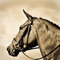
Dignityby reephotoComment: This is going to sound weird, but couldn't you have mirrored this image?
For some reason, head shots of horses like this seem to work a little better if they are facing right............I know, weird, but just a thought.........
I like the processing, the effect you have acheived is different, and as a result, this does stand out. Not sure on the square crop though. I would have cropped a little off the top, and given a little more to the left (or right if you mirrorred it) giving the horse somewhere more to look........... |
| Photographer found comment helpful. |
| 10/05/2009 04:09:43 PM |
Shipwreck by OdieComment: Great locationb....Will be interested to see where this is after the challenge. Maybe just a little close though, the crop seems to be a little too close for me. The placement is good, but a love panoramic, and feel a little space to the left, and even more to the right (keep the boat on the third line) would have made a stunning view, even better that this is. Long exposure works really well, coloours are great as well................ |
| Photographer found comment helpful. |
Home -
Challenges -
Community -
League -
Photos -
Cameras -
Lenses -
Learn -
Help -
Terms of Use -
Privacy -
Top ^
DPChallenge, and website content and design, Copyright © 2001-2025 Challenging Technologies, LLC.
All digital photo copyrights belong to the photographers and may not be used without permission.
Current Server Time: 08/05/2025 04:07:43 AM EDT.