| Image |
Comment |
| 01/20/2010 05:25:37 PM |
Rainmanby RetroesqueComment: The Waterwall.........I miss Melbourne. I remeber as a kid playing with the waterwall, and complaining when they were thinking of not keeping it when they renovated the NGV.
Like the use of the security guard, and the placement in the bottom corner I feel works. It is a shame that you could not get it without the people in the upper part of the image. Haveing the blank negative space would have produced a stronger image. |
 Photographer found comment helpful. Photographer found comment helpful. |
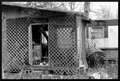
| 12/21/2009 05:39:04 PM |
Watch Your Stepby picklenoseComment: The composition of this is a little messy, nothing really grabs the eye as the subject..........The B&W does not really work for me here....and the crop is very tight |
| Photographer found comment helpful. |
| 12/21/2009 05:37:15 PM |
|
| Photographer found comment helpful. |
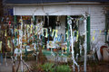
| 12/21/2009 05:36:49 PM |
Bubba's Holiday Decorby npaselComment: Tight crop, multiple elements all trying to get attention....Composition really needed further work to make this image |
| Photographer found comment helpful. |
| 12/21/2009 05:36:01 PM |
|
| Photographer found comment helpful. |
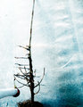
| 12/21/2009 05:35:00 PM |
Skeletonsby glad2badadComment: Yes............Balanced, works.....not sure on the border, and some additional grass could have helped a little on balance......... |
| Photographer found comment helpful. |
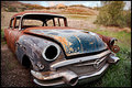
| 12/21/2009 05:34:01 PM |
Parked and Forgottenby edmengComment: Great subject, but the crop is too close for me........everything is too close to the edge, without a need to be, and without emphasizing anything for me either |
| Photographer found comment helpful. |
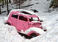
| 12/21/2009 05:33:09 PM |
Pink Carby justineComment: Contrast, colour, it works........The colour alone in this image makes it stand out past many others. The snow really works here, and is perfect for the image.....great when nature works. A different crop maybe could have improved this......it seems a little too centred in the frame for me....... |
| Photographer found comment helpful. |
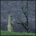
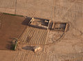
| 12/21/2009 05:31:32 PM |
Parchedby CorySmithComment: Very Parched, and the image does show a different type of rural decay.......for the message you have behind this, you get a good score from me. While most people sort out a falling down building, you (intentionally or otherwise) manage to tell a story, and make a statement. A different placement of the elements may have added additional effect, keeping the buildings to one side more and an expanding nothingness would have sold the message further. however, a great image that can have a story as well........ |
| Photographer found comment helpful. |
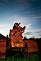
| 12/21/2009 05:28:51 PM |
A Dying Craftby odriewComment: The subject here is very interesting, however I feel that a more interesting angle could have produced a better photo. The image here seems a little flat, with no depth to it. The tracks could have produced some interesting elements in this.........the crop is a little too close as well to make this work |
| Photographer found comment helpful. |
Home -
Challenges -
Community -
League -
Photos -
Cameras -
Lenses -
Learn -
Help -
Terms of Use -
Privacy -
Top ^
DPChallenge, and website content and design, Copyright © 2001-2025 Challenging Technologies, LLC.
All digital photo copyrights belong to the photographers and may not be used without permission.
Current Server Time: 08/05/2025 12:40:22 AM EDT.