| Image |
Comment |
| 12/09/2003 01:57:43 PM |
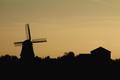
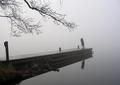
Sunset Skylineby AzrifelComment: Which is the main shape your trying to present? that is the question here. It's a very nice image, but I think you should have concentrated on one central figure. 5 |
 Photographer found comment helpful. Photographer found comment helpful. |
| 12/09/2003 01:55:25 PM |
|
| Photographer found comment helpful. |
| 12/09/2003 01:54:39 PM |
|
| Photographer found comment helpful. |
| 12/09/2003 01:53:49 PM |
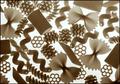
Can You Taste Shape?by adineComment: This is a fun treatment and image, but I'm not have a particular shape dominate for me. 5 |
| Photographer found comment helpful. |
| 12/09/2003 01:53:12 PM |
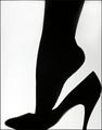
Air Shapesby vtruanComment: I'm not having a particular shape be the focal point. A good image in general 5 |
| Photographer found comment helpful. |
| 12/09/2003 01:47:00 PM |
On the Shy Sideby OneSweetSinComment: Greetings from the Critique Club
Definitely meets the challenge topic, well composed.
There have been a number of things pointed out by the commentors.
As odd as it sounds, it's just a tad soft. I know, this is a soft focus challenge, but as much as there is here it causes the image to be lost.
If the colours, esp. of the lipstick had been more pronounced I think this much "fogging" could have worked. For this level of soft the image behind must be very strong.
I'm also not sure about the colour gradiation of the lipstick, the orange hues just aren't working.
I think this is a very good portrait. If you can go back to the original and not loose the colours (assuming they are there) I would suspect a top notch photo.
I hope this helps.
JC
|
| Photographer found comment helpful. |
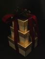
| 12/08/2003 11:41:59 AM |
A Christmas Surpriseby StevePaxComment: Greetings from the Critique Club
This is a nice idea. I like the angle you used.
It does appear, though, to be out of focus rather than soft focus. A common mistake.
By haveing the image sharply focused and using any number of ways to create the "soft" ambience it makes for a more clean and detailed image.
I like dark images. I wouldn't brighten this anymore except for just a bit more on the articles at the top and to match the highlight on the top box with the rest of them.
I hope this helps,
JC
|
| Photographer found comment helpful. |
| 12/08/2003 12:10:59 AM |
|
| Photographer found comment helpful. |
| 12/08/2003 12:01:21 AM |
|
| Photographer found comment helpful. |
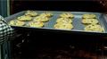
| 12/05/2003 12:26:32 PM |
Freshly Bakedby amcraigComment: Greetings from the Critique Club
and welcome to the site.
This is a good first effort for a challenge. It definitely fit the criteria of the challenge.
A number of comments have already pointed out some the weaknesses.
The crop and angle are the two major points I see.
If you could bring the level of view up, to focus more on the cookies and the top part of the oven I think it will help. A little light on the interior of the oven would accent it. I could see using a smaller baking sheet with fewer cookies so you would have more space around your central theme.
I do think that the oven mitt is fine, it creates a sense of movement, your pulling the fresh cookies out of the oven. I might find a more neutral one though.
I hope this helps.
JC |
| Photographer found comment helpful. |
Home -
Challenges -
Community -
League -
Photos -
Cameras -
Lenses -
Learn -
Help -
Terms of Use -
Privacy -
Top ^
DPChallenge, and website content and design, Copyright © 2001-2025 Challenging Technologies, LLC.
All digital photo copyrights belong to the photographers and may not be used without permission.
Current Server Time: 09/04/2025 07:35:39 AM EDT.