| Image |
Comment |
| 02/16/2012 12:45:27 AM |
Pretty in Redby aliquiComment: As I said, I did remember this off the top of my head, so it stuck in there after looking at it and it also struck me a bit when I saw it, but not enough to originally make me comment.
I like all the texture you've got going on, and the light on the leafy bits is really quite nice, as it sculpts them very well. I like how three dimensional the whole thing feels. I also like how the petals sorta blend together, they look much more ephemeral in comparison to the green parts. Your choice to go with a photo of a flower that is largely not flower is interesting, but I like it. It's nice to see flowers from ways we don't normally. It's a very nicely done floral shot, in my mind. |
 Photographer found comment helpful. Photographer found comment helpful. |
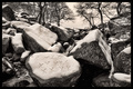
| 02/15/2012 08:59:58 PM |
February in Florida...ROCKS !!!by CaptUnderpantsComment: Somewhat surprised you got no comments on this one, Don.
I'd have voted this a 5, personally.
It's a generally nice scene to me, but a landscape with rocks was a very common interpretation, so for an entry to go above a 5 with that subject, it'd really have to do something for me. I would say there's nothing inherently wrong with the shot, but it also doesn't have anything that really makes it super remarkable to separate it from the pack. Any time your theme matches something that is done by others in the challenge or has been done a lot on DPC, you really need to separate yourself from that pack in order to do well with it.
Also, I like the processing on this one overall more than on the other, but I would've toned down the sky a little. The blue is a bit extreme/dark, and not in a way that I would expect from a polarizer. I might have included a bit more of the crest of rocks to fill out the composition a bit more. It could be my screen (I'm at work) but you have some very light halo on the very top point of the rocks. Overall, a good photo that I would say doesn't really suffer from any particular flaws, but more that it doesn't separate itself from the rest. It's a frequent problem with landscapes, and hard to avoid a lot of times. |
| Photographer found comment helpful. |
| 02/15/2012 08:51:28 PM |
13 - nil unlucky for some by GilesComment: I thought there might be a practical reason you hadn't, but thought that I'd share all my thoughts. I saw the alternate with the Euro, but it seemed to small in the scene to really have much of an impact, hence why I liked this one.
As for the light- it works fine here. I guess you could've boosted your whites via curves so that the snow was closer to white, but it's not a huge deal and a preference thing. As is, I think the off-white snow works well with the general feel. |
| Photographer found comment helpful. |
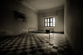
| 02/15/2012 11:45:02 AM |
Tuol Sleng - S21by cosneyComment: Conveys the gravity of the locale well. Curious if this was actually taken at the museum or if it's a title that fits the mood. |
| Photographer found comment helpful. |
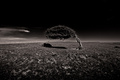
| 02/15/2012 06:11:25 AM |
Solitudeby HawkinsTComment: Probably my fave for this challenge. The photo feels so static, but the tree has obviously had a tortured life. It feels caught in time here. The centered comp works well, I think. |
| Photographer found comment helpful. |
| 02/15/2012 06:05:08 AM |
13 - nil unlucky for some by GilesComment: Saw your post in the forums-
I prefer this to your alternates.
I didn't vote on this challenge, but I think it is a more interesting combination of the elements than many others on here. If I were taking this, I'd consider doing scissors in all the snow in the scene, but that's just me.
As far as discussing my thoughts on your actual image-
I like it. The snow seems a little underexposed, but fits with the overall toning. I'd vote it a 6, but I normally vote a bit lower than most on here. My voting sorta goes like this 5=ho hum but nothing that really flaws it outright 6= well developed idea or exceptionally captured boring entry 7= well developed idea that engages me 8=wow, makes instant impression 9=nothing I can really think of that would improve the shot 10=I want it on my wall.
So, while I think you had a good idea, and one which was original, it didn't particularly engage me personally, which is what separates any 6 from higher scores for me. Just a personal thing I guess, for me. |
| Photographer found comment helpful. |
| 02/15/2012 02:33:25 AM |
Benevolent Professor Tettigoniiby AlynComment: The processing is a bit over the top, in a lot of ways, but I think the end product is very cool This has taken on a look entirely different from simply a normal macro of a katydid, bordering instead on an interesting rendering of a character from a pixar film or something. Pretty cool shot. |
| Photographer found comment helpful. |
| 02/15/2012 02:23:22 AM |
isolatedby lobrinComment: Excellent street capture. Like this very much. |
| Photographer found comment helpful. |
| 02/15/2012 02:06:51 AM |
Touchdownby HighNoonerComment: Wonderful sense of scale on this one. Very gloomy, strong. Well done. |
| Photographer found comment helpful. |
| 02/15/2012 02:06:18 AM |
|
| Photographer found comment helpful. |
Home -
Challenges -
Community -
League -
Photos -
Cameras -
Lenses -
Learn -
Help -
Terms of Use -
Privacy -
Top ^
DPChallenge, and website content and design, Copyright © 2001-2025 Challenging Technologies, LLC.
All digital photo copyrights belong to the photographers and may not be used without permission.
Current Server Time: 06/21/2025 02:12:39 AM EDT.