|
|
|
Showing 1681 - 1690 of ~1875 |
| Image |
Comment |
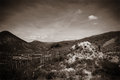
| 03/15/2009 07:47:14 AM | Tapped outby snafflesComment: The Critique Club has come at long last, in the form of my glorious comment!
Upon first glance, I notice that the composition doesn't seem too strong. It feels almost as though there should be more negative space, or perhaps that it should be placed in different areas. It's hard to say what composition I would prefer for this subject, however, but it doesn't feel quite right as it is. Perhaps a lower angle?
It is a good example of high key lighting, and is also suitable for the challenge, in my eyes. I think I'm correct in assuming that you lost some points from many votes because your background wasn't TECHNICALLY white, but I like the light sepia tone as it adds an almost aged feel to the photograph. Having looked through the rest of the challenge afterward, yours is probably the most "unwhite," which singles it out. The sepia makes me think of an old relic of a photo that's been aging to perfection in an album for years on end. In short, I like the effect. I also think you might have lost some points from viewers because of the title and a lack of understanding on their behalf, since they couldn't view the comments you left for an explanation.
Anyway, I enjoy your photo, and hopefully you did too.
-Derek |  Photographer found comment helpful. Photographer found comment helpful. |
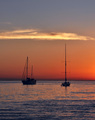
| 02/13/2009 08:17:38 AM | Red Sky at Night, Sailor's Delightby kaiser_chiefComment: Hello from the Critique Club-
My initial impression of your shot is that the colors are very calming. The saturation is good, and the tones are somewhat soft and subdued, which leads to a soothing presentation. Sails lowered and moored in the bay, the yachts certainly add to this effect, as do the relatively calm waters of the bay. Overall, the scene is exposed properly, though I would say there is a small sliver of the cloud that seems to be a bit overexposed. I might suggest bringing out a bit more detail in the hulls of the yachts, since they are focal points. Currently, they are a bit in the middle, being dark but not quite a silhouette.
In terms of composition, you have carefully placed your subjects in regards to the rule of thirds, which I think is fitting for the scene. Using the cloud as a delineation between the upper and middle third is a convenient and well thought out approach. Speaking of the placement of the yachts, I also like that they are in different angles relative to the camera, and furthermore that their masts are different lengths and they are slightly different distances from the camera as well. This adds a bit of a dynamic nature to the photo. Having said that, I think your score would have been higher had the scene been more dynamic or dramatic. If you look at the top finishing sunsets for this FS (and really, most all FS), they all have elements that make them dynamic, be they intense, fiery colors, crepuscular rays, or something moving, such as the surf. These elements all add interest and pop to an image, which are especially necessary elements in a FS. In your scene, it almost seems as though all the change for the night has already occurred and everything will just be going to sleep and getting dark. Including more of the horizon and the gradations of color that would be created closer to the sun might be an example for this, though that would eliminate the option of using the rule of thirds in the exact manner that you did.
I liked your photo, but think that when voters come in to the FS they are expecting a �loud� image to really wow them, whereas yours is a carefully composed and subdued scene more appropriate for a maritime or similar challenge.
| | Photographer found comment helpful. |
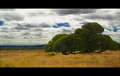
| 02/06/2009 08:58:18 AM | Prelude to a Stormby QikiComment: Hello from the Critique Club!
Initial impression from this shot is the stark contrast between the green of the tree and the brownish yellow of the grass. This makes the tree pop from the foreground well. I think the use of
a polarizer was wise, because the dark blue where the sky is present is a nice addition. The color and saturation of the entire scene is great, but I might have considered lightening the dark areas of the tree a bit, myself. You did a nice job of capturing the varying amounts of light, and the clouds have a
nice amount of contrast to them. There is a small area in clouds, upper left, that looks a bit overexposed, but it is rather insignificant. Several comments allude to your tree being cropped, but on a closer look, it appears that you included the entire tree that is your subject, and that it is background trees that look cropped. That is somewhat distracting, not only because it looks cropped, but also because your subject doesn\'t separate from the background. I assume this only happened because of the spacing of the trees, since you carefully included
the entire tree otherwise. I like the choice of your subject- the way it sprawls along the ground is interesting. Your score may have suffered a bit for the thicker borders, given the increasing displeasure with borders lately. My opinion is that it is a bit thick, but not overwhelmingly so. Lastly, I would associate the title you chose with more ominous cloud cover. This looks like it might be the front part of a warm front, and thus a storm would be somewhat nearby, but your title choice makes me think of more imminent changes.
Personally, I like this image a good deal, and would have assumed a bit higher score than the end result. | | Photographer found comment helpful. |
| 01/28/2009 09:26:45 AM | FLIGHTby thekfactorComment: ====Critique Club====
The first thing that strikes me about this image is the clarity of the gull- and especially the eye. You did a phenomenal job of stopping the motion. This is a bit of a two edged sword, however. On the one hand, you have awesome clarity, to the extent that you can see the bird's pupil clearly, as well as individual feathers. On the other, it makes the flight of the bird (which I think is a focal point) seem very static. Perhaps part of this effect is because the empty space was placed where the bird has already been, as several commenters noted, but it could also be due to the nature of the background. Although it isn't cluttered and therefore doesn't interfere directly with the foreground, it also doesn't add to the subject. Another approach to this shot that you could have tried is a motion pan- this technique does require practice but would be well suited to this. Having a slightly more active background, combined with a pan, would blur the background but also bring out the motion of the bird. This would add difficulty, but also improve the aesthetics of your shot. As it is, although the ocean backdrop is a nice, soothing scene, it gives no idea of the spatial relationship of the gull, becoming very similar to a blank blue sky.
The colors are very nice and saturated, and the exposure is very good, capturing the lights and darks of the gull (which can be pretty tricky to do). A little bit of additional contrast on the gull might have made it pop from the background a bit more, but I think a different background would have been more beneficial overall.
Keep in mind that a lot of times, for a wildlife shot to score well on DPC, the technicals have to be perfect, and in addition you need either an exotic creature or an exemplary capture of dramatic behavior or setting. Getting these all at the same time makes it 100% a game of timing. I think a lot of voters may have seen this just as a photo of an everyday gull, and voted it down because it wasn't terribly catchy in that sense.
All in all, great job and just keep plugging away until you get that perfect behavior with the perfect background with the perfect focus. Sounds easy, doesn't it? ;) | | Photographer found comment helpful. |
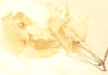
| 01/08/2009 10:43:22 PM | Leafs and Flowers - Eternal Friendship.by pedrobopComment: It's difficult to see the structure of the flower, partly because your depth of field is shallow and partly because of the nature of the flower- the way that it is oriented makes it difficult to determine that it is a flower (to me). I usually view an image first and the title second, and in this case I wasn't quite sure what I was looking at until I read the title. Some will penalize for this. Colors and textures are nice though. All in all I think the biggest thing is DoF- more in the top left would be nice to keep the leaf in focus (or flattening the leaf more so it is in the same focal plane). | | Photographer found comment helpful. |
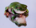
| 12/13/2008 08:19:36 AM | frog reflectionsby ShutterPugComment: And to think, I laughed at those who said frogs were the new water drop at DPC...
The crazy eyes are isolated nicely by your choice for focus on this, and the glistening skin really gives you an idea of the skin's texture (as well as how much it appears to be glued to the glass). | | Photographer found comment helpful. |
| 12/13/2008 08:16:12 AM | IMG_5440by ryandComment: I like the PP on this- nice choice doing it sepia. I like the vignette, but it's a little heavier than I might perhaps have done it. | | Photographer found comment helpful. |
| 12/13/2008 08:13:53 AM | Hickey 9by TCGuruComment: So now we all know why you said it was stolen! It was an underhanded attempt to garner comments! ;)
I really like this- especially how the lighting tapers off so nicely into shadow. One thing though: it is ever so distracting that the hand on the right is ever so slightly lower and includes more arm, so it looks a bit off balance, but I obsess over details, so it's probably just me obsessing. | | Photographer found comment helpful. |
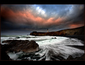
| 12/13/2008 07:59:07 AM | Pacific Daybreak by DrAchooComment: This was my favorite from the challenge. Love the blurred foam, and the rocky outcropping extening out with the lighthouse is great. The clouds really add a sense of the dramatic to this, emphasizing the magnitude of everything. A smidgeon of the sky appears blown out, but that's nitpicking. | | Photographer found comment helpful. |
| 12/13/2008 07:22:07 AM | | | Photographer found comment helpful. |
|
Showing 1681 - 1690 of ~1875 |
Home -
Challenges -
Community -
League -
Photos -
Cameras -
Lenses -
Learn -
Help -
Terms of Use -
Privacy -
Top ^
DPChallenge, and website content and design, Copyright © 2001-2025 Challenging Technologies, LLC.
All digital photo copyrights belong to the photographers and may not be used without permission.
Current Server Time: 06/17/2025 05:42:32 PM EDT.
|