The Critique Club has come at long last, in the form of my glorious comment!
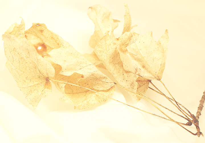
Upon first glance, I notice that the composition doesn't seem too strong. It feels almost as though there should be more negative space, or perhaps that it should be placed in different areas. It's hard to say what composition I would prefer for this subject, however, but it doesn't feel quite right as it is. Perhaps a lower angle?
It is a good example of high key lighting, and is also suitable for the challenge, in my eyes. I think I'm correct in assuming that you lost some points from many votes because your background wasn't TECHNICALLY white, but I like the light sepia tone as it adds an almost aged feel to the photograph. Having looked through the rest of the challenge afterward, yours is probably the most "unwhite," which singles it out. The sepia makes me think of an old relic of a photo that's been aging to perfection in an album for years on end. In short, I like the effect. I also think you might have lost some points from viewers because of the title and a lack of understanding on their behalf, since they couldn't view the comments you left for an explanation.
Anyway, I enjoy your photo, and hopefully you did too.
-Derek |