| Image |
Comment |
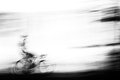
| 05/09/2010 06:19:45 AM |
slackby posthumousComment: Awesome movement. I love how both the rider and the bike dissolve into motion. The essence of transport, a fleeting representation of that which was.
Like a painting. |
 Photographer found comment helpful. Photographer found comment helpful. |
| 05/09/2010 06:11:50 AM |
Georgiaby JimiRoseComment: The submitted photo is great for its capture of raw energy and excitedness. But it is not useful to the subject. This, however, is an awesome useful depiction of her that she can more readily use. Both are great captures; this is more practical for her. Exceptional capture of emotion and life. Good job. The faded processing works great. |
| Photographer found comment helpful. |
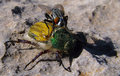
| 05/09/2010 04:31:56 AM |
Bingham Beetle with Flyby CoryComment: As an amateur entomologist, I'm not familiar with the term Bingham beetle, but after some perusing I couldn't find a more accurate moniker... definitely a scarab, cockchafer perhaps. The fly is a member of the Sarcophagid genus I think.
I'm surprised at the reflectivity of the beetle's body/legs. Odd.
Was the beetle deceased, or was this just chance? |
| Photographer found comment helpful. |
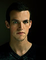
| 05/09/2010 04:05:46 AM |
Forever Youngby SenayComment: To me, I guess that the final product and the original are completely different and can't be compared...
What I mean is that there was a lot of potential to go with an actual accurate portrayal of the original, but the final product is very stylized. How I would rate it depends upon which you're aiming to accomplish. This, here, is a great stylized image in my opinion. It has a definite green cast to it, but it works well for a stylized portrait.
If I were going with the original and looking at ways to improve, I would think about lowering the keylight and making it have a higher angle (more offset to the right) to make things a bit more moody in shot instead of afterward. It seems as though you've lowered it anyway, so that's something to consider. I tend to underexpose my photos a LITTLE because it seems easier to pull from under than over. As was already mentioned, eyes are a bit over the top, but it works well as a stylized photo.
Consider a rimlight to separate things a bit more, or just hair in general. |
| Photographer found comment helpful. |
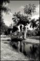
| 05/09/2010 02:29:34 AM |
Palm Lakesby ManicComment: Hey there  Manic Manic- you testing to see what sort of Critiques are being put out by the Club these days? ;0
First thoughts on seeing your photo-
My preference for Black and White is to maximize contrast and really nail the gamut of tonality to increase the dramatic nature of the BW, because I feel like that�s what it works best for. However, I see you�ve taken a bit of an opposite approach, and I rather like where you�ve taken things. You obviously wanted to make things a bit dreamier, what with the application of gaussian blur, and this was well done. The lack of prominent contrast works wonderfully with the blur, and it also fits the scene. I think of palm trees as tropical, and somewhat dreamy in a vacation sense (perhaps I wouldn�t associate palm trees with dreamy vacations if I didn�t live in Colorado), and you�ve developed a compelling theme through combining these elements (similar to what Deb said).
While I think you really nailed that, the subject matter itself isn�t terribly compelling to me. There isn�t clear points for the viewer to focus upon, and the emphasis on subject is limited by the other intruding elements in the scene. There�s really a lot to look at, but it�s at the awkward point where there is no complete surrender to cluttered madness and it isn�t a clearly defined and simplified scene- it�s in a nether region. I think either more or less subjects would have benefited things. It would also be nice if there was a bit more detail in the clouds, though I understand you had a very contrasty scene so you would�ve been forced to sacrifice more of the palm fronds to complete shadow.
|
| Photographer found comment helpful. |
| 04/27/2010 02:10:04 AM |
|
| Photographer found comment helpful. |
| 04/21/2010 03:41:24 PM |
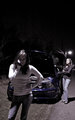
Strandedby SEGComment: You know, looking at ths, I don't really know what to suggest. You have many elements that improve a photo... women in good shape, slight DoF effect, and it meets the challenge. But I would say that for some reason things are not active or dynamic enough. Lighting up the left subject's face would have really added to things, but required an additional strobe. Concept is good though. |
| Photographer found comment helpful. |
| 04/21/2010 12:37:00 AM |
Sunday Reading: Mark 6by northeboundComment: You've just got too contrasty a scene here to attempt to get a normal type of exposure (not embracing the super contrast). I'd consider almost like a low key style, high contrast. The colors are washed out from the direct sunlight, so I'd go BW instead, as well. Crop a bit off the right, it seems to be awkwardly placed for some reason. Here's what I mean (all basic legal).
 |
| Photographer found comment helpful. |
| 04/21/2010 12:23:16 AM |
|
| Photographer found comment helpful. |
| 04/21/2010 12:19:33 AM |
|
| Photographer found comment helpful. |
Home -
Challenges -
Community -
League -
Photos -
Cameras -
Lenses -
Learn -
Help -
Terms of Use -
Privacy -
Top ^
DPChallenge, and website content and design, Copyright © 2001-2025 Challenging Technologies, LLC.
All digital photo copyrights belong to the photographers and may not be used without permission.
Current Server Time: 06/21/2025 05:51:14 PM EDT.