| Image |
Comment |
| 06/11/2003 01:27:06 PM |
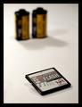
Photoworld Magazine: Is digital taking over?by auiComment: Great concept, but to work as a magazine cover, you might have to rethink your placement of the rolls of film in proximity to the disk. I know it may seem like I'm being too picky, but when I look at the shot, the first thing I'm thinking of is "would this work as a magazine cover?" Once you add the words that appear on any magazine cover, it might not work as it is. However, I do like the shot a lot, especially since you created something that fits neatly into your article title. |
 Photographer found comment helpful. Photographer found comment helpful. |
| 06/11/2003 01:22:04 PM |
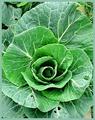
The Kitchen Gardenby LizzComment: This is one of my favorites. It would look great as a magazine cover because of the placement on the page, but also because the colors and textures are so vivid. It would have been nice had a little bug not gotten to the leaves since I would think a gardening magazine of any kind would try to feature a near-perfect plant on their cover...unless of course the cover article is about how to deal with plant-eating bugs. LOL Anyway, I think you fit the criteria of the challenge very nicely with this shot. |
| Photographer found comment helpful. |
| 06/11/2003 01:18:08 PM |
|
| Photographer found comment helpful. |
| 06/11/2003 01:09:42 PM |
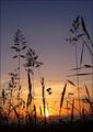
Outsideby bosniakComment: I can definitely see this as a magazine cover. You have allowed room for the wording that would appear on the front and your shot certainly pertains to the content of the magazine. The amber behind the silhouette of the grass is very beautiful. |
| Photographer found comment helpful. |
| 06/11/2003 01:02:12 PM |
Natureby shadowComment: Different cropping might have allowed me to see it differently, but it just doesn't look like a magazine cover to me. |
| Photographer found comment helpful. |
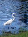
| 06/11/2003 12:57:12 PM |
Wildlife Conservation....http://wcs.org/by GraciousComment: This is a nice photo and very appropriate for your magazine cover. The placement of the subject allows for the magazine title and article blurbs. As far as the photo itself is concerned, I particularly like the ripples of the water toward the top of the page. |
| Photographer found comment helpful. |
| 06/11/2003 12:54:49 PM |
Retired Livingby jdw91479Comment: Nice concept but the photo doesn't seem cropped for a magazine cover so it doesn't quite fit the challenge for me. I also think it would have been more effective on a bright, sunny day rather than the overcast. |
| Photographer found comment helpful. |
| 06/11/2003 12:11:25 PM |
|
| Photographer found comment helpful. |
| 06/10/2003 04:26:37 PM |
|
| Photographer found comment helpful. |
| 06/10/2003 04:25:05 PM |
|
| Photographer found comment helpful. |
Home -
Challenges -
Community -
League -
Photos -
Cameras -
Lenses -
Learn -
Help -
Terms of Use -
Privacy -
Top ^
DPChallenge, and website content and design, Copyright © 2001-2025 Challenging Technologies, LLC.
All digital photo copyrights belong to the photographers and may not be used without permission.
Current Server Time: 08/04/2025 04:41:32 PM EDT.