| Image |
Comment |
| 08/18/2003 08:34:57 AM |
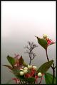
Early Fall Fruitsby pitsamanComment: This is one of my favorites of the challenge. Absolutely beautiful in every way. The placement on the page, the softness of the center branch in the background, the sharp focus of those in the fore, the perfect lighting...but most of all, that splendid contrast of the red against all the different shades of green. Just fantastic. A 10 from me if I could give you a vote!! |
 Photographer found comment helpful. Photographer found comment helpful. |
| 08/18/2003 08:31:37 AM |
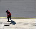
Tidy Up!by RuchartComment: I liked this shot as a thumbnail, but opening it up, I'm even more curious about it. I figured it was a janitor cleaning up a parking lot, but this person's clothing and helmet suggest something more. He almost looks like a racer of some kind, which makes the idea of him tidying up a little more intriguing. What is he cleaning up? Debris from a crash? Is he a motorcyclist cleaning up stuff from the track that might cause a crash? You have taken your interpretation of negative space to create a picture for the imagination to fill in the blanks. Always my favorite kind of shot. |
| Photographer found comment helpful. |
| 08/18/2003 08:23:34 AM |
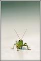
Hopperby JackoComment: I liked this as a thumbnail which is why I opened it up larger to comment on it (I can't vote). I was a little disappointed that the grasshopper's body is not in focus, but I suppose that's either intentional or unavoidable given his...er...pose (do grasshoppers pose? LOL). Anyway, I love his placement on the page, the way he is looking straight on into the camera, the soft reflection underneath him and definitely your use of negative space. Cool picture. Thanks. |
| Photographer found comment helpful. |
| 08/18/2003 08:18:59 AM |
Trinity by crabappl3Comment: Every once in awhile, the camera manages to capture something truly wonderous and this is definitely one of those shots. Not only have you taken my breath away with the beauty of your obvious center of focus, but you have captivated my imagination as I study the clouds at the top of the frame and see the "angel" watching over this lonely little grave. I think the sepia works wonderfully here, disallowing color to detract from these amazing images. The ONLY distraction I see is the very small silhouette in the bottom left corner of the frame which can be easily tweaked out with post-processing techniques. All in all, a terrific use of negative space. A 10 from me (if only I could vote). |
| Photographer found comment helpful. |
| 08/14/2003 02:46:39 PM |
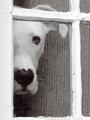
Peekby AleciaComment: This is a great shot. I love how both the dog and the window panes stand out against the darker backdrop and the placement on the page is perfect. I can't give you a vote but if I could, it would be at least an 8. Great job. |
| Photographer found comment helpful. |
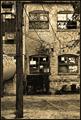
| 08/13/2003 03:55:30 PM |
Industrial Revolutionby crabappl3Comment: I like how the lighting captures the character of the building, particularly the bricks. I also think the tree branches and pole in the front adds depth to the shot that would otherwise have been lost without it. Nicely done. |
| Photographer found comment helpful. |
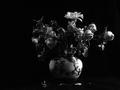
| 08/13/2003 03:48:17 PM |
Alone in Desolationby banmornComment: In this instance, I think centering the still life better would have been more effective. Interesting use of light to just vaguely suggest the flowers for the most part. |
| Photographer found comment helpful. |
| 08/13/2003 03:45:16 PM |
untitledby AesculapiusComment: Interesting photo, nicely executed but I'm having a hard time seeing how you intended it to fit into the theme of the challenge. I do think the shadow extending from the left hand is a little long and perhaps a solid white tabletop would have been more effective than the sheets of paper. |
| Photographer found comment helpful. |
| 08/13/2003 03:38:12 PM |
Aloneby a1leyez0nm3Comment: This is a beautiful photo, but rather than evoking a feeling of desolation, the rays of light shooting out from behind the clouds give me more a sense of hope and peace. The title alone doesn't alter this perception. Wonderful shot though. |
| Photographer found comment helpful. |
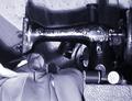
| 08/13/2003 03:34:54 PM |
Her hands lie idle nowby neenee1999Comment: Touching theme and wonderful title. The shot might be a bit more effective though had you managed to light it a little differently to soften that large shadow behind the machine. Also, the resolution does not seem very crisp on my PC. It's not that it's out of focus, it looks to be more of a digital problem. |
| Photographer found comment helpful. |
Home -
Challenges -
Community -
League -
Photos -
Cameras -
Lenses -
Learn -
Help -
Terms of Use -
Privacy -
Top ^
DPChallenge, and website content and design, Copyright © 2001-2025 Challenging Technologies, LLC.
All digital photo copyrights belong to the photographers and may not be used without permission.
Current Server Time: 08/04/2025 08:11:50 PM EDT.