| Image |
Comment |
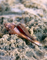
| 01/10/2009 07:53:27 PM |
Beach Discoveryby kellyoComment: Nice composition with the shell along the diagonal. Good use of DOF. Top third looks noisy rather than OOF creamy. |
 Photographer found comment helpful. Photographer found comment helpful. |
| 01/10/2009 07:51:51 PM |
Hiddenby APComment: Great gradients in the sky and water. I love the cool shapes of the islands. The sand theme is not empasized with the islands being so dark. |
| Photographer found comment helpful. |
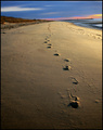
| 01/10/2009 07:48:30 PM |
The Path Less Traveledby jrjrComment: Nice lines (footsteps) winding throughout the photo. Not sure that infinity is in focus, which is usually the case for a landscape. |
| Photographer found comment helpful. |
| 01/10/2009 07:45:30 PM |
le sposiby rinacComment: Cool effect, providing a nice mood. Not sure I can really tell what is sand and what is not. |
| Photographer found comment helpful. |
| 01/10/2009 07:43:48 PM |
|
| Photographer found comment helpful. |
| 01/10/2009 03:30:04 PM |
Layersby k9logicComment: I love the bold colors and all the curves and diagonals. Lighting is a bit on the harsh side. Not sure where the green sand came from as it is not present in any of the jars :) |
| Photographer found comment helpful. |
| 01/10/2009 03:26:24 PM |
Maui Beachby DigitalVitaComment: Cool textures. I like all the muted colors. Not sure the sand lines and shadows work well together. The stem of the leaf standing so upright looks odd to me. |
| Photographer found comment helpful. |
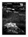
| 01/08/2009 11:36:50 PM |
In Sand, we find our 'Rest'.by WeJayComment: Love the grave as it is emotional and expressive. Deep blacks and bright whites. I am not so fond of the upper half. There is no sense of scale -- are these caskets 20 feet away or houses 200 feet away. I'd crop to the lower half. I am also not a fan of the wide multi-tiered frame. Go simple on frames. |
| Photographer found comment helpful. |
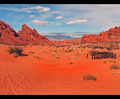
| 01/08/2009 11:31:10 PM |
Valley of Fireby BlackboxComment: I like the softness of the rocks and clouds, which gives it a painting like effect. The tire tracks in the foreground are not as pretty as the rest of the scenary and detract a bit. Perhaps a crop removing the bottom 40% would emphasis the upper part. |
| Photographer found comment helpful. |
| 01/08/2009 11:28:07 PM |
Sea of tranquilityby HighNoonerComment: Reds are really cool. Is this Mars? :) Perhaps move the horizon a little farther from the middle of the photo to emphasize either the land or sky more. Tire tracks kind of remove a little of the ambiance, but what can you do. |
| Photographer found comment helpful. |
Home -
Challenges -
Community -
League -
Photos -
Cameras -
Lenses -
Learn -
Help -
Terms of Use -
Privacy -
Top ^
DPChallenge, and website content and design, Copyright © 2001-2025 Challenging Technologies, LLC.
All digital photo copyrights belong to the photographers and may not be used without permission.
Current Server Time: 06/22/2025 04:25:10 PM EDT.