|
|
|
Showing 861 - 870 of ~922 |
| Image |
Comment |
| 06/19/2003 12:06:40 AM | |  Photographer found comment helpful. Photographer found comment helpful. |
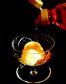
| 06/15/2003 09:35:49 AM | Sweeter Treatby hughletherenComment: *critique club*
Overall
The rich colour palate certainly supports the feeling of a �Sweeter Treat�. You have succeeded in creating a warm atmosphere, a cosy image probably fitting a commercial use if the logo were present. Technically, your choice of aperture captures the detail well, your shutter speed stops the movement crisply, your lighting presents the material reasonably securely and your composition is cropped cleanly with no superfluous elements. There appears to be some blurring on the bottle cap, but otherwise, the shot has been executed well. You have captured the flavour (sorry, the pun had to be put in somewhere, best at the beginning) of the challenge by presenting not only liquid but a function of the liquid. To this extent, the shot succeeds. However, this success is limited when purely graphic elements are considered.
Artistic and Conceptual Considerations
I have a number of problems with this image. Graphically, a key element is the repeating arcs. However, due to the camera angle chosen and the choice of pitch black background, these arcs conflict rather than complement each other. I would have preferred a dual tone background, one which sets off the horizontal from the vertical. At present, the bowl seems to be at a warped angle to the background. A lower camera angle would have equalised the arcs and balanced the angle of the bowl to the background. In other words, there is a lack of perspective which makes viewing the image difficult, although the pitch black backing is classy. I can see why you would like to use it.
Returning to the arc theme, a horizontal bottle cap would have continued the theme nicely, and you might have taken trouble to ensure that all arcs were of the same angle, or if different, pleasingly contrastive. The bottle needs to be lifted for gravity to make the liquid fall out. Could the lines of the bottle be positioned to balance those of the glass?
I feel that the pitch black backing was a mistake, not only for the reasons mentioned above. To ensure the integrity of the black, you needed to use a fast shutter speed and some exposure compensation. You spot lit areas of the scene which emphasised graphic elements � the arcs � (I suspect unintentionally) in order to provide enough light for the actual thematic elements � the ice-cream, syrup and bottle. Better would have been to have provided a much more balanced lighting, avoiding the unwanted reflection on the left-hand side of the glass, chose a background colour to complement the colours of the elements and exposed for the syrup itself. At present, the syrup, ostensibly the main element, is hardly visible. I suggest that you consult a colour chart for complementary or contrastive colours for the syrup and place that at the back. You�ll find the tonal range of the resulting image considerably different from the present one, but more vital and, possibly, more rewarding.
The weakness of the syrup is made even more problematic by pouring it *behind* the ice-cream. At the very least, it should come directly on top, better still, to the front of the image. Compositionally, a lower camera angle would force a scene with a much higher level of ice-cream, above the bowl rim level (and of course, more to eat later!). Then, you could be afforded with a more face-on camera angle which would emphasise the space between the bottle cap and the ice-cream mountain. (A well-lit light-cream backing would really be effective here in turning the syrup stream into a viable graphic element.) I would also suggest you take a white balance reading from the ice-cream, which would help align the colour coordination throughout the scene, although I don�t believe that there are any colour problems here with your presentation.
A Second Overall
You executed your vision well. However, that vision was not entirely inspired nor executed with a concept of graphic understanding. The shots that won this particular challenge were all completely wonderful in their use of the camera as a device that captures prepared graphics. This shot has some of that potential. I hope that you find my suggestions useful.
Best wishes,
Jim
| | Photographer found comment helpful. |
| 06/11/2003 04:37:56 AM | Pure Maple Syrupby GraciousComment: *Critique Club*
Overall
You use a very limited orange-centred colour palatte to create a homey, soft, comfortable feeling. Viewers are tempted to eat your offering, which is the point of the photograph. In this, you succeeded well in creating the mood. However, the colour limitations also tend to obscure key details, the syrup itself, the edge of the plate, the sense of runnyness of the syrup.
I like the precise dof used. The subject is very crisp and the fork is placed outside. The fork adds a human touch, we feel that someone is going to eat the waffle soon, but isn't a key element. Your dof brings out this very nicely.
I'm not certain that you're totally aware of your subject. There's a sense of confusion between the waffle and the syrup. If the subject is the waffle, the present placing is fine. But if the subject is the syrup, you need to consider ways to bring that out more.
Composition
You've placed the waffle dead in the centre of the shot, making it the key subject, not the syrup. I wonder if a much lower camera angle pointing to the place where the syrup runs off the waffle might have created a more dynamic effect and place the emphasis on to the syrup? The strawberry and the fork create a nice line, unbalancing the centred waffle.
Lighting
Here is the main problem - desk lamps tend to give an orange cast. Here, too much, I feel. You need to counter this using your white balance setting. I realise that you went for the orange glow, but viewers know that, for example, the plate is white, so the final effect is slightly unnatural. Also, the strawberry is hidden by too much shadow. You can position your lights at different distances to simultaneously provide light and depth. Same distance placing weakens any feeling of depth. For example, in this shot, you could put 1 lamp to the immediate left as the main light source and the other about 30cm further away to the front to help counterbalance the strong shadow.
Suggestions (take 'em or leave 'em as you will)
Fix the colour balance.
Set up the lights as suggested.
Get real close. A macro shot on the point where the syrup falls from the waffle. Use a slowish shutter speed to capture the drip.
Get out, wide. Show a human about to dive into the waffle. Focus on the emotion, the mixture of anticipation and expectation.
Clean up the syrup.
Use a differently-coloured plate, one that contrasts with the yellowish syrup, a blue, perhaps.
Change the composition. Subjects that are bang in the middle are often lacking in interest.
Best wishes,
Jim
| | Photographer found comment helpful. |
| 06/11/2003 03:24:19 AM | | | Photographer found comment helpful. |
| 06/11/2003 03:16:14 AM | Sports Illustrated Swimsuit Editionby AleciaComment: it's a pity about the underexposure on the skin. I'd like to give a high mark for the model, the composition, the appropriateness to the challenge, but the exposure forces me otherwise. | | Photographer found comment helpful. |
| 06/11/2003 03:13:38 AM | | | Photographer found comment helpful. |
| 06/11/2003 03:12:15 AM | | | Photographer found comment helpful. |
| 06/11/2003 03:09:23 AM | | | Photographer found comment helpful. |
| 06/11/2003 03:02:04 AM | | | Photographer found comment helpful. |
| 06/11/2003 03:01:27 AM | National Geographicby kyrielleComment: I don't think that this image is captivating enough for a magazine cover, irrespective of how well the shot is taken. | | Photographer found comment helpful. |
|
Showing 861 - 870 of ~922 |
Home -
Challenges -
Community -
League -
Photos -
Cameras -
Lenses -
Learn -
Help -
Terms of Use -
Privacy -
Top ^
DPChallenge, and website content and design, Copyright © 2001-2025 Challenging Technologies, LLC.
All digital photo copyrights belong to the photographers and may not be used without permission.
Current Server Time: 08/01/2025 11:30:48 AM EDT.
|