| Image |
Comment |
| 03/27/2008 12:30:10 PM |
Wine Glassby ElaineComment: Very pretty. Is the glass blue or is this a background? I only ask because it seems too dark to me. |
 Photographer found comment helpful. Photographer found comment helpful. |
| 03/27/2008 12:29:22 PM |
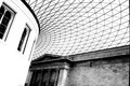
Pattern.by thedarkposeComment: Hmmm! There is so much, or was so much going on here. The bricks of building have a distinct pattern, but they are now all blurred together, the windows on the left have a pattern, but the white is so blown out you can't see it. I almost feel as if you are sacrificing elements that could make this stunning to force our eyes to the ceiling...which is oof to my eyes. |
| Photographer found comment helpful. |
| 03/27/2008 12:27:01 PM |
|
| Photographer found comment helpful. |
| 03/27/2008 12:26:15 PM |
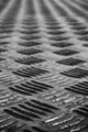
The Line Worldby cujeeComment: So many patterns, so little time. I think my biggest problem is coloring, or lack thereof. I am not a photographer so I really can't explain what is missing, it is probably in the editing. Was this desaturated? Was it b&w? Send this to the Critique Club and see if they have any suggestions. |
| Photographer found comment helpful. |
| 03/27/2008 12:24:00 PM |
|
| Photographer found comment helpful. |
| 03/27/2008 12:23:45 PM |
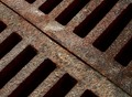
Rust Doth Corruptby dponlymeComment: I think the pattern challenge is actually diminished by the texture of the rust. Not that it diminishes this shot. I really, really, really like what you have done here. The angle from left to right, top to bottom, is different. Most people would have gone the other way, or taken this on the horizontal. The rust does add visual interst and I think that overall this is wonderful photography. |
| Photographer found comment helpful. |
| 03/27/2008 12:19:30 PM |
Pattern on the Half Shellby ScooterMcNuttyComment: Interesting idea. You have lost part of the dynamic of this with the shadow on the left. It almost looks like you are not centered. There is a weensy bit shell missing on the right, but we can't tell if it is the same on the left, due to the shadows. Leave the vertical cropping alone. I like the aspect of these lines going into infinity at the top. |
| Photographer found comment helpful. |
| 03/27/2008 12:17:10 PM |
"Pathway" to Heavenby bly_12Comment: I bit of a stretch for me, but I see what you are doing. Interesting use of dof to bring the eyes to the center of the neck. This is a choice I haven't seen used much, not sure if others are going to appreciate it. Oh, back to the challenge. If you could have taken this shot and showed only the neck, I would be more inclined to accept, without question, how this fits the challenge. |
| Photographer found comment helpful. |
| 03/27/2008 12:14:00 PM |
|
| Photographer found comment helpful. |
| 03/27/2008 12:13:27 PM |
|
| Photographer found comment helpful. |
Home -
Challenges -
Community -
League -
Photos -
Cameras -
Lenses -
Learn -
Help -
Terms of Use -
Privacy -
Top ^
DPChallenge, and website content and design, Copyright © 2001-2025 Challenging Technologies, LLC.
All digital photo copyrights belong to the photographers and may not be used without permission.
Current Server Time: 08/27/2025 08:32:14 AM EDT.